Menu

Posts tagged “user research”

Usability testing note-taking and analysis

David Travis has a good overview of collecting and analyzing usability testing data in How to record and analyze user research observations. This definition of an observation is particularly important:

Here’s the golden rule: an observation is a record of something you see or hear. Novice researchers often treat their opinions on what they like or dislike as observations. But your opinions aren’t observations — and neither are suggestions for new features or insights on how to fix usability issues. Don’t try to interpret the things you observe or fit things into a solution. That comes later.

The best observations come from watching real users do real tasks, and being as true as possible to the concrete details of what you see. You can either do this in the wild (with a field visit) or simulate actual use in a lab environment (with a usability test).

When making notes, just jot down observations, don’t try to solve the problem right there. The only thing I would add to David’s advice is that I try to mark important observations as I start to notice trends throughout the day, like so:

Usability notes

Now, if I could only figure out how to read my own handwriting, that would really help.

How to get more into Lean UX

Ben Melbourne’s UX Designers: Why are we Wasting Time? is a great post on lean methodologies and Lean UX in particular. Of course, I especially like this point:

No amount of text or slides will ever replace the richness of observing your target audience first-hand. Take your client/team out in the field with you, or you’re greatly reducing the value of your research. Seeing a user point out the flaws in your product is the quickest way to convince a CEO to drop his pet feature.

Product Discovery in the context of Agile development

Back in 2012 I wrote the following about a blind spot I’ve noticed in Agile development:

Problem solving involves not just iteration, but also lots of variation. This often requires time to get it wrong a few times, which doesn’t fit comfortably with the concept of release dates. See, the problem with integrating Agile and UX is not that designers want to hang on to “slow and heavy documents,” “big upfront design”, or whatever you want to call it. The problem is that each iteration further solidifies the chosen path, and there is no time to stop and ask if you’re going in the right direction.

All of that came flooding back when I read Jeff Patton’s Common Agile Practice Isn’t for Startups, in which he puts a slightly different spin on the issue that Agile is not very good at helping us figure out what to build. His solution is a product discovery process (something that’s obviously near and dear to my heart as well). He places the discovery process in the context of a different kind of velocity than is usually measured in Agile—trying to learn as much as possible about customers and the product:

There’s something very different about this process loop: the primary measure of progress during discovery isn’t delivery velocity, it’s learning velocity. And sadly, we can’t measure it in features or stories completed. And, even worse, we can’t plan two weeks of it in detail because what we learn today can and should change what we do tomorrow.

He goes on to describe a Nordstrom process:

Notice the Nordstrom Lab still uses time-boxes, 1 week in this case. But, they didn’t start the time-box by predicting how much they’d deliver, but with learning goals in mind. Then they iterated around the build-measure-learn loop as fast as they could.

The post is hard to quote from, so really, just go ahead and read it. It’s a very interesting approach to making discovery part of a regular Agile process.

The difference between fidelity and resolution

John Willshire wrote a good post on the difference between fidelity and resolution in design. From Want to improve your design process? Question your fidelity:

For us, fidelity is all about the people axis; how close is this to the real world? That’s the future point, when the product is out in front of lots of people, being used often, at scale. If you want to increase fidelity, then you show whatever you have to more people.

Which leaves the vertical axis, things, to be all about resolution. Resolution is a much more technical description of what we have in front of us, used across many different fields to description the detailed specifications of what the thing involves. It’s been much more useful when you’re using that language around the thing you’re working on.

There are some good illustrations in the post to make the point clear. I think this is a pretty important distinction, since it shows how user feedback can be helpful during each phase of a project.

Don't stop believing (in user research)

I’m having a hard time with Alex Schleifer’s (Airbnb’s head of design) proclamations in Why Airbnb’s New Head of Design Believes ‘Design-Led’ Companies Don’t Work. There are a lot of sweeping generalizations in the article, but I’ll focus on one specific part — user-centered design. First, this:

The solution Schleifer and CEO Brian Chesky devised actually deemphasizes the designers. The point, Schleifer says, isn’t to create a “design-led culture,” because that tends to tell anyone who isn’t a designer that their insights take a backseat. It puts the entire organization in the position of having to react to one privileged point of view. Instead, Schleifer wants more people to appreciate what typically lies only within the realm of designers—the user viewpoint.

So far, so good. It makes total sense to bake user empathy into the process and not elevate it to some elite role. Let’s continue:

Thus, every project team at Airbnb now has a project manager whose explicit role is to represent the user, not a particular functional group like engineering or design. “Conflict is a huge and important part of innovation,” says Schleifer. “This structure creates points where different points of view meet, and are either aligned or not.”

Ok, this is good too. This is usually the role the product owner or user researcher or UX designer should be fulfilling (if they’re not, something’s wrong). But if we need to call it something else to avoid stepping on toes, that’s fine. Let’s keep going:

Airbnb’s approach does seem fairly novel, simply because it deals with a problem that bedevils any product company to one degree or another: Designers tend to design for themselves, whether they intend to or not.

I agree with this, and have written about the phenomenon before in Designer Myopia: How To Stop Designing For Ourselves. But then the author goes on to say this:

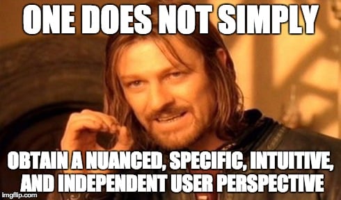
User research, meanwhile, often has limits. It’ll tell you what’s wrong, but it only rarely leads directly to great products. A true user perspective is something more nuanced, specific, intuitive, and independent.

This is where he loses me. User research is not just usability testing that tells you what’s wrong. It’s also ethnography and contextual inquiry and participatory design and in-depth interviews and a slew of other things that result in exactly what they are trying to accomplish: a user perspective that is “nuanced, specific, intuitive, and independent.” As I point out in that designer myopia article:

We do ethnography to learn, not to confirm our beliefs. By using this method to understand the culture and real needs of our users, we’re able to design better user-centered solutions than would be possible if we relied only on existing UI patterns and some usability testing.

Leaving the office and spending time observing users in their own environments is the best way to understand how a product is really being used in the wild. It’s the most efficient way to get out of your own head.

I would love to know how Airbnb proposes that their project managers get these perspectives without qualitative user research, i.e. direct contact with customers.

Articles like this make for great “you’re doing it wrong” headlines, but they are often so light on detail that you’re just left feeling bad about yourself without knowing why (or how to fix it). So I just want to say, don’t let them get to you. Keep doing what you’re doing. Conduct observational user research in context, triangulate your results, and speak up for user needs. There’s no evidence to suggest that those methods have stopped working.

Usability testing and agile, together

I really like the approach described in Jen McGinn and Ana Ramírez Chang’s RITE+Krug: A Combination of Usability Test Methods for Agile Design. It’s a dense paper, but worth your time. Here’s a key part (my emphasis added):

Prior to using the RITE+Krug combination, the user research process and results had been divorced from the Agile processes, which resulted in the findings coming too late to be acted on. Because of this issue, we integrated the user research with the rest of the process, as illustrated in Table 1.

The team consists of developers, product managers, user experience designers, visual designers, quality assurance engineers, and a user researcher. The user experience designers and product managers work closely with the development team during the feature sprints—answering questions, giving feedback on progress, and fine tuning the feature as it is implemented. The bug fix sprints give the developers time to focus on product stability.

Meanwhile the product managers, user experience designers, visual designers, and the user researcher work on preparing the small set of features that will be implemented in the next iteration (see Table 1). This work includes feature selection, design, user testing, and redesigns. The whole team (including developers) gives feedback on the feature specification and design before it is ready to be implemented. Like others, our design team stays an iteration ahead of the development team. Like Patton recommends, we iterate the UI before it ever reaches development, thereby turning what is traditionally a validation process into a design process.

And here’s the table:

One of the biggest issues with usability testing and Agile is the complaint that testing slows down the process. This seems like a really good way to alleviate those concerns.

Big data and big statistical mistakes

Tim Harford has an excellent critique of the statistical issues with the “big data” trend in Big data: are we making a big mistake? First, there’s this:

But the “big data” that interests many companies is what we might call “found data”, the digital exhaust of web searches, credit card payments and mobiles pinging the nearest phone mast.

I still love the term “digital exhaust”. I first saw Frank Chimero use it in the context of social media when he said (in a post that’s now gone from the internet):

The less engaged I become with social media, the more it begins to feel like huffing the exhaust of other people’s digital lives.

But back to big data. The big problem (see what I did there?) is that statistical problems don’t just go away when you have more data. In fact, they get worse. For example:

Because found data sets are so messy, it can be hard to figure out what biases lurk inside them – and because they are so large, some analysts seem to have decided the sampling problem isn’t worth worrying about. It is.

The article goes into the detail on this, and I think it’s important for us to recognize the limitations of big data before jumping on the bandwagon.

User-centered design at Ikea

Beth Kowitt’s How Ikea took over the world is a great look inside the Ikea machine. For me, the biggest takeaway is how research and prototyping drive everything Ikea does. On research:

One way Ikea researchers get around this is by taking a firsthand look themselves. The company frequently does home visits and—in a practice that blends research with reality TV—will even send an anthropologist to live in a volunteer’s abode. Ikea recently put up cameras in people’s homes in Stockholm, Milan, New York, and Shenzhen, China, to better understand how people use their sofas. What did they learn? “They do all kinds of things except sitting and watching TV,” Ydholm says. The Ikea sleuths found that in Shenzhen, most of the subjects sat on the floor using the sofas as a backrest. “I can tell you seriously we for sure have not designed our sofas according to people sitting on the floor and using a sofa like that,” says Ydholm.

And on prototyping:

Products under development go through rapid prototyping in the pattern shop to provide a sense of what they will actually look like in the flesh—or at least in plastic. On a recent visit, one of the four 3-D printers was outputting a toilet brush. Apparently this is one of the more normal items. “We have a lot of strange things,” says Henrik Holmberg, who manages the department. “That is very good that we can do it in our own shop rather than spreading the crazy ideas externally.” One of the oddest things he’s ever worked on was a lamp made from the same material as egg cartons. “I thought that was very crazy,” he says, “but we proved the technique was possible.”

Great article on the power of user-centered design.

Giving better design feedback

I’ve been thinking about product feedback. We do alot of it at Jive, since most of our work happens in the open. It’s one of my favorite things about Jive and I wouldn’t change it for the world. We all want to make the best product possible, and you can only get that if you put everyone’s heads together.

So I’ve been thinking about how we can make sure we give each other good feedback. I went back and reviewed some of the things I’ve learned over the years about what makes product feedback useful. I wanted to share three articles in particular that have been really helpful to me. I’m going to try to use these techniques more, and I invite you to join in.

First, Mike Monteiro wrote a great post called How To Give Better Design Feedback (it’s now mysteriously gone from the internet, but I managed to resurrect a copy from my Pinboard archive and post it on Evernote). This part, in particular, is a great point to remember:

First rule of design feedback: what you’re looking at is not art. It’s not even close. It’s a business tool in the making and should be looked at objectively like any other business tool you work with. The right question is not, “Do I like it?” but “Does this meet our goals?” If it’s blue, don’t ask yourself whether you like blue. Ask yourself if blue is going to help you sell sprockets. Better yet: ask your design team. You just wrote your first feedback question.

Cemre Güngör’s How to give better product feedback is also a great article to go through, and this is some good advice:

Describe objectively what you expected and what the product delivered (or fail to deliver). Speak about your particular experience “I got confused when I used this…” instead of generalizing “This is confusing…” or speaking of hypothetical user-beings “Users will get confused…”. This should help disarm the team and empathize.

The worst kind of generalizations speak on behalf of the whole wide world: “Nobody will like/use this”. Being dramatic is unlikely to make the product team start thinking about their work in a new context and change their ways.

But my favorite article on this, because it provides such a great framework for feedback, is Jared Spool’s Moving from Critical Review to Critique. The whole thing is fantastic, and it goes over how to structure a good review. Here’s the gist:

What makes a critique different from a critical design review is we are not there to find flaws. We’re there to learn from the design and to explore where it works well and where it could be improved.

In a well-run critique, we explicitly separate out the discussion of “What are we trying to do with this design?” from the discussion of “Does this rendition accomplish it?” By separating out these two pieces, we avoid digging into the designer’s work just because they unaware of a critical requirement or need.

This part is particularly effective:

The audience also now can explore the design. Often this is done, not with critical commentary, but with exploratory questions. “Have you thought about how users will share the photos with their friends?” “Have you considered how the application works when there’s no network connectivity?”

By posing their thoughts as questions, the designer can say whether they’d thought about that issue or not. If they have, it gives them a nice chance to talk about their thinking. If they haven’t, well, they just say, “No, hadn’t thought about that yet.”

If you have any other tips on giving good feedback, please let me know!

A technical guide to mobile usability testing

I wrote a guest post on mobile usability testing for my friends at Unboxed Consulting. It’s something I’ve mentioned briefly here on Elezea before, but in this post I go quite deep on the ins and outs of setting up a mobile usability lab. From A technical guide to mobile usability testing:

Setting aside the details of recruiting, script writing, and interviewing, from a technical perspective doing usability testing on desktop web applications is pretty simple, thanks to software like Morae and Silverback. There is, however, no straight-forward, single solution for doing usability testing on mobile devices. I recently went through the process of setting up our own mobile usability testing process at Jive, so I thought I’d share some of what we learned about the components of a good setup.