Menu

Posts tagged “user experience”

Realignment > Redesign

Alina Senderzon defends realignment strategies in Resist the Redesign:

Yet, designers are quick to jump on redesign opportunities—after all, it’s exciting to start anew. In reality, however, a redesign isn’t always the right solution to the problem. The roadblock for users may lie in the pricing of your product, which could be discovered through customer development. Or your messaging isn’t compelling and could be saved by some clever copywriting. Or maybe customers feel compelled to convert, but the checkout process is too long and needs to be streamlined. Any number of changes could generate dramatic value for the business, and though they likely involve some design decisions, they rarely require a clean slate.

This is similar to the approach I wrote about a couple years ago in The Data-Pixel Approach To Improving User Experience.

Don't stop believing (in user research)

I’m having a hard time with Alex Schleifer’s (Airbnb’s head of design) proclamations in Why Airbnb’s New Head of Design Believes ‘Design-Led’ Companies Don’t Work. There are a lot of sweeping generalizations in the article, but I’ll focus on one specific part — user-centered design. First, this:

The solution Schleifer and CEO Brian Chesky devised actually deemphasizes the designers. The point, Schleifer says, isn’t to create a “design-led culture,” because that tends to tell anyone who isn’t a designer that their insights take a backseat. It puts the entire organization in the position of having to react to one privileged point of view. Instead, Schleifer wants more people to appreciate what typically lies only within the realm of designers—the user viewpoint.

So far, so good. It makes total sense to bake user empathy into the process and not elevate it to some elite role. Let’s continue:

Thus, every project team at Airbnb now has a project manager whose explicit role is to represent the user, not a particular functional group like engineering or design. “Conflict is a huge and important part of innovation,” says Schleifer. “This structure creates points where different points of view meet, and are either aligned or not.”

Ok, this is good too. This is usually the role the product owner or user researcher or UX designer should be fulfilling (if they’re not, something’s wrong). But if we need to call it something else to avoid stepping on toes, that’s fine. Let’s keep going:

Airbnb’s approach does seem fairly novel, simply because it deals with a problem that bedevils any product company to one degree or another: Designers tend to design for themselves, whether they intend to or not.

I agree with this, and have written about the phenomenon before in Designer Myopia: How To Stop Designing For Ourselves. But then the author goes on to say this:

User research, meanwhile, often has limits. It’ll tell you what’s wrong, but it only rarely leads directly to great products. A true user perspective is something more nuanced, specific, intuitive, and independent.

This is where he loses me. User research is not just usability testing that tells you what’s wrong. It’s also ethnography and contextual inquiry and participatory design and in-depth interviews and a slew of other things that result in exactly what they are trying to accomplish: a user perspective that is “nuanced, specific, intuitive, and independent.” As I point out in that designer myopia article:

We do ethnography to learn, not to confirm our beliefs. By using this method to understand the culture and real needs of our users, we’re able to design better user-centered solutions than would be possible if we relied only on existing UI patterns and some usability testing.

Leaving the office and spending time observing users in their own environments is the best way to understand how a product is really being used in the wild. It’s the most efficient way to get out of your own head.

I would love to know how Airbnb proposes that their project managers get these perspectives without qualitative user research, i.e. direct contact with customers.

Articles like this make for great “you’re doing it wrong” headlines, but they are often so light on detail that you’re just left feeling bad about yourself without knowing why (or how to fix it). So I just want to say, don’t let them get to you. Keep doing what you’re doing. Conduct observational user research in context, triangulate your results, and speak up for user needs. There’s no evidence to suggest that those methods have stopped working.

Usability testing and agile, together

I really like the approach described in Jen McGinn and Ana Ramírez Chang’s RITE+Krug: A Combination of Usability Test Methods for Agile Design. It’s a dense paper, but worth your time. Here’s a key part (my emphasis added):

Prior to using the RITE+Krug combination, the user research process and results had been divorced from the Agile processes, which resulted in the findings coming too late to be acted on. Because of this issue, we integrated the user research with the rest of the process, as illustrated in Table 1.

The team consists of developers, product managers, user experience designers, visual designers, quality assurance engineers, and a user researcher. The user experience designers and product managers work closely with the development team during the feature sprints—answering questions, giving feedback on progress, and fine tuning the feature as it is implemented. The bug fix sprints give the developers time to focus on product stability.

Meanwhile the product managers, user experience designers, visual designers, and the user researcher work on preparing the small set of features that will be implemented in the next iteration (see Table 1). This work includes feature selection, design, user testing, and redesigns. The whole team (including developers) gives feedback on the feature specification and design before it is ready to be implemented. Like others, our design team stays an iteration ahead of the development team. Like Patton recommends, we iterate the UI before it ever reaches development, thereby turning what is traditionally a validation process into a design process.

And here’s the table:

One of the biggest issues with usability testing and Agile is the complaint that testing slows down the process. This seems like a really good way to alleviate those concerns.

Our obsession with data

Virginia Heffernan’s A Sucker Is Optimized Every Minute is a deeply cynical, extremely funny rant on our obsession with data:

These days, optimizers of squeeze pages, drawing lessons as much from the labcoats at Optimizely as from the big daddies at Google, recommend creating a three-to-10 minute video that’s introduced by a “magnetic headline” (“Find the Perfect Lampshade for Any Lamp”) and quickly chase it with an “information gap” like “You’re Not Going to Believe the Trick I Use While Lampshade Shopping.” (Article of faith among optimizers: humans find information gaps intolerable and will move heaven and earth to close them.) Next you get specific: “Click the play button to see me do my lampshade trick!” — after which the video unspools, only to stall at the midpoint with a virtual tollbooth. You can’t go on unless you hand over an email address. Presto.

A sucker is optimized every minute.

Label your icons

I’ve been spending way more time with Google’s Material Design guidelines than I ever thought I would, but such is life.

Anyway, as I was going through it, and started to think about the Android side of an app I’m working on, I tweeted this:

Concerned about Material Design’s reliance on label-less icons. Pretty sure most users don’t know what these mean. pic.twitter.com/aH1IZvAyG6

— Rian van der Merwe (@RianVDM) March 11, 2015

That screenshot is from the section on Icons in the guidelines, but it’s not the only example. The whole document is full of screen shots of label-less icons. There’s not a single label in the section on Typography.

No labels

There’s lots of research about why this is a bad idea, but I’ll just cite two articles on the topic. First, Aurora Bedford sums it up nicely in Icon Usability:

A user’s understanding of an icon is based on previous experience. Due to the absence of a standard usage for most icons, text labels are necessary to communicate the meaning and reduce ambiguity.

And Josh Porter also makes a good point in Labels always win:

I think labels should be kept around in almost all cases as they turn guesses into clear decisions. Nothing says “manage” like “manage”. In other words, in the battle of clarity between icons and labels, labels always win.

Beyond that, there’s also plenty of evidence from A/B testing that even much-used icons like the hamburger menu is simply not well understood (see Hamburger vs Menu: The Final AB Test). So, be kind. Label your icons.

Update March 16, 2015

I’ve received some interesting and helpful responses from the Android community:

@RianVDM Agree, but they are labeled here which I have used countless times https://t.co/GYVxBoCOH9

— Mike Arney (@mike_arney) March 16, 2015

@RianVDM on Android a long press should show you the label of the icon, it’s required when you develop an app for Android

— Omar Tosca (@otozk) March 16, 2015

Why enterprise software is so bad

Business

My day didn’t start great. The first thing I read was Michael Dubakov’s statement about enterprise software people (i.e., people like me) in Enterprise software vendors have no taste:

My current theory is that enterprise software vendors have no taste. CEO, VP of development, Product managers that focus on enterprise market — all of them have no fucking taste. There is no taste in companies [sic] DNA, nobody cares about design and aesthetic. Profits, revenue, sales and new features — yes! Beautiful design — no.

Nobody, you guys. Literally nobody. I guess I don’t blame Michael for this false cause fallacy. It sure seems like a logical conclusion: product bad, therefore product person bad. As with most things, though, it’s more complicated than that.

Let’s start with the most difficult thing about designing in the enterprise space: in most cases, the people who buy the software and the people who use the software are completely different, and therefore have completely different needs. This is not a problem in the consumer market, where the person who gives you money is usually also the person who uses your product.

The people who buy enterprise software — IT managers, HR managers, etc. — care about things like configurability, control, more features than a competitor, and most of all: the ability to customize the thing just so, so that it fits in with whatever systems already exist. End users care about none of those things. They care about getting a job done as quickly and with as much enjoyment as possible.

So, what happens is what happens in most organizations that rely on outside sales. Many Sales teams go out and sell things that don’t exist in the product. And they often sign contracts that have two things in it that make designers wake up in a cold sweat: (1) a list of features (or — ugh, I hate this term so much — “product requirements”), and (2) delivery dates.

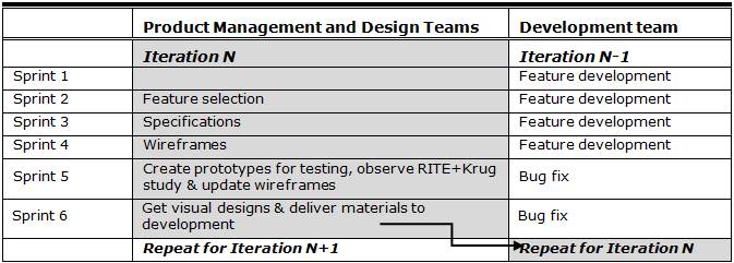
Product people then have to fulfill the needs of the contract/promise (as opposed to the needs of end users) in never enough time. Instead of having the time to understand a problem and user needs, building hypotheses and testing them, and taking time to iterate, they make a thing to hit a deadline and then move on to the next thing that has a deadline.

And that’s why enterprise software looks the way it looks. It’s not that product people don’t have taste. It’s that they don’t have agency.

But, I do want to say, there are welcome signs that this is changing. There is a new realization that the needs of buyers and end users can co-exist peacefully, and the result is better products. As an example, our new CEO is a huge advocate for design, and is pushing the organization to create “simple, smart, beautiful products.” This will take time, of course, but if you look at the new suite of apps that we’re working on, you’ll see that these are starting to look more like consumer products.

There are other things I think we can do to help along this shift:

  • Train sales teams on the ins and outs of product development. How prioritization works, how long things generally take, what the major user needs are that the product is trying to solve, etc. If they have more knowledge about how their promises affect the teams, it will go a long way to change behavior.
  • Spend as much time with end users as possible, record the sessions, and share it widely. Nothing gets an organization riled up about good design like seeing end users struggle with a product.
  • Start on a small product that no one cares about (like the mobile site maybe?). Follow a Lean UX process (or whatever methodology you subscribe to). Build it well, and show people the results. Then start moving the process into other areas.

So, anyway. Yeah, enterprise software is still, for the most part, pretty bad. It’s time for us to break out of the constraints of the past that caused that, and do something better. It’s actually a good time to be in enterprise software. There’s so much opportunity, and a newfound agency for designers. I’m optimistic. The day can only get better from here.

Giving better design feedback

I’ve been thinking about product feedback. We do alot of it at Jive, since most of our work happens in the open. It’s one of my favorite things about Jive and I wouldn’t change it for the world. We all want to make the best product possible, and you can only get that if you put everyone’s heads together.

So I’ve been thinking about how we can make sure we give each other good feedback. I went back and reviewed some of the things I’ve learned over the years about what makes product feedback useful. I wanted to share three articles in particular that have been really helpful to me. I’m going to try to use these techniques more, and I invite you to join in.

First, Mike Monteiro wrote a great post called How To Give Better Design Feedback (it’s now mysteriously gone from the internet, but I managed to resurrect a copy from my Pinboard archive and post it on Evernote). This part, in particular, is a great point to remember:

First rule of design feedback: what you’re looking at is not art. It’s not even close. It’s a business tool in the making and should be looked at objectively like any other business tool you work with. The right question is not, “Do I like it?” but “Does this meet our goals?” If it’s blue, don’t ask yourself whether you like blue. Ask yourself if blue is going to help you sell sprockets. Better yet: ask your design team. You just wrote your first feedback question.

Cemre Güngör’s How to give better product feedback is also a great article to go through, and this is some good advice:

Describe objectively what you expected and what the product delivered (or fail to deliver). Speak about your particular experience “I got confused when I used this…” instead of generalizing “This is confusing…” or speaking of hypothetical user-beings “Users will get confused…”. This should help disarm the team and empathize.

The worst kind of generalizations speak on behalf of the whole wide world: “Nobody will like/use this”. Being dramatic is unlikely to make the product team start thinking about their work in a new context and change their ways.

But my favorite article on this, because it provides such a great framework for feedback, is Jared Spool’s Moving from Critical Review to Critique. The whole thing is fantastic, and it goes over how to structure a good review. Here’s the gist:

What makes a critique different from a critical design review is we are not there to find flaws. We’re there to learn from the design and to explore where it works well and where it could be improved.

In a well-run critique, we explicitly separate out the discussion of “What are we trying to do with this design?” from the discussion of “Does this rendition accomplish it?” By separating out these two pieces, we avoid digging into the designer’s work just because they unaware of a critical requirement or need.

This part is particularly effective:

The audience also now can explore the design. Often this is done, not with critical commentary, but with exploratory questions. “Have you thought about how users will share the photos with their friends?” “Have you considered how the application works when there’s no network connectivity?”

By posing their thoughts as questions, the designer can say whether they’d thought about that issue or not. If they have, it gives them a nice chance to talk about their thinking. If they haven’t, well, they just say, “No, hadn’t thought about that yet.”

If you have any other tips on giving good feedback, please let me know!

Design wars

Lukas Mathis’ False Dichotomies is a great post about how quickly design feedback can turn into an argument about the wrong things:

In creative endeavors, tribal, black and white thinking can be problematic, because it prevents you from noticing all possible options. Whenever the discussion veers from «how can we solve this problem» to «should we pick option A or option B», you need to take a step back, and ask yourself — and your team — if these are really the only two options.

Is there any kind of middle ground?

Are there entirely different approaches we didn’t consider?

Are there valid concerns the other group is raising, and can we take these concerns into account without completely dismissing our own concerns?

A technical guide to mobile usability testing

I wrote a guest post on mobile usability testing for my friends at Unboxed Consulting. It’s something I’ve mentioned briefly here on Elezea before, but in this post I go quite deep on the ins and outs of setting up a mobile usability lab. From A technical guide to mobile usability testing:

Setting aside the details of recruiting, script writing, and interviewing, from a technical perspective doing usability testing on desktop web applications is pretty simple, thanks to software like Morae and Silverback. There is, however, no straight-forward, single solution for doing usability testing on mobile devices. I recently went through the process of setting up our own mobile usability testing process at Jive, so I thought I’d share some of what we learned about the components of a good setup.

The problem with surveys

Erika Hall speaks so much truth in her post On Surveys:

If you are treating a survey like a quantitative input, you can only ask questions that the respondents can be relied on to count. You must be honest about the type of data you are able to collect, or don’t bother.

My first role at eBay, years ago, was as a quantitative user researcher1. We ran surveys to measure satisfaction with different areas of the product over time. If that period taught me anything, it’s that surveys are extremely useful when combined with analytics as well as qualitative user research (triangulation), and pretty useless when looked at in isolation. There just isn’t enough context by itself.


  1. One of my early experiences at eBay was getting to work one morning and discovering that Peter Merholz wrote a scathing blog post about a survey I was running. This was my second month on the job, so I was pretty sure I was going to get fired. The worst part of it was that he didn’t have the full context, so his criticism wasn’t even valid. We were doing a controlled experiment where each group saw only one of the images in the survey, and the “likelihood to purchase” question was just a decoy as an introduction. We weren’t trying to get absolute numbers of likelihood to purchase (that would be ridiculous) — we were comparing responses to different pages to figure out what iconography would be best for ratings (stars, bars, or check marks). Subsequent questions were more specific about the ratings aspect. It went all the way up to our VP of Product and my manager had to write an explanation. I was mortified. I still sometimes wake up in the middle of the night in a cold sweat, screaming “survey!!!!!!!!!”