Menu

Posts tagged “user experience”

User-centered design in the enterprise: A case study of Jive Circle

We just announced Jive Circle, a new corporate directory app for iOS and Android that we’ve been working on since the beginning of the year. I’m really excited about this app, because we were able to follow a user-centered design process to ensure we’re launching a product that is both useful and usable. In this post I’d like to talk a bit about the process we followed, and some of the lessons we learned as a team.

So let’s start where every product should start: user needs.

Start at the beginning: user needs

Jive Circle is the 3rd product in what we’re calling our Workstyle apps. The first (Jive Daily) and second (Jive Chime) were released earlier this year. During the market research for these products the research team discovered a new pain point that was just waiting to be solved: corporate directories.

Accessing the corporate directory is something people do multiple times a day. The problem is that it’s a terrible experience. There are usually HR systems or intranets that try to give easy access, but the research showed that people rarely used these systems (for reasons ranging from “it sucks!” to “I forgot my password and can’t be bothered to reset it”). Instead, they do something that’s accessible but a really bad experience: they use Microsoft Outlook.

The most common way to look someone up in a corporate directory is this:

  1. Compose a new email message in Outlook
  2. Type in the person’s email address
  3. Right click on their name
  4. Go to their profile
  5. Copy the needed information
  6. Close out the (unsent) email

Not exactly an ideal process. We saw an opportunity to fix this. Enter Jive Circle.

Iteration is better than words: prototyping solutions

From the very beginning, we wanted the design process to be right. We agreed as a team that we want to get user feedback early and often, and that we’ll get a working prototype as quickly as possible so that we can iterate from there.

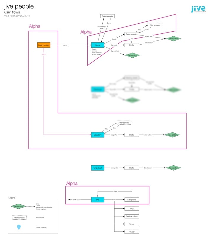
The first thing I wanted us to agree on—before starting any design work—was the basic user flows and information architecture. This took a couple of weeks to get right, but eventually v5.1 was the one we settled on (apologies for the blurring—there’s an upcoming feature I can’t tell you about yet…):

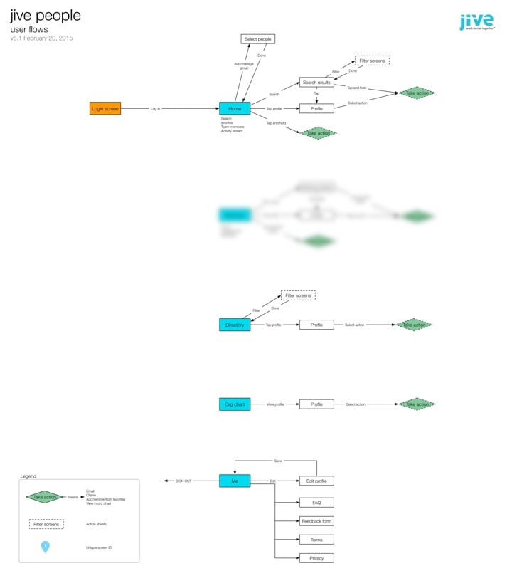
The flows have stayed mostly unchanged from this version. It was immensely helpful to start with user flows, as opposed to just making screens and hoping for the best. We came across a bunch of questions and issues as we worked through the IA, and it was much more efficient to work through them in this phase than it would have been once design had already started.

With the basic flows settled it was time to move on to design. I chose to use Proto.io for the initial prototypes. There are lots of alternatives, of course, but this is the one that came closest to what I needed (including a “long tap” gesture that none of the other tools had at the time).

Looking back over it now, it’s amazing to see the evolution of the app from the first prototype to our first Alpha dev build. Some things changed a lot, others remained largely the same. Here’s for example, is the Home screen from the very first prototype, compared to what is in the Beta version today:

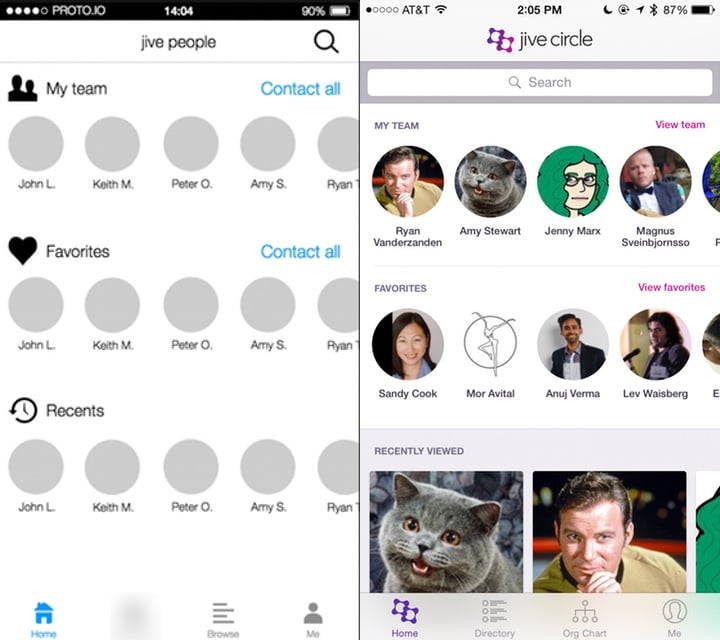
The more prominent search bar, dedicated “team” views, and card-based information at the bottom were all changes made as a direct result of usability testing—but more on that later.

Every couple of days I would publish a new version of the prototype based on team feedback, along with a list of what changed:

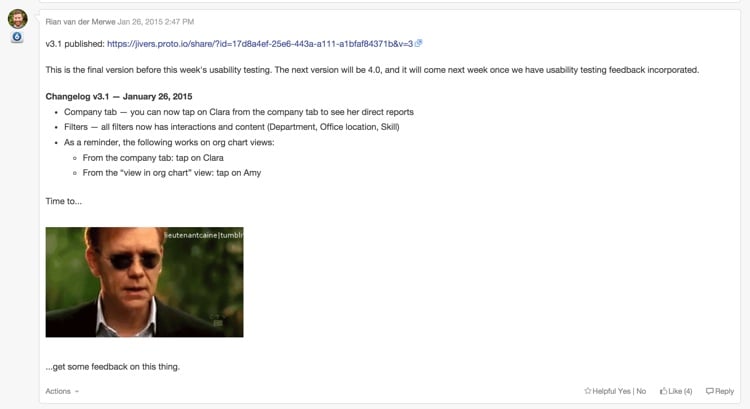
As you can see from the image above, by the time we hit v3.1, we realized it was time to get this thing in front of users before we went any further…

Save time and pain: usability testing

It was always really important to us to do at least two rounds of usability testing on this product: one round on a prototype, and one round on the first Alpha build. So with v3.1 of the prototype in hand I ran some usability tests to better understand how people currently use their corporate directories, and how well our proposed solution is working.

It was, as usual, incredibly insightful, and the changes we made based on that early feedback had a big impact on the utility and usability of the app. If we waited until we released the app to market to find that out… Well, that would have been an expensive mistake.

Two of the biggest insights we uncovered were:

  • Knowing someone’s location, time zone, and availability is incredibly important, and the starting point for almost every interaction with that person. So this has to be a central component of the app.
  • It’s surprising how often people want to look others up in an org chart—especially in large organizations. This meant that instead of having an org chart as a sub-set of a directory, we needed to make it another core aspect.

With our insights in hand we continued to make improvements to the prototype, until we arrived at v5.1. It was time to start visual design and development…

Making it real: From prototype to visual design and development

Early on in the development process we did something that I think is important to note. We decided to develop the first iteration of the app using a vertical as opposed to a horizontal approach. Here’s what I mean by that… With a horizontal approach you add all the features the app will have in the first iteration, and then start perfecting them. The problem with this is that you end up with a bunch of half-baked features, and if you run out of time before the release date, you’re screwed.

If you take a vertical approach you pick the features you want to work on first, and complete them front to back. You make sure they work well. You might have fewer features in the first release, but they’ll be fully baked, so you’ll have a useful app. And then you get to add some great stuff in upcoming releases. This is sometimes referred to as the cupcake theory of product development. For us, this meant focusing on a very specific feature-set that the entire team agreed on:

At this point our visual designers started working on the main screens and animations for the Alpha release, and the dev team started to build the back-end. We followed a very collaborative approach to development. It was challenging at times, since our dev team is in Tel Aviv, and the product and design teams are all on the US West Coast. But thanks to our internal collaboration software, lots of video calls, and a few weeks of in-person time, we made it work.

By the time the team published Alpha, we were all quite beside ourselves with excitement. The Alpha was already an amazing app, and we couldn’t wait to get it into the hands of users. So we moved on to the next phase…

Polishing a turd diamond in the rough: more usability testing

We did two things with the Alpha version:

  • We released it as an internal Alpha to a subset of users in our own company, so that they could try to break it and help us fix bugs.
  • We did another round of usability testing to do a few last course corrections if needed (and yes, we did need to!).

At this point we also started working on the fun parts of the app—those extra little animations and interactions that just make the app special. Our visual designers and developers did a fantastic job on the details here. Below are a couple of my favorite animations in the app:

Long press on an avatar:

Org chart animation:

These animations are subtle and not overbearing, but really help to bring some personality to the app.

Ship it already: knowing when you’re done

We probably could’ve kept going for forever, but the market waits for no person, so it was time to work towards our announcement date.

This is where our decision to follow a vertical approach really paid off. We were halfway through a feature when we ran out of time. In a horizontal approach that would have been a disaster. But because we completed each feature before starting on the next one, this wasn’t a problem. We just cut that feature out of the initial release, and we’ll add it as an update in coming months.

So now we wait for August 31st, our official release date! The app was submitted to the app stores today, so we’ll see how that part goes. All in all this is one of my favorite projects I’ve ever worked on. The team is amazing, the process was fantastic, and I can’t wait to get it out there and start adding even more useful things to it.

Most of all, I’m excited that we were able to make prototyping, usability testing, and rapid iteration part of the design process. It helped us focus on staying user-centered, and I’m convinced it saved us months of development time.

Lessons learned

There are a couple of important takeaways from the project that I want to note.

  • Remote teams are hard. We all know this, but it sometimes feel like we pretend it’s going to be easier than it is. There are only two things I’ve found that make working in remote teams easier: (1) overcommunicate, and (2) travel to spend time together as much as possible.
  • Prototyping really is the best way to go. I’m not going to say wireframes are dead—in fact, I would say quite the opposite. But if time and budget allows for it, nothing beats an interactive prototype for team communication and user feedback.
  • Enterprise software CAN be designed and developed in a modern way. The whole team was on board with our user-centered design approach, and that made all the difference. Don’t think that just because you work in a large organization, you have to continue to work in BDUF, slow, waterfall environments.

As with all things design-related, this app is far from perfect. But I have confidence in our process. I have confidence in the utility of it. And I know that we’ll keep making improvements as the feedback from users come in, because that’s been a cornerstone of the project since the beginning. What more can a product designer ask for?

How = What + Why

I wrote an article on analytics and usability testing for the UserVoice blog, so I wanted to share it here as well. From How = What + Why (Or, Where to Start Improving Your User Experience):

The first thing to clear up is this: in order to know where to start to improve the user experience of your product, you’re going to need more than a single data source. No single method can tell you the whole story you need to make good decisions. Usability testing will show you where there are interaction problems, but it won’t show you the magnitude of those problems. Web analytics will show you lots of numbers, but it can’t tell you how to fix issues you encounter. Even worse, it’s not always clear how to interpret analytics in isolation, so you might not even be able to tell if some things really are issues in the first place.

There is hope, though. It’s in the combination of these two methods that we find the elusive answer to our question. Combining usability testing with web analytics gives us the insight we need to make the right UX decisions about our products.

Regressive disclosure: designing complex interfaces by reducing choice

I’m currently designing an Admin Console for enterprise software, and it’s going pretty much as you’d expect it to go, which is like this:

Winning

Every time I think I’ve made a breakthrough and sit back to enjoy my handiwork, I realize I missed something, and back into the abyss I go. I’ll probably write an emotional case study once this is all said and done, but for now there’s one breakthrough that has actually lived up to repeated scrutiny, so I wanted to share that.

First, let’s define what an admin console is. It’s that area of a site where admin users go to manage users, content, billing, notifications, and all kinds of other admin-y things. It’s also the area of a site that mostly gets ignored because (1) very few people have to use it, and (2) it’s freaking hard to design. There can be hundreds of options, and figuring out how to make it all fit together while still providing a good user experience can drive a grown man to tears very quickly. But if you don’t spend the time on this, and admins can’t do what they need to do, the whole site can fall down for its users.

So onward we go.

Initially I approached the design as primarily an Information Architecture problem to solve. I assumed that the main concern for admin consoles is findability of features. Where do you go to send invites? Manage authentication options? Set up analytics? But as I thought about it more, I realized that when it comes to admin consoles, there are actually two very distinct user actions, and they need to different design paradigms:

  • First, there’s the action of finding the thing you’re looking for. And yes, that’s primarily an Information Architecture problem to solve.
  • Second, there’s the action of doing the thing you found. And that is less of an IA problem, and much more a user experience problem to solve.

In most admin consoles the acts of finding and doing are both built on the same interface. What this usually means is that even if you get your IA right, performing the action you go there to do can be really difficult and confusing because the interface is still in finding mode. What we need is to separate those two actions. How do we do that? I have pictures!

Let’s begin with how most admin consoles work:

In this case, the whole thing is a mess. The Information Architecture is not well thought through, so finding what you’re looking for is extremely difficult. To add insult to injury, if you do manage to find your path and switch to doing, all those distractions remain in the interface, and you’re left to fend for yourself amidst the chaos.

Now, let’s see what happens if you look at this only as an Information Architecture problem, as I did at first:

We’re certainly making progress now. The list of things you can do is neatly ordered, so it’s much easier to navigate. But there’s still a problem: the interface remains consistent during the doing phase, so the probability to get confused is still high.

So what happens if we look at finding and doing as completely separate actions? What if we try to solve both the IA and the UI problems, depending on which phase we’re in? I think we end up with something like this:

Now we’re talking. With every step, you get fewer choices, so you’re essentially getting guided to the most appropriate choice. And even more importantly, once you enter the doing phase, there is no more distraction. Everything is focused on completing the task at hand. Maybe this results in more clicks overall, maybe it doesn’t. That’s not important, though. What’s important is that the next action to take is as obvious as possible.

This approach is in direct contrast with progressive disclosure. Instead of starting with a few options, and opening up to more options as you go, you start with many options (which is essential in a complex UI like an admin console), and provide fewer options as you go. Perhaps we can call it regressive disclosure? I don’t know, I’m bad at naming things.

How is this thinking manifesting itself in my current project? Well, instead of providing a traditional navigation—however well thought out it might be—I’m leaning towards a design that is much more linear, and provides fewer choices as the user goes along. I’m also working on a full-screen design for the doing phase, where the rest of the IA disappears completely once you move on from finding. As an added bonus, this is a much more natural design on mobile is well, so it’s going to make our responsive efforts easier as well.

There’s still a long way to go, but at least I now feel like the framework is solid. Hopefully you can use this for something you’re working on as well!

How to improve Enterprise UX

A couple of weeks ago I did a talk on Enterprise UX at UX Burlington. You can now read a written version of the talk on A List Apart. From Unsuck the Enterprise:

So if you’re someone who works in enterprise software, come a bit closer—I need to tell you something…

I know the work can be difficult. I know there are an infinite number of factors involved in getting product live, and sometimes what gets launched isn’t what you had in mind. I know there are sleepless nights about this sometimes. But don’t give up. Don’t think that enterprise design has to be boring or tasteless. With a little bit of effort and a lot of tenacity, it’s possible to create great enterprise product. We need you to make it happen, though. Who else is going to do it?

Or if you have 20 minutes to spare, the video for the talk is also now available on Vimeo:

Don't sell features, sell outcomes

I don’t want Yelp; I want to know where to eat. I don’t care about Google Calendar; I care about not missing appointments. I don’t buy iPhones; I buy best-in-class pictures of my kids. I’m loyal only to results, and I suspect you are, too.

— From John Pavlus’s Apple and Google Race to See Who Can Kill the App First, a good reminder that users care about outcomes, not features

A little friction can be a good thing

Chris Palmieri’s A Practice of Ethics gets a bit rambly at times, but I really like the questions he wants designers to ask themselves. This bit on friction is particularly good:

Some friction is borne of our simple incompetence. This friction leads to the potholes of user experience — hidden data entry requirements, inscrutable error messages, long page loading times. Some friction is borne of greed, such as the tedious impedance of user abandonment. “Are you sure?” Yes, I’m sure.

But some friction is borne of respect, when we present information about the choices available to users and help them make better decisions. An emailed invoice could remind a customer they were paying for a service they no longer use. A checkbox could assure a user of their current content privacy settings before posting a sensitive photo. Recognition of a past purchase can save a customer the hassle of having to return a book they already have, or confirm that they are re-buying exactly the same shampoo.

It reminds me of Andrew Grimes’s excellent Meta-Moments: Thoughtfulness by Design:

Meta-moments can provide us with space to interpret, understand, and add meaning to our experiences. A little friction in our flow is all we need. A roadblock must be overcome. A speed bump must be negotiated. A diversion must be navigated. Each of these cases involves our attention in a thoughtful way. Our level of engagement deepens. We have an experience we can remember.

Not all friction is bad…

When explosive growth hurts a product

I’m seeing this sentiment about Slack quite a bit these days:

Am I the only person who feels like Slack has turned into an even less controlled, one-more-thing-to-check, inbox?

— Craig Mod (@craigmod) June 2, 2015

I am now on nine Slacks and I get DMs in all of them and this is rapidly becoming untenable

— Erin Kissane (@kissane) June 2, 2015

This is such an interesting side effect of being successful. Slack is an amazing product, and the way they’re building it is nothing short of remarkable. From their launch strategy to the way they keep innovating, it’s a wonderful case study.

But now something else is happening. Slack is so successful that public groups have exploded, and it’s not uncommon for people to switch between 5 or more Slack accounts during any given day. I think we’re now learning that the thing that makes Slack so useful also requires it to remain a relatively small part of one’s workday.

Slack is a great communication tool, with integrations that make it possible to reduce the amount of time spent on other services. But once you have multiple accounts and multiple rooms to contend with every day, it has the potential to become worse than that technology we all love to hate—email. At least with email there’s an assumption of asynchronous communication. With Slack there’s always an expectation to get an answer immediately, so the stress it induces can really skyrocket out of control.

What a predicament. This is a product that is incredibly useful, but that needs a relative measure of quietness to remain so. This means that explosive growth actually hurts its utility. What an interesting design problem to solve…

Make me think

Meta-Moments: Thoughtfulness by Design is a great post by Andrew Grimes on the benefits of making users pause and think in certain areas of an interface:

Meta-moments can provide us with space to interpret, understand, and add meaning to our experiences. A little friction in our flow is all we need. A roadblock must be overcome. A speed bump must be negotiated. A diversion must be navigated. Each of these cases involves our attention in a thoughtful way. Our level of engagement deepens. We have an experience we can remember.

Lean vs. Design?

This is sure to be a bit controversial, but Jon Kolko makes some great points about design-led vs. lean development in Lean Doesn’t Always Create the Best Products:

And with this, we arrive at perhaps the most important distinction between an empathetic design-led approach and Lean. Lean is fast. Design is slow. Design is more contemplative, reflective, and because it demands systems thinking and marinating in the ambiguity of cultural data, it simply takes longer. The benefit is in producing emotionally sound products: products that people love, not just products people use. Increasingly, people expect more from the products and services they engage with. They expect quality, and use it both as a selection criteria for purchase and as a constraint for sustained use.

I don’t think Lean principles are necessarily in conflict with design principles (there is, after all, a thriving Lean UX movement). But the part that resonates here is the speed pressure that the Lean movement has placed on design activities. All research, prototyping, and graphic design is expected to happen much faster now. Speed is good, but not if it comes at the cost of not truly understanding the problems and user needs you’re designing for. And that’s where Jon’s points are worth taking to heart.

Mobile vs. Desktop in the enterprise software market

“Mobile first” is more about progressive enhancement and making important design hierarchy decisions than it is about thinking about small screens, so I don’t agree with the “outdated” bit in Paul Adams’s Why ‘mobile first’ may already be outdated. That said, he makes a good point about enterprise software:

Many businesses being advised to go all in on mobile screens, should consider how often they are accessed while people are at work. Software that people probably shouldn’t, but do, look at on their work computer: news, sports, social, messaging, personal email. The large screen matters.

Now imagine that you actually build software specifically for people to use at work. This may be software for getting work done, such as Google Docs, Intercom, Slack, Basecamp, Trello, etc. The likelihood now is that the larger screen is the most important one. The large screen app is more important than the mobile app. The mobile app plays a different role to the large screen app, and in many cases a supporting role.

I see this is in our user research all the time. If we do usability testing on our mobile apps, one of the first questions is always, “Will I be able to use this on my desktop”? For software that gets used mostly at work, focusing on desktop — as unsexy as it might sound — is still hugely important.