Menu

Posts tagged “technology”

Why online reputation systems don't work

Josh Klein explains why reputation systems like Klout will never work in Can Reputation Come Down to a Number?:

There’s a more nuanced problem interwoven into the problem of arriving at a unified reputation system. The people who are attempting it, such as Klout and Kred, might hope to measure reputation but their algorithms, at best, track influence. The two are not equal. Influence is the ability to get others to take action, such as donating funds. But how that influence can be wielded is critical; Obama had great luck in soliciting donations using his influence, but so did Butch Cassidy. Influence is different in different contexts, and measuring only “influence” means you are judging someone’s capabilities without any of the necessary context.

Personally, I think the only online reputation system that does work is Klouchebag.

Blame the business model for the Instagram/Twitter spat

Dan Lyons gets to the heart of the Instagram/Twitter spat in Instagram Turns Evil, And It’s All Our Fault:

Companies like Twitter and Instagram (and Facebook, which owns Instagram) are set up in such a way that their interests have never been aligned with the interest of their users, but in fact are in complete opposition to them.

The only way these companies can succeed financially is by tricking members and forcing them into walled gardens. Think of it this way - there’s a reason that they don’t hold a circus out in the open, and instead put it under a tent - and it’s not to keep you dry in case of rain.

Dan is saying this is all our fault for letting these companies box us in. But really — what’s the alternative? Where’s the paid Instagram clone that has the same network effect as the free one does? This is not an easy problem to solve.

Related post from the Elezea archive: Everything for free, always: how Facebook ads show us the sad state of the Internet.

More on Android vs iOS mobile web browsing engagement

Anthony Wing Kosner wrote a very interesting analysis of Horace Dediu’s Android engagement paradox numbers, which show that although Android market share is surging, its share of mobile browsing is lagging way behind iOS. The Android vs iOS Engagement Paradox is full of insights like this:

In the U.S. and many other countries, inexpensive Android devices are the replacement for the feature phones most consumers have been using. A feature phone user carries their minimal expectations with them to their new device. It turns out that just giving someone a smartphone doesn’t make them a smartphone user. They need habits of use that take advantage of the new functionality they now possess. iOS users, in contrast, are much more interested from the get-go in what their device can do, though few of us really tap anything near the full computing capacity of what we carry in our pockets.

Read The Android vs iOS Engagement Paradox on Forbes.

Google wreaks havoc on our company's calendars

We run our company on Google Apps for Business, and we’ve never had any problems. Until now. On Friday morning we came in to work to find that all our calendars are completely, utterly messed up. We lost data, ownership changed randomly, and some of us lost access to our own calendars. We’re still coming to terms with what happened, and it’s hard to explain without getting into specific detail, so I’ll just give you taste of the damage. Sorry for all the names of people you don’t know, but it’s the only way I can keep this straight:

  • My work calendar disappeared from my account, and is now owned by Chris’s personal Google Apps account.
  • I now own the Boardroom calendar, which is a resource calendar.
  • Chris’s work account now owns his personal calendar.
  • Debré’s work calendar disappeared from her account, and is now owned by Philip’s work account.
  • Philip’s personal calendar disappeared from his account, and is now owned by Angela’s work account.
  • Some events have gone completely missing from calendars — they’re just not there any more. Those events also disappeared from our clients’ calendars, which is a huge embarrassment and inconvenience because we don’t know when we’re supposed to meet with who.

And on and on it goes. Google Apps for Business promises 24/7 customer support, with a guarantee that “We’re always available to help via phone or email.” We discovered this issue on Friday morning, so I called immediately. They opened a case, I sent some screen shots, and then we waited.

Later in the day I got an email saying that “Your case will now be further analyzed by the next tier of support.” And then they went dark. I kept sending more information as we found it, but nothing happened. I phoned again on Friday evening and Saturday morning, but by then, phone support couldn’t do anything because the case was transferred to a “calendar specialist”.

On Saturday evening I received an update from Google Apps Support:

I looked at the calendars you mentioned and see the strange names that you mentioned. However, determining exactly what happened will require some in depth logs analysis. This will take some time.

And after that — nothing. Now it’s Monday morning and our ability to run our business is crippled since we don’t have access to our meeting schedule. And since we know that some events have gone missing, we can’t even trust what remains.

On the Google Apps Calendar page it says this (my emphasis added):

Google Calendar is designed for security and reliability with features like encrypted connections to Google’s servers, simultaneous replicated storage for your calendar appointments, built-in disaster recovery and fine-grained sharing, which lets you share your calendar with people in and out of your organization.

So if there’s built-in disaster recovery, why can’t they just restore our calendars to the state it was in Thursday night? Why has it been three days and we’re not getting regular updates and progress reports? Why promise 24/7 customer support if you can’t deliver it? And yes, this includes both phone and email support of their “core services”, which includes Google Calendar.

I’m writing this to hopefully accomplish three things:

  • Get some more attention on the issue so that Google can fix it and let us get on with our business.
  • Ask if anyone has experienced this problem before — if so, please get in touch.
  • Warn you about something you most likely already know: your data is not safe anywhere.

That’s the story so far. Google, please help. We just want our calendars back, and we’d love to know what happened.

Update 12/10/2012: The Internet works! On Monday evening I received a call from a senior Google Calendar employee, and he spent 30 minutes on the phone with me to help troubleshoot and get to the bottom of the issue. Our calendars aren’t fixed yet, but I’m confident that Google is now on top of it and will give us regular updates on what’s going on. At this point it looks like a 3rd party application had a sync issue with GCal, and that instigated a weird chain reaction. I’ll update again with more information once it’s all been fixed.

Update 12/12/2012: We’re mostly back up and running. It sounds like BusyCal had a conniption during one of its regular syncs, and used an API call that created the whole mess. I’m told that the API call that was used doesn’t give them much logging, so we’re not able to figure out exactly what happened. That’s too bad, but at least we’re mostly restored (still some events missing, but we’ll live with that). They ended up undeleting all events that were deleted when the issue happened. I think we could have done that on Friday, and still not sure why it took so long to sort out, but since this post went out Google became really involved and responsive, so I’m happy with that. And that, as they say, is that.

The future of online publishing

It’s an exciting time for publishing. After what feels like years of magazines and newspapers ignoring the Internet in the hope that it will go away, a new wave of innovation is happening. I wanted to share some of the content that I think provides some good context and thinking around this topic.

In one of the most important articles of 2012, Craig Mod defines a new way to deliver content called Subcompact Publishing. He starts off with an important observation:

In product design, the simplest thought exercise is to make additions. It’s the easiest way to make an Old Thing feel like a New Thing. The more difficult exercise is to reconsider the product in the context of now. A now which may be very different from the then in which the product was originally conceived.

Craig continues with a Subcompact Manifesto. The gist is that this new type of publication is small (both in issue and file sizes), HTML(ish) based, and completely focused on portability and reader needs. But it’s important to hear Craig talk about this, so if you haven’t read his brilliant article yet, it’s a good idea to do that first before continuing.

Craig’s post prompted quite a few responses. Jason Kottke followed up with a bunch of examples of Subcompact Publishing, including three of my favourites: Evening Edition, NextDraft, and The Magazine.

Jim Ray wrote a good summary called 29th Street Publishing and the Next Wave of Digital Publishing, in which he also points to some of the challenges that exist on the publishing side to make this a reality:

Adobe’s Digital Publishing Suite, which is what many traditional publishers have been using to quickly put together iPad versions of their magazines, is trying to solve an impossible problem. Publishers don’t have the resources to build digital native versions of their print magazines (which still manage to be quite lucrative, btw) so they bolted some tools onto their existing workflow and shipped it. This has all happened before, of course, when these same publishers were trying to figure out how to make workflows built for printing presses talk to an FTP server.

By starting fresh, 29th Street (and other upstarts, like The Magazine) can build proper apps that readers actually enjoy, instead of just pushing out a bloated PDF of a magazine into the Newsstand app.

I linked to this a while ago, but I want to mention Ben Brown’s concept of Reader Aware Design again, because it’s very relevant to this discussion:

Enormous piles of data are being collected about our browsing habits. When do we visit? What have we visited recently? This information is squirreled away in the cloud in order to better sell us things. Instead of just handing all that data over to Google and Facebook and Twitter, sites should leverage some of it to enhance the reading experience. In addition to becoming device aware through responsive design techniques, our sites should also strive to become reader aware.

Ben did more than just write about this — he has since released Aware.js, a jQuery plugin that implements many of the features he talked about. It’s definitely worth checking out. I’m keen to play with it on this site as well.

I also like Frank Chimero’s reflections on another emerging form of publishing he calls anthologies:

I think the web is heading toward an age of anthologies, where users gain new ways to select, sequence, recontextualize, and publish the content they consume. Anthologies are distinct from remix culture, because the source material is not modified. Some of these tools will be automated like Flipboard or Facebook’s timeline, but I’m interested in the opportunities of manual tools which require our attention to pass over what we’ve saved, bookmarked, liked, hearted, and favorited on the web. The chosen material is sorted, arranged, and given edges. An anthology flies in the face of the web as it exists, simply in that one may “finish” because it “ends.” I hope we are finally admitting to ourselves that we can’t stomach as much as we thought. We’ve realized that the way to make sense of this meal is to step away from the table for a while and come back later.

Frank mentions Readability’s Readlists as an example of this. I haven’t tried Readlists because I’m still a little uncomfortable with taking other people’s work and packaging it in a way that sends very little traffic back to the original source, but maybe I’m just being old school.

Finally, on this week’s episode of 5by5’s The Crossover, Gina Trapani and Jason Snell discuss the evolution of publishing, and it’s the perfect companion to what’s been written on the topic over the past week or so.

In short, we’re about to see an influx of great ideas in the publishing industry, and for the first time in a long time, it looks like readers like us will be the real winners.

Responsive design is not an excuse for poor site performance

Tim Kadlec wrote a very timely post about performance and responsive design called Responsive Responsive Design. He starts off by driving home the importance of well-performing sites:

The reality is that high performance should be a requirement on any web project, not an afterthought. Poor performance has been tied to a decrease in revenue, traffic, conversions, and overall user satisfaction. Case study after case study shows that improving performance, even marginally, will impact the bottom line. The situation is no different on mobile where 71% of people say they expect sites to load as quickly or faster on their phone when compared to the desktop.

And then he breaks down one of the most prevailing and dangerous myths of responsive design:

I adamantly disagree with the belief that poor performance is inherent to responsive design. That’s not a rule – it’s a cop-out. It’s an example of blaming the technique when we should be blaming the implementation. This argument also falls flat because it ignores the fact that the trend of fat sites is increasing on the web in general. While some responsive sites are the worst offenders, it’s hardly an issue resigned to one technique.

Tim then shares some very good strategies and techniques for making sure responsive sites don’t become too bloated. Read Responsive Responsive Design.

Related post on Elezea: Why Google might just be right about responsive design in Africa.

Responsive design's overly enthusiastic phase

Dmitri Fadeyev wrote a good critique of the recent design trend we see in redesigns of sites like The Next Web, Mashable, and ReadWrite. From Redesign Trend in Tech News Sites: Big, Responsive and Content Heavy:

While I like the style direction, I think these sites are trying a little too hard to work like apps, and in doing so, they surrender the strengths of the plain website, namely: simple, responsive navigation mechanisms. Simple sites don’t lag and don’t have any ambiguous navigation elements. They behave like a page, which, while being a constraint, is not necessarily a bad thing. The new wave of responsive redesigns in tech news sites certainly look good with their nice typography and healthy use of whitespace, but they feel heavy, they don’t feel right in the browser. They look more like apps but the speed and responsiveness of a native app just isn’t there.

I think we’re in a period of enthusiastic over-reaching as more and more content sites discover the power of good typography and responsive design. It’s great to see major sites taking risks and experimenting with this stuff. The enthusiasm is fantastic. But I hope that we’ll eventually get through the flashy phase to reach a maturity level in responsive design where the text can truly speak for itself without relying on fancy gimmicks to draw attention to itself.

Going beyond usability to design meaningful experiences

Giorgio Baresi wrote a long and very interesting post on how designers have an opportunity (and responsibility) to go beyond usability to build meaningful products that enrich people’s lives. From Designing Life-Changing Solutions :

The spread of widely available technology, such as sensors, smartphones, and high-speed mobile networks, puts us on top of a mountain of data and allows designers to tackle problems in ways that were unimaginable even a few years ago. By making sense of this abundance of data, designers are able to create life-changing products and services that help people achieve goals and objectives in relevant, meaningful, and actionable ways.  This ability moves design beyond the “A to B” scenario to embrace whole new solutions in which the starting point is known but the destination and the path to get there cannot be precisely defined upfront. Clear goals with clear paths have broadened, becoming as vague as “taking good care of yourself,” “living a healthy lifestyle,” or “managing your personal finances.”

This creates the opportunity for designers to work together with psychologists, as well as other subject matter experts, to better define how these broad challenges can be translated into meaningful products and services that are able to become true life companions.

Giorgio shares some great examples, as well as three design principles to help turn these goals into reality. It’s definitely worth making time for this one.

Ok Twitter, I see where you're going with this

In December 2011 Twitter unveiled a new UI, along with updated iPhone, Android, and web clients. The response from tech circles was immediate and extremely negative. Twitter 4.0 for iPhone got slammed particularly hard. Here’s John Gruber with a pretty good representation of the views expressed by many:

Twitter 4.0 for iPhone lacks the surprise, delight, and attention to detail of a deserving successor to Tweetie, offering instead a least common denominator experience that no one deserves.

By the time Twitter 4.0 came out I was already using Tweetbot, but I updated and played around with the app anyway, as I’m sure many did. I had three main issues:

  • Severely limited functionality. Some things I do all the time in Tweetbot are either impossible or very difficult to do in Twitter for iPhone. This includes easily switching accounts, adding/removing people from lists, seeing someone’s @-reply stream, and quickly getting to saved searches.
  • Inability to interact with tweets in the main stream. You can’t click on a link or someone’s profile from the main Tweet stream. You have to tap through to the Tweet detail — in many ways an unnecessary tap. More on this later.
  • The Discover tab. Like most complainers I assumed Discover was just a thinly veiled attempt to start shoving ads in our faces. Back in Twitter 4.0 this was just a list of seemingly random tweets, probably based on some global trending topics. There was always talk of customization, but the initial incarnation of Discover didn’t have much of that.

So, like many others, I joked about it on Twitter1, and then moved back to Tweetbot without another thought.

Why didn’t they just come clean and call the “Discover” tab the “Monetization” tab? #NewNewTwitter

— Rian van der Merwe (@RianVDM) December 9, 2011

But that was not the end of the story. Slowly but surely, Twitter has been working on putting the pieces together of that consistent user experience they’ve been talking about for a long time.

The story unfolds

In June 2012, Twitter rolled out expanded Tweets, a way to see more information about a single Tweet (like an embedded photo or an article summary). They called the technology behind this feature Twitter Cards.

Then, in July, Twitter 4.3 for iPhone came out with support for expanded Tweets. This was followed by Twitter 5.0 in September, which included a redesigned iPad app (a topic for a different blog post, so let’s just leave that for now), as well as profile header images.

And then came Twitter 5.1 on November 16. It was a point release, sure, but I think this is the version that finally brings together two separate threads that Twitter has been working on for a while: Twitter Cards and the Discover tab. The release notes for Twitter 5.1 said this:

See what’s popular within your network on Discover.

— Tweets, tailored just for you, now appear right in the stream

— These Tweets show photo, video, and article previews so you can engage easily

This time something weird happened in my Twitter stream. I started seeing a few positive tweets about the new app. I even saw a few positive mentions about the Discover tab. Fred Wilson blogged about it just today.

I decided to take another look. I worked with Alex to implement Twitter cards on this site. I moved Tweetbot to another screen and committed to trying Twitter for iPhone as my primary app for a week. And now I think I finally see where Twitter is going with all of this. And that maybe we should have trusted them a year ago. Possibly even apologize to them. But I’m getting ahead of myself. Let’s back up.

Information consumption on Twitter

When it comes to information consumption on Twitter, I think there are two overriding user needs:

  • Get through as much content in as little time as possible.
  • Know as quickly as possible if a link is worth clicking on.

The first requirement is technically difficult, but conceptually easy to meet. Just make the app as fast as it possibly can be. The second requirement is more difficult though. In the context of Twitter (specifically on mobile) there are two pieces of information that is important to decide if a link is worth clicking on:

  • The source. This is easy to tell if you can see the URL, but since so many people still use URL-shorteners like bitly, the domain is often obscured, so you don’t know where the link is going to end up.
  • A summary of the article. This is not easy to do in 120 characters2, especially if the Tweet just says “This!! —> bitly.com/blahblah”.

Why not just click on a link to see if it’s worth reading? Well, because it messes with that speed principle. Loading a site takes time. Especially if you don’t know if the bitly link goes to Mashable and you then have to download a 2MB page with a gazillion HTTP requests. Clicking on a link is expensive, so you only want to do it if it’s worth it.

So this is where Twitter Cards come in. If someone tweets a link to sites that have implemented it, you can immediately see the source and a summary of the article to help you figure out if it’s really worth clicking through — even if a URL shortener is being used:
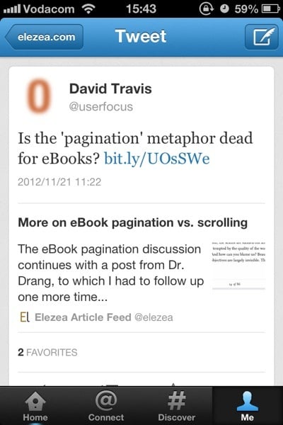
Twitter Cards

You also have to tap through to the tweet detail to click on the link; you can’t do it from the main stream. As I mentioned earlier, this extra tap used to annoy me, but I now think it’s a deliberate and important design decision. They are compromising immediate convenience for clarity of information. You might not agree with the decision, but it’s certainly not an oversight — I’m pretty sure it’s well thought through.

The implementation reminds me of the distinction between search results pages and product details pages on e-commerce sites. A search for “The Beatles” on Amazon doesn’t show you an “Add to cart” button on the search results page. You have to go to the product details page for that:
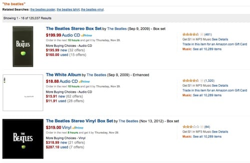
Amazon search

Twitter’s approach is similar. You have to view the summary before you can “commit”. The goal is to keep you inside the app until you’re absolutely sure you’re ready for the “purchase” — which in this case means clicking on a URL, emailing it to someone, sending it to Instapaper, etc. And now that the Discover tab is a much better customized version of photos and articles you might be interested in, the entire story is coming together really nicely.

There are still many features I miss in Twitter for iPhone. Having to poke around aimlessly for a while every time I’d like to see Tweets from a different list is probably the most frustrating issue at this point. But I have to say that Twitter Cards have made my experience so much more enjoyable and efficient that I’m going to stick with Twitter 5.1 for iPhone beyond my one-week experiment.

So what have we learned?

There are also some important product lessons to learn here. In his brilliant essay Subcompact Publishing Craig Mod sums it up nicely:

In product design, the simplest thought exercise is to make additions. It’s the easiest way to make an Old Thing feel like a New Thing. The more difficult exercise is to reconsider the product in the context of now. A now which may be very different from the then in which the product was originally conceived.

This is exactly what Twitter has done, starting with 4.0 almost a year ago. It was a gutsy move to rethink the entire experience — one they got a lot of ridicule for. And I’m sure the design team felt like this quite often:
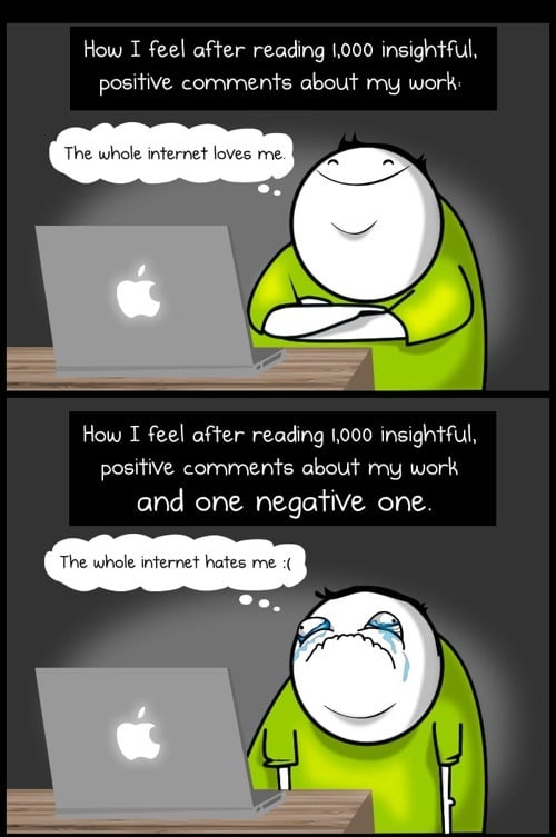
Comments on the web

(Source: The Oatmeal)

But to their credit, they stuck to their guns. They knew where they were going, and instead of surrendering to the extremely vocal complainers, they kept their eyes on the vision and went for it. That’s good product management. And now, almost a year later, I think they are finally seeing the tide turning as we’re getting a better sense of the end game.3

So, uh, I believe an apology is in order. I’m sorry, Twitter. I see where you’re going with this. And I like it.


  1. Oh, the irony. 

  2. Not a typo. You need to leave 20 characters for the URL, ok? 

  3. Yes, I know, there’s the API debacle as well, but I’m talking specifically about the Product design aspect here. 

Designing to improve lives

Meagan Fallone wrote a great article on social entrepreneurship for Fast Company. From Technology Is Useless If It Doesn’t Address A Human Need:

We in turn can teach Silicon Valley about the human link between the design function and the impact for a human being’s quality of life. We do not regard the users of technology as “customers,” but as human beings whose lives must be improved by the demystification of and access to technology. Otherwise, technology has no place in the basic human needs we see in the developing world. Sustainable design of technology must address real challenges; this is non-negotiable for us. Social enterprise stands alone in its responsibility to ensuring sustainability and impact in every possible aspect of our work.

There is much we can learn from this approach. Even in the consumer space, we need to replace some “customer” thinking with “human” thinking and look for ways to improve people’s lives, not just get more money from them.

In another great article on social entrepreneurship, David Bornstein quotes Sally Osberg, president and chief executive of the Skoll Foundation:

“I’ve come to see how the ‘social’ that characterizes their purpose also characterizes their way of working. In other words, social entrepreneurs don’t just pursue a social end, they pursue that end in a fundamentally communal way.” This approach is badly needed at a time of extreme factionalism, she adds: “Regardless of whether you call it teamwork, collaboration or consensus-building, we need it, and we need it now.”

I’ve seen this first-hand in our work with Praekelt Foundation. Their passion for their work, clarity of purpose, and relentless pursuit of working together to create the best possible experience, is teaching me so much about how powerful design can be — in any context.