Menu

Posts tagged “technology”

The elusive goal of lasting beauty in web design

A few months ago Nilay Patel did a good interview with Tony Fadell, the creator of the Nest thermostat. From Inside the Nest on The Verge:

Fadell looks out at the Manhattan skyline and says that he always wanted to be an architect; that buildings stay beautiful forever but digital devices are quickly obsolete. “You look at hardware or software five years later? They’re crap. You would never use them again. People use architecture all the time.”

His voice rises. “What is our form of architecture? What is the thing that lasts of beauty?”

I’ve been thinking about this for a while now, and the reason I can’t get the interview out of my head is that I just can’t think of a good answer to Fadell’s question.

In web design, what is the thing that lasts of beauty?

Aesthetics and beauty in web design is so subjective, so polarizing, that I wonder if anything lasts of beauty in what we do. As one example among many, the current trend set by Path and Feedly seems to capture everyone’s imaginations. Beautiful, high-quality, full-screen photography with functional interactions and copy elegantly embedded:

feedly-home.jpg

I also find these sites beautiful - and functional. But will it last? 2010 and most of 2011 were mostly about minimalism, and now the pendelum seems to be swinging towards a more emotive aesthetic again. That’s fine because our field is fluid and dynamic, and unlike buildings, things change very rapidly in what we do.

But I do wonder: where are our timeless stadiums?
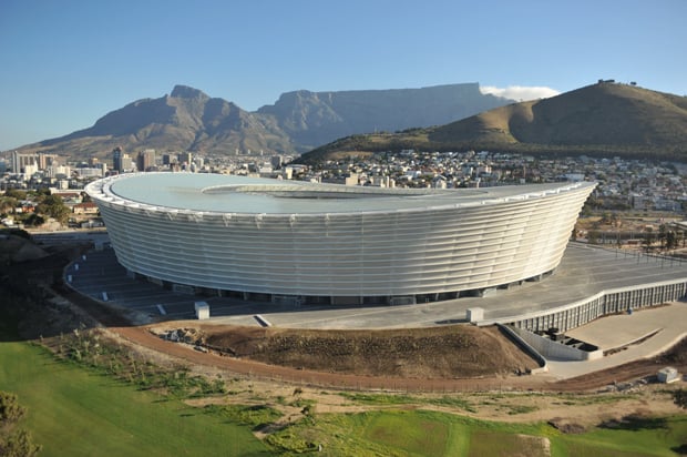
cape-town-stadium.jpg

In a recent article on Russian architecture Dmitry Fadeyev describes metro stations in Moscow and ends with the following remark:

What’s interesting about this type of architecture is that its aim goes far beyond that of creating a functional underground system. Its aim is to promote a political ideal, and it does it through beauty by enriching lives of the people who get to experience it. The question here isn’t: how do we solve the problem of creating a metro station in an efficient manner - instead the question is: how do we create a station that elevates people’s mood and inspires their lives. This architecture isn’t there just to help you live - it makes life worth living.

Maybe that’s why I think it’s important to talk about lasting beauty in web design. I wonder what would happen if we felt the weight of responsibility a little more when we’re designing. What if we go into each project as if the design will be around for 100 years or more? Would we make it fit into the web environment better, aim to give it a timeless aesthetic, and spend more time considering the consequences of our design decisions? Would we try to design something that “makes life worth living”?


Update 1/10/02: Francisco Inchauste wrote a great comment on Google+. Instead of summarizing it, I’ll post it here in its entirety. His point about content being that thing that lasts of beauty is particularly interesting. Francisco writes:

Our raw material doesn’t have a cost. You can cut up pixels and add to them. You can only cut a stone or wood once. Then it’s in a final form. We never find a final form for our digital goods, because by nature they are in a state of flux. The real beauty could be the changing connections of nodes that make up our Web.

_The lens (browsers/devices) to view that work is always different and also evolving everyday. I think that’s why people have landed on content as the focus again. The content can evolve in presentation, but at the core is still the same content. So, maybe the goal of lasting beauty is in content, instead?
_
Dropbox and the network effect

Rachel Swaby wrote a great piece for Wired on the complex problems that Dropbox had to solve to arrive at the simple solution they have today. This sentence stopped me in my tracks:

Almost immediately, those who didn’t actively search out the solution outnumbered early adopters.

Think about that. About 100,000 early adopters signed up for the Dropbox service in the six months leading up to the official launch. But because these early adopters started sharing folders with coworkers, friends, and family, they immediately hooked an entire network of regular users into the service.

Dropbox solved a problem most people don’t know they have, and made the solution simple enough so that non-tech savvy users immediately get the beauty of it and how it can fit into their lives. That’s innovation.

Everything for free, always: how Facebook ads show us the sad state of the Internet

I don’t like anonymous sources, but this post by “a former CTO [who] was briefed on Facebook’s advertising strategy” caught a lot of people’s attention last week. This paragraph, in particular, stands out:

What most users don’t know is that the new features being introduced are all centered around increasing the value of Facebook to advertisers, to the point where Facebook representatives have been selling the idea that Timeline is actually about re-conceptualizing users around their consumer preferences, or as they put it, “brands are now an essential part of people’s identities.”

Brent Simmons had a very succinct response to that last quote:

Pukin’

I agree.

John Gruber then linked to a page that Facebook set up to explain how they make money. Facebook says that it now costs over a billion dollars a year to keep the site running. That’s a lot of money, for sure. But it’s a damn shame that advertising appears to be the only viable way for Facebook to foot that bill.

Facebook says that they have over 800 million active users, and that “more than 50% of our active users log on to Facebook in any given day.” So let’s, for argument’s sake, say that about 500 million users visit Facebook every day. If each of those users paid Facebook $2 per year, the revenue would cover the cost of running the site. Just increase that to $3 per year, or 25c per month, and you suddenly have $1.5B revenue per year (or roughly $500M profit, based on Facebook’s rough estimate of their operating costs). Let’s be clear about this: it’s the cost of one coffee per year.

Yes, of course this is naive - it would never happen. Most people aren’t willing to pay for services or content on the Internet. There is an expectation that everything should be free, and that at the same time, companies should respect our privacy and keep The Brands™ away from our personal information. It’s not a realistic expectation - something’s gotta give if no one is willing to pay for anything. But most people don’t think about it long enough to realize that.

A recent article on the Pinboard blog really resonated with me, and by the way it spread on Twitter I know it struck a chord with a lot of others too. From Don’t be a free user:

What if a little site you love doesn’t have a business model? Yell at the developers! Explain that you are tired of good projects folding and are willing to pay cash American dollar to prevent that from happening. It doesn’t take prohibitive per-user revenue to put a project in the black. It just requires a number greater than zero.

In Facebook’s case that “number greater than zero” is $3 per year (have I mentioned that it’s per year!?). But the non-geek world just don’t think about these things. They don’t think about designers and developers who create apps and need to be compensated for it to keep a service alive. They feel that 99c is too much to pay for an iOS game. They freak out every time Facebook moves some things around, still blissfully unaware that they are not Facebook’s customers, they’re just the product being sold to advertisers. All they want is their free Facebook so they can “inbox” their friends about tomorrow’s party. “Pay for this thing?”, they say. “Screw that - it’s not my problem how you keep the site up. Oh, by the way, just remember that you have to respect my privacy and you can’t show me any advertising.”

It’s terribly frustrating.

I fear we’ve painted ourselves into this free corner, and the only way out is to sell our identities to The Brands™. Steve Jobs alluded to this in his negotiations with the New York Times when he refused to give them access to user information Apple collects in the App store. From his biography:

If you don’t like it, don’t use us. I’m not the one who got you in this jam. You’re the ones who’ve spent the past five years giving away your paper online and not collecting anyone’s credit card information.

We created this culture. We’re the ones who have been giving stuff away for free for the past decade, not collecting anyone’s credit card information. We’ve conditioned users that everything should be free, always. This gives advertisers the upper hand in any negotiation, because they know that their way is the only way that most sites can make money.

Why is this such a big deal? Relevant, contextual advertising isn’t bad, right? Not in moderation, no (see The Deck). But when ads become the only way out and advertisers are the ones calling the shots, users suffer. Also, as a matter of principle I firmly believe that it’s better to pay the makers of things directly than through some convoluted ad system.

We can’t really blame Facebook for choosing this path of least resistance. It’s the hand they were dealt by the culture we’ve created. But I remain hopeful that new services will charge for what they do so that we can slowly begin to define our own identities without The Brands™ trying to tell us who we are.

Glitz vs. Plumbing: why I also quit Delicious and switched to Pinboard

Sometimes, you don’t need glitz; you need plumbing.

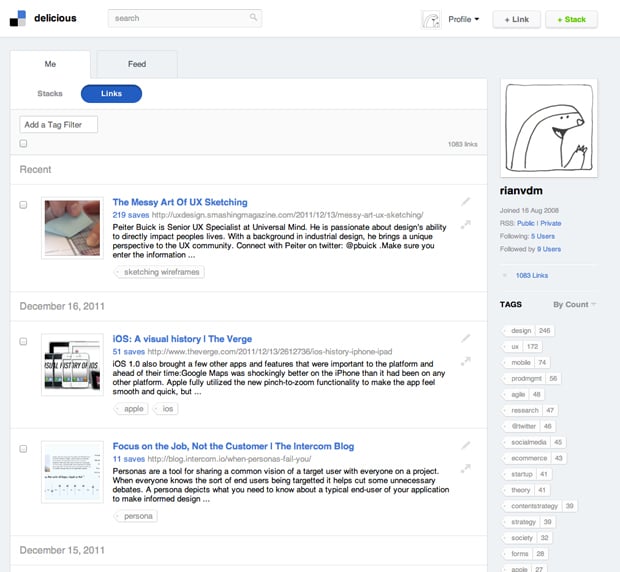
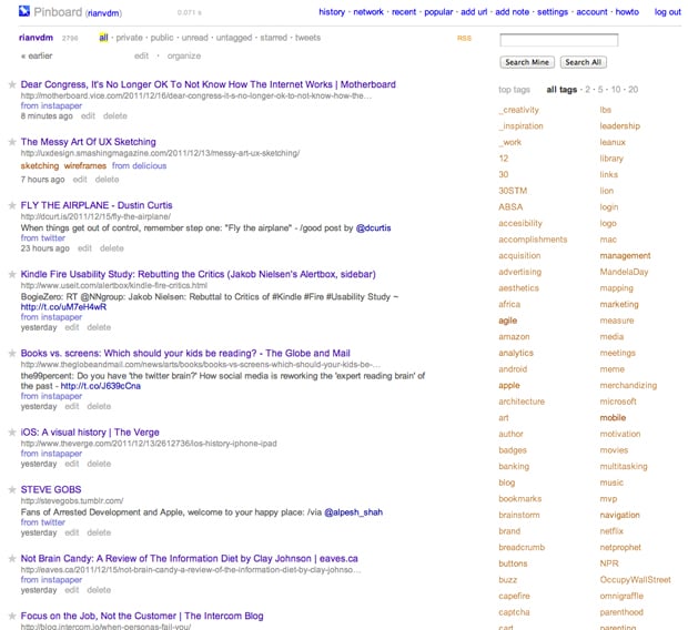
That’s Charles Arthur in Goodbye Delicious, hello Pinboard, explaining why The Guardian is dumping Delicious as their social bookmarking service. Let me ask you a question. Which of the following two screen shots is prettier?

Delicious:

delicious-screenshot.jpg

Pinboard:

pinboard-screenshot.jpg

Delicious, right? Now let me ask you another question. Which site is more useful as a social bookmarking site? It’s ok, I’ll answer for you: it’s Pinboard.

Pinboard’s aesthetic[1] is fairly bland, but the  sparse, table-like layout is the best way to organize the vast amount of information you collect on the Internet. The aesthetic fits the purpose of the app. But wait, there’s more. It lets you import from Twitter, Instapaper, and Google Reader (well, back in the day when Google Reader still supported public sharing). It has browser bookmarklets that work effortlessly. It integrates smoothly with a variety of RSS Readers. Sorry for the cliché, but it just works.

Meanwhile, Delicious has become slow, it has constant availability issues, and the aesthetic keeps getting more extravagant. This actually reduces its utility by obscuring the app’s core features. Social bookmarking is about two things - tagging the things you’re saving, and searching for those thing later on. That’s it. The new Delicious owners are apparently trying to turn it into something more, but whatever that something more is, I’m not buying.

Anyway, back to glitz and plumbing. As I’ve mentioned before, great aesthetic design builds trust, increases engagement, and elicits the appropriate emotional responses to a brand. But glitz is something else. Glitz is about making things shiny without asking what the thing should look like to fulfill its primary purpose.

Social bookmarking is Internet plumbing, not glitz. I now use Pinboard, and highly recommend it.


  1. Time for the obligatory disclaimer. Yes, Design is about problem solving, and it includes elements such as User Research, Interaction Design, Content Strategy, Visual Design, etc. Here I am referring only to the aesthetic layer of the Visual Design component. ↩

Losing out on the advantages of deep, immersive thought

John Barber writes about the problems with reading on tablets in Books vs. screens: Which should your kids be reading?:

The hyperlinked, text-messaging screen shapes the mind quite differently than the book, according to Wolf. “It pulls attention with such rapidity it doesn’t allow the kind of deep, focused attention that reading a book 10 years ago invited,” she says. “It invites constant change of attention, it invites multitasking. It invites, in other words, a kind of triage of attention.”

Such a skill is certainly necessary in the 21st century, she adds. “But it does not have a place in the deepest kind of immersive thought.”

I’ve definitely noticed this in myself. I get fidgety after reading a few pages on my Kindle, wondering what I’m missing elsewhere on the web. I find myself struggling to embrace boredom. It’s not a good trend.

Related: it’s a good thing I just bought this.

Security, passwords, and the messiness of everyday experiences

I enjoyed On Culture and Interaction Design, an interview with anthropologist Genevieve Bell. In one section she discusses how we often design systems based on a cultural ideal, but in practice it ends up solving the wrong problem. She uses the example of security:

We design systems to keep systems safe and people write their passwords on bits of paper stuck to their systems. So, is it that people don’t care about security or is that the security we are designing is securing the wrong things? Or, are they just securing them in the wrong ways? Clearly we know that people care about the security of their homes, their possessions, their digital selves, but they adopt a range of patterns for doing it that are incredibly messy, complicated, and contradictory.

Passwords ensure that unauthorized people don’t get access to a system. But the mere fact that tools like 1Password exist to remove the need to remember passwords should tell us that we’re doing it wrong. Current password systems solve the problem from the wrong perspective: the system, not the user.

The problem runs even deeper. We’re not only solving the problem from the wrong perspective, we’re also introducing unnecessary complexity because of the way these systems are implemented. From a great post on the AgileBits blog:

Security systems (well, the good ones anyway) are designed by people who fully understand the reasons behind the rules. The problem is that they try to design things for people like themselves””people who thoroughly understand the reasons. Thus we are left with products that only work well for people who have a deep understanding of the system and its components.

This is why people have weak passwords and write them down on pieces of paper everywhere. It’s why the experience is complex and messy, and why we have to spend so much time building “Forgot password” flows when we could be spending that time making the core experience of our products better.

So what’s the alternative? I have a huge appreciation for the role that anthropology can play in the design of products and experiences - which is what Genevieve advocates in her interview as well. Ethnography (often called Contextual Inquiry in the user-centered design world) is the single best way to uncover unmet needs and make sure we are solving the right problems for our users.

In Ethnography in Industry, Victoria Bellotti defines ethnography as “a holistic, in-person, and qualitative approach to the study of human behavior and interaction in natural settings.” By using this method to understand the culture and real needs of personal security, we should be able to design a user-centered solution to protecting digital information. One that isn’t stuck in the downward spiral of designer myopia we often encounter in proposed solutions to complex problems.

Security is an impossible industry to reinvent, you say? Maybe. But the problem does remind me of something Matt Legend Gemmell says about innovation in his excellent post Copycats:

The lesson of the technology industry in the past five years is that really successful products dare to NOT copy. They’re pure, in that they’re actually designed from first principles - they’re based on the problem and the constraints, without being viewed through the lens of someon’s existing attempt. You know, the kind of thing you actually wanted to work on when you got your degree and were still unsullied by the lazy, corporate machine.

So who wants to take a crack at it?

Copying taste without understanding design

Rob Beschizza in What the Vaio Z says about Sony’s little design problem, a brilliant article on the difference between taste and design:

Apple competitors are obsessed with copying Apple’s tastes without copying its central design habit, which is solving a problem and then refining the solution until the problem changes.

This is also what makes the HP Envy such a bizarre rip-off of the Macbook Pro. It all reminds me of that scene in Armageddon where the Bruce Willis character blows up at the contractors who tried to build an oil drill he designed:

Let me get this straight. You had me pulled off my oil rig, flown half way around the world, you stole my drill design, couldn’t read the plans right, and did a piss poor job of putting it together!

I can image hearing those same words coming out of Steve Jobs’s mouth if he could see the Sony Vaio Z and the HP Envy.

The future of voice control: good for information, bad for creating things

Bret Victor wrote a very interesting rant a few days ago on the the problem with touch interfaces and the future of Interaction Design. The piece got a lot of attention, so today he followed up with some responses to the questions and comments he received.

I particularly enjoyed his thoughts on the limits of voice control. His argument is that voice is a good way to get information or issue commands (yes, like Siri), but that it’s not very good for creating and understanding:

I have a hard time imagining Monet saying to his canvas, “Give me some water lilies. Make ‘em impressionistic.” Or designing a building by telling all the walls where to go. Most artistic and engineering projects (at least, non-language-based ones) can’t just be described. They exist in space, and we manipulate space with our hands.

It’s obvious, yes, but I think we need to remind ourselves of this. Creating things requires “manipulating space with our hands”, even if that means manipulating words onto a page when they’re stubbornly stuck in space somewhere.[1]


  1. Sure, some people (like John Siracusa) are able to dictate the first drafts of stuff they write, but I’m pretty sure they’re not editing their work through voice control. Editing (which is the hardest part of writing) requires a keyboard and lots of banging your head on it.  â†©

Design as opportunity to make meaningful connections

I love pretty much everything Frank Chimero writes, and his essay on the meaning of design from a few weeks back still rings in my ears:

We should care more about our craft because w’re granted an opportunity to contribute to the world. We should care more about what we say because each time we speak, ther’s someone there to listen. We should care more about our audiences because they are the ones who give our work value. We might think that design work is about you or about me or anyone else who makes it, or maybe about the things that we make and the artifacts we produce, but don’t let this way of thinking fool you. The things we make are all just excuses to speak with one another and to help one another. We are all linked, and the things that we make for each other strengthen the invisible threads that tie us all together.

Many people won’t agree with this sentiment. Many will think it’s silly to think about something as trivial as web design in this grandiose way. They’ll remind us that we’re just making web sites, not saving the world. And that’s fine - not everyone is going to care as much about design, or even understand why some of us do.

But I do care. I care because I think we have the opportunity to shape a technology that is at once exhilarating and dangerous. A technology that has the massive opportunity to bring people closer together, if we can just keep it together long enough not to destroy each other in YouTube comments and flaming blog posts.

So, yes, I care a lot about this, probably more than I should. But I’m with Frank on this: everything we do is just an excuse “to speak with one another and to help one another.”

Being honest about technology

I’m still slowly making my way through Sherry Turkle’s Alone Together, and this quote really jumped out at me this morning:

We have to love our technology enough to describe it accurately. And we have to love ourselves enough to confront technology’s true effects on us. These amended narratives are a kind of realtechnik. The realtechnik of connectivity culture is about possibilities and fulfillment, but it also about the problems and dislocations of the tethered self. Technology helps us manage life stresses but generates anxieties of its own. The two are often closely linked.