Menu

Posts tagged “social media”

Who will hold a brief for the real?

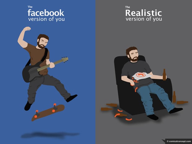
the-real-you.jpg

When I saw this image on Comical Concept I first found it funny. And then I realized how scarily true it is. It reminded me of a couple of paragraphs from Sherry Turkle’s book Alone Together:

But online, you’re slim, rich, and buffed up, and you feel you have more opportunities than in the real world. So, here, too, better than nothing can become better than something - or better than anything. Not surprisingly, people report feeling let down when they move from the virtual to the real world. It is not uncommon to see people fidget with their smartphones, looking for virtual places where they might once again be more.

It is not unusual for people to feel more comfortable in an unreal place than a real one because they feel that in simulation they show their better and perhaps truer self. With all of this going on, who will hold a brief for the real?

As a constant user myself, it would be hypocritical of me to go on a rant against social media. But I do worry about how this story plays out. What happens when we get so attached to the online places where we “might once again be more” that we get tired of being with the people around us?

New new Twitter's new new direction: Monetization

Mike Rundle sums up how many of us feel about Twitter’s new new iPhone app in Twitter For iPhone Takes A Step Back:

The new app will be more inviting and accessible to new users, but I don’t like that this comes at the expense of the user experience and existing gesture shortcuts. There’s a way to make both novice and advanced users happy, and I hope Twitter 4.1 does a better job at appealing to all sides of their userbase than 4.0 has done.

If you step back from all the interaction and visual changes, this is the overarching theme that stands out for me as well. Expert users are suddenly left out in the cold. The new approach breaks the fundamental UI principle of flexibility and efficiency of use:

Accelerators - unseen by the novice user - may often speed up the interaction for the expert user such that the system can cater to both inexperienced and experienced users. Allow users to tailor frequent actions.

A great example of accelerators done right is Gmail’s keyboard shortcuts. They’re there to increase efficiency for expert users, but they don’t get in the way of novice users. The same functionality is there for all users, yet expert users have the ability to become more efficient by learning these shortcuts.

And that’s where the new Twitter for iPhone falls down. The biggest culprit is the now defunct swipe gesture on individual tweets. I’m with Ben Brooks on this one:

What is absolutely crazy - what drives me nuts - is the ditching of the swipe-to-act gesture. In previous versions you could swipe left or right on a tweet to slide open an action menu. From there you could quickly favorite, retweet, Instapaper, or reply to the tweet.

But let’s get real about this. I don’t think any of the design decisions the team made were an accident or an oversight. This is just all indicative of a company that is shifting the balance from being purely user-centered to a company that needs to sacrifice some user needs in order to make money. Dan Frommer summarized this well:

This is the beginning of Jack Dorsey’s real vision for Twitter combined with Dick Costolo’s vision for a real-time social advertising product. The main components: writing and Tweets, obviously; having conversations with other people; discovering what’s happening in the world through Twitter; and seeing a promoted message from brands here and there.

Spot on. I mentioned this morning that they should have just come clean and called the “Discover” tab the “Monetization” tab. Some have complained that users should be able to remove that tab, which is true, but it’s not going to happen because the balance has shifted. Our needs are going to be sacrificed more and more in favor of business goals[1].

So here’s the truth in all of this: the new app isn’t a mistake. It’s a deliberate and effective redesign to reduce all the pesky “distractions” (like viewing your lists and favorites easily) so that you’re more likely to “discover” the “promoted messages from brands here and there”.

I don’t think we should pass judgment on Twitter for making these decisions to increase revenue - we want them to stay around, after all. But I think we can request and expect a 4.1 version that at least meets us in the middle. Simplifying is not just about taking features away, it’s about making complex actions easier to understand and use. We need our accelerators back, please.


  1. I will say this though - I really like the “Connect” tab. The labeling might be horrible, but it’s a great feature.  â†©

Google Circles and Path 2.0: How good UI design cannot fix a broken solution

When Google+ first came out there was plenty of praise for its UI design[1], particularly the “un-Google like” design of the Circles feature. Oliver Reichenstein wrote:

Every interaction seems to have been thought through and designed until its last little bits (and those matter as much as the big bits). It even has room for some warmth (like the circle rolling away when you delete it) which is rare for Google’s cold UID approach.

We’re seeing the same thing with last week’s release of Path 2.0. I agree with the entire Internet on this: the design is gorgeous with lots of small delightful details. Here’s Geoff Teehan in Going down the right Path:

It feels familiar, but they’ve made some smart decisions that break away from the norm without wandering off into obtuse interactions or under/over-designed visuals. The decisions they’ve made not only make things better, they add personality and delight ”“ something that is crucial, and often overlooked when designing something functional.

Here’s the thing. Google Circles aims to solve a real problem with social networks, but the solution is tedious. Path has a beautiful interface, but I can’t figure out what user need it’s trying to solve. And those issues are problematic if you want to get to product/market fit.

Google Circles

There are inherent problems with binary social networks. The idea that someone is either full-on in your life (and therefore has access to everything about you) or not at all is not how it works offline. You tend to share certain information only with certain groups of people. Only some people will be interested in photos of your new puppy, whereas those same people will probably not be interested in blog posts about your work.

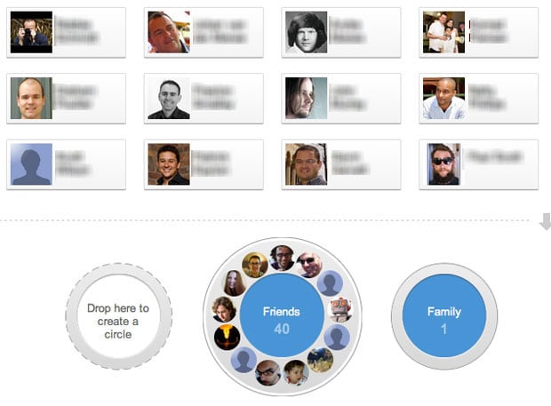
Google Circles aims to solve these problems by allowing you to drag and drop people into distinct buckets, and letting you only share what you want with each circle. And yes, the UI makes it really easy to do this. It’s great design.

google circles

The problem is that it’s just too much work. I’ve long since given up trying to maintain my Circles, and I’m pretty sure I’m not alone. Circles also lost its core utility for me. After I put about 100 people into different buckets I couldn’t remember who I put where, and what I was supposed to share with which Circle. So I just gave up and started sharing everything publicly.

It doesn’t matter how great and fun an experience is, good UI design cannot fix a broken solution.

Path 2.0

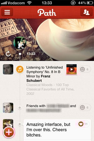
I get the same feeling when I play around with Path. Let me be clear: I love this app. I wish I could dump Facebook and use Path all the time. Sometimes I go in and scroll up and down just to see the clock animation. When I open the app in the morning I tell it that I’m awake just so I can see what the weather is going to be like today. Fantastic design.

path user interface

There’s a problem, though. I don’t know what I’m supposed to be doing with this app. Yes, I know it’s still early and not a lot of people are on the network yet (even though it’s now starting to gain some real traction). But here’s one reason the app might not have enough staying power to grow out of its initial “Hey, that’s cool!” phase: what unmet user need does it solve? Is it doing anything that’s not already being addressed by a number of general and niche social networks? I don’t think so.

Once again: it doesn’t matter how great and fun an experience is, good UI design cannot fix a broken solution. Good design can effectively differentiate a good solution, and bad design can completely ruin a good solution. But good design simply cannot make up for a solution that doesn’t address a core user need really well. As a recent post on ZURBlog proclaimed, people don’t buy products - they buy the benefit.

I’m afraid that in the case of both Google Circles and Path 2.0, they might just be flawed solutions wrapped in a layer of beautiful UI design. It’s fun to play with for a while, but when it inevitably becomes tedious you eventually just forget to use it. Forever.


  1. When I talk about UI design in the context of this article, I mean specifically Interaction Design and Visual Design. I don’t mean to imply that Design = Making Things Pretty, or that UX is only about those elements. I use this term in the interest of simplicity since this is not an article about the elements of a User-Centered Design process. ↩

Update: Luke Bornheimer pointed me to his answer on Quora where he argues that Path’s biggest differentiator is how it easily enables private/public sharing.

Conditioning and the addictive nature of social media feeds

When presenting someone with a stimulus results in some kind of reflexive behavior we call it classical conditioning. The most famous example of this is Ivan Pavlov’s experiment where dogs started salivating whenever they heard a bell that indicated that food was on the way.

Compare that to operant conditioning, which happens when someone deliberately alters their behavior because of a stimulus they receive as a result of that behavior. We all know about positive reinforcement[1] - that’s one of the ways to affect operant conditioning in someone. The classic example here is the experiment where rats can be taught to press a lever to get sugar solution delivered down their feeding tubes.

In Unpredictable Rewards, Kevin Purdy applies the theory of operant conditioning to activity streams on Twitter and Facebook. He explains why some people[2] can’t stop looking at their feeds:

Eyal Ophir, primary researcher at the Stanford Multitasking study, believes ticker-style updates are effective in a way familiar to researchers of operant conditioning.

“Unpredictable rewards keep us guessing, so we’ll keep checking long after we’re no longer getting rewarded, because ‘you never know,’” Ophir wrote in an email. “So if there’s one or two exciting tweets, or a rewarding social experience in the Facebook Ticker, and we can never tell when something like that will come again, that’s going to be a good motivator for us to just keep checking. And that’s going to drive up the perceived value of interrupting whatever we’re doing (work, family, etc.) to go and check.”

It’s scary to think about our social media activities in this way, especially if you keep going down the path of operant conditioning. One of the key predictive factors is deprivation: “the effectiveness of a consequence will increase as the individual becomes deprived of that stimulus”. So, the less frequently you see something valuable in your stream, the more motivated you become to keep checking until you find that one valuable piece of information.

It might be time for us to step back and accurately assess the size of the benefit: “If the size, or amount, of the consequence is large enough to be worth the effort, the consequence will be more effective upon the behavior.” How valuable is the number of likes on that one status really? And is it worth checking our phones every 5 minutes in the hope of seeing a change?


  1. When a behavior (response) is followed by a stimulus that is appetitive or rewarding, increasing the frequency of that behavior (via Wikipedia) ↩
  2. I’m going to say “some people”, not “I” or “we”. I like living in denial like that. ↩

Solving information overload: the role of manual content curation

There’s an information overload just on articles about information overload, so you might be reluctant to spend time reading another one. However, Accessibility vs. access: How the rhetoric of “rare” is changing in the age of information abundance by Maria Popova is the best commentary I’ve seen on the topic in a long time.

The article starts off by explaining the root cause for the problem we find ourselves in: the concept of “rare” largely goes away if all information is available digitally:

W’re in the habit of associating value with scarcity, but the digital world unlinks them. You can be the sole owner of a Jackson Pollock or a Blue Mauritius but not of a piece of information ”” not for long, anyway. Nor is obscurity a virtue. A hidden parchment page enters the light when it molts into a digital simulacrum. It was never the parchment that mattered.

The consequence is that it’s now so much harder to know what pieces of information are worth our time. Just because something is accessible doesn’t mean we should access it. Maria goes on to explain why editors (or content curators) are so crucial if we want to solve this problem:

The primary purpose of an editor [is] to extend the horizon of what people are interested in and what people know. Giving people what they think they want is easy, but it’s also not very satisfying: the same stuff, over and over again. Great editors are like great matchmakers: they introduce people to whole new ways of thinking, and they fall in love.

Information curators are that necessary cross-pollinator between accessibility and access, between availability and actionability, guiding people to smart, interesting, culturally relevant content that “rots away” in some digital archive, just like its analog versions used to in basement of some library or museum or university.

I do want to add a thought on the idea of “automated curation” - what sites like paper.li are trying to do (you know, those tweets proclaiming that “The [clever name] Daily is Out!”). I simply don’t think effective automated curation will ever be possible. I agree with Angie King on paper.li:

My experience with Paper.li just proves the importance of curation over aggregation. Without an editorial eye overseeing the publication of my Paper.li page, the content loses value. I actually prefer just paging through my Twitter stream over trying to make sense of the no-context, automatically generated list of junk that displays on my Paper.li page.

In a great piece called The language of data: fear + words, Randall Snare explains why automated curation is so difficult:

Emails ”“ and other written things ”“ aren’t just filled with semantic meaning, but with subtext. Algorithms treat words like the basic components of language, while the actual basic components are often hidden ”“ elements like association, nuance, emotion and humour.

Which brings us back to the need for humans - call them editors, call them people who read a lot, call them whatever you want - to help guide us to the information that might interest us. I’d go so far as to say that our ability to grow and learn depends on it.

Frictionless content sharing and the shifting burden of understanding

Frank Chimero reflecting on Facebook’s advances in “frictionless sharing” of content:

Any physicist knows that it’s impossible to exist in a frictionless universe, and that friction hasn’t been diminished with Facebook’s sharing model so much as transferred the work of making sense of things from the one sharing to the audience.

I recently mentioned that reducing the effort needed to share and communicate with others might be inching us closer to a post-literate society. Frank’s remark adds another consideration: the reduced effort required to share information places the burden of understanding much more on the audience than on the person sharing.

“Frictionless” sharing of what song you are currently listening to sounds interesting at first, and then it just starts to sound creepy. But even if you can get beyond the creepiness factor you’re faced with the fact that it becomes the audience’s responsibility to make sense of that information. How interesting is knowing what song I’m listening to without an explanation why I’m listening to it and what it means to me?

At what point will all this lazy sharing result in lazy audiences who can’t be bothered to go hunting for the meaning in the information? At what point does the audience become mere “consumers” of content in the true sense of the word - “to destroy or expend by use” - and end up in a similar situation as the obese passengers on the Axiom?

Facebook Open Graph and the post-literate society

Here’s Mashable in an article with a title that sounds like it was created in a random buzzword generator: Facebook Open Graph Seeks to Deliver Real-Time Serendipity:

Facebook felt constrained by the Like button because it was an implicit endorsement of content. Facebook wants users to share everything they are doing, whether it’s watching a show or hiking a trail, so it decided to create a way to “express lightweight activity.”

So in essence they’re saying that clicking the Like button is too much of a commitment; the action is too heavy. We need something a little more indifferent and “lightweight”.

With the Like button you already didn’t have to use words. With Facebook Open Graph you grant permission to an app once, and then it silently and passively starts broadcasting what you’re doing. No thinking required.

By continuing to reduce the effort needed to share and communicate with others we seem to inch ever closer to a post-literate society.  In his essay Like, the Post-Literate Society, James Shelly discusses this phenomenon and quotes Bruce W. Power:

What happens to thinking, resistance, and dissent when the ground becomes wordless?

He goes on to say this:

Thus I ponder: do we become a post-literate society at the moment we manifest an incapacity to discuss our own potential status as such? If so, are we already there?

These are good questions on a day like today.

Embracing boredom

In Alone Together: Why We Expect More from Technology and Less from Each Other Sherry Turkle tells a story about having dinner in Paris with her daughter, Rebecca. While they are eating, Rebecca gets a call from a friend in Boston, asking if sh’s available for lunch. Rebecca simply answers that it won’t be possible, but that Friday could work. She doesn’t even tell her friend that sh’s currently in Paris. Sherry has mixed feelings about this:

I was wistful, worried that Rebecca was missing an experience I cherished in my youth: an undiluted Paris. My Paris came with the thrill of disconnection from everything I knew. My daughter’s Paris did not include this displacement.

I told me wife this story later that evening, and we started talking about our own tumultuous 30-day backpacking trip through Europe at a time when our relationship was”¦ well, let’s just say it was on less stable ground than it is now (remind me to tell you how we broke up on top of the Eiffel tower and got back together in Venice).

We talked about the truth in Sherry’s words - how being so utterly disconnected from the rest of the world played a big role in our ability to immerse ourselves in the newness and strangeness of the culture around us. We were only able to check email about once every 3-4 days. I can’t even imagine how I’d be able to go that long without email now, but back then it wasn’t a big deal. Less email = more time for walking through the streets of a new city.

Fast forward to today, and I am incredibly fortunate to travel for business reasonably often, but I must admit that it doesn’t fill me with the same excitement as that Europe backbacking trip did. And I think that’s partly because the constant connection means that I’m not really immersed in another culture, I’m just working from a different office.

Shelly comes to the following conclusion after her trip to Paris with her daughter:

Adolescents have always balanced connection and disconnection; we need to acknowledge the familiarity of our needs and the novelty of our circumstances. The Internet is more than old wine in new bottles; now we can always be elsewhere.

And that is perhaps the real issue here. If the Internet lets us be elsewhere any time we want, what point is there in physically moving ourselves across the world any more? Especially if we use the Internet to bring ourselves back to where we came from the minute we get there?

Alain de Botton recently tweeted:

The problem with the net: it prevents us from boredom and all its many advantages.

One of those advantages is the ability to sit in a restaurant in Paris and truly take it in without wondering what everyone else is up to. Even just sitting in your own back yard without wondering what everyone else is up to would probably already be a huge step in the right direction. Oh, the thinks you could think.

Her’s to being bored.

Deluge of Content on the Web Swamps Yahoo (and puts content creators in a tough spot)

The Wall Street Journal in Deluge of Content on the Web Swamps Yahoo:

As Web traffic explodes, Internet companies are struggling to profit off ads shown next to the articles, videos and other content offered to viewers.

It’s a simple rule of any market. The more information that is created, the more the value is reduced. And despite attempts to woo spending with bigger, bolder and more targeted ads, services that help consumers navigate that content, namely search, remain the big money makers online.

As I (and many others) have written before, it doesn’t look like display advertising is a sustainable business model for media sites going forward (and I think we can agree that it makes for a pretty bad user experience). This puts content creators in quite a predicament: how do you make money from producing content? The WSJ piece points to the central problem here:

“People tell me that content is king, but that is not true at all,” says Rishad Tobaccowala, chief strategy and innovation officer at Vivaki, the digital-media unit of Publicis Groupe SA. “Most people make money pointing to content, not creating, curating or collecting content.”

Although the value of pointing to content is indisputable, we need a better way than display ads for content creators and curators to make a living. And I don’t think we quite know what that looks like yet.

In defense of RSS

There was plenty of chatter about RSS over the weekend, mainly because of this “you’re doing it wrong” article on Ars Technica.

Most of the responses I’ve seen are strong defenses of RSS, and I’m happy about that. There has been so much talk about Twitter replacing RSS that I’ve been wondering if anyone else still uses it as much as I do. In fact, because of the iPad and apps like Reeder, my RSS usage is at an all-time high.

Marco Arment argues for a combined Twitter/RSS setup:

I can follow tons of low-traffic sites and keep my reading list more diverse than if I relied only on social links, but other people ensure that I never miss anything great on the high-volume sites.

Ben Brooks has a different use case (more similar to mine) - he subscribes to lots of feeds, but he doesn’t allow the unread count to bother him. He makes a good point about not blaming RSS if you feel overwhelmed:

A tool is a tool. Should I get mad at my car because there are thousands of miles of road I haven’t driven yet to drive? No. If you don’t like RSS don’t use it. If you want to use it but don’t want to have thousands of items, then use it like Marco does. Or use it like I do and check the feeds more often.

But of course, no discussion on RSS is complete until its creator weighs in. Dave Winer blames feed readers (like Google Reader) and their insistence on showing you how many unread items you have, and asks us to separate that from the technology itself:

If you miss five days of reading the news because you were on vacation (good for you!) the newspaper you read the first day back isn’t five times as thick as the normal day’s paper. And it doesn’t have your name on the cover saying “Joe you haven’t read 1,942,279 articles since this paper started.” It doesn’t put you on the hook for reading everything anyone has ever written. The paper doesn’t care, so why does your RSS reader?

These guys all make a very good case for RSS so I’m not going to say too much more about it. I do want to add something I haven’t seen mentioned before though: using folders in your RSS reader to help manage the deluge of information. Here is a screenshot of my folder structure in Reeder:

RSS folders

I have a certain set of blogs that I tag as favorites, and those are the ones I read first. If ther’s time I move on to the others.

Note that I have a folder called “Large tech blogs”. The usual suspects are in there: TechCrunch, Mashable, Ars Technica, Wired… These blogs post a lot, so when the unread numbers get out of control I typically just scan some headlines and then mark all as read. With the big blogs I know that if something is really important, Twitter will tell me.

RSS will remain an important part of my workflow, and since I turn dock unread badges off, I don’t feel like my app of choice is silently judging me.

Setting up folders and actively managing your RSS feeds is hard work. But the payoff is huge for me - I can quickly get a broad overview of what’s going on in the industry without having to rely on the fleeting nature of a tweet coming across my timeline.

I’m a die-hard fan.

(By the way, if you’re interested in following my shared items, you can do so here)