Menu

Posts tagged “product management”

A better way to approach Net Promoter

Back in my eBay days, when Net Promoter was just becoming a huge deal, there came a time when we were asked to include the measurement in our user research. Even then I was extremely uncomfortable with the simplistic nature of the measure, but I just didn’t have the experience to speak up about it. It seems that NPS is finally getting the wind taken out of its sails. The latest takedown I read is Matt LeMay’s excellent On Net Promoter and Data Golems:

This very ubiquity is a huge part of what makes Net Promoter so attractive. It’s a system with an official-sounding name that consistently produces a measurable quantitative output. The score it produces can be easily benchmarked against that of any other company. And this is why, no matter how many times it is critiqued and debunked, Net Promoter only seems to grow in power and pervasiveness. The primary value of Net Promoter is not how effectively it predicts customer loyalty, but rather how effectively it covers your ass.

The main problem with the NPS question—“How likely are you to recommend [product] to a friend or colleague”—is that it’s a data model that doesn’t fit the social model of recommending products.

But by oversimplifying the multifaceted and highly variable human context around recommendation, Net Promoter falls into one of the biggest pitfalls of the “data-driven” age: it puts forth a data model that does not accurately reflect the underlying social model. When’s the last time you thought to yourself “I am likely to recommend this product to my friends or colleagues” as opposed to something like, “I can’t wait to tell my friend Tricia about this new slow cooker because I know that she doesn’t like to cook things on the stove”?

Luckily, Matt provides some really good ways to improve the use of NPS. Is this is something you deal with in your company I highly recommend his article.

Developers: our best source of true innovation

I find the common meme of “Oh, that’s ugly—a developer must have designed that” pretty misguided (and I’m not even a developer). The reason is that most developers I know have exceptional ideas (and taste). So these words from Marty Cagan really resonated with me:

I consider this mindset of the product owner (or more generally, the CEO or stakeholders) as the only one that can determine what to build, as toxic to teams, and a major reason for the lack of innovation. I’ve tried to explain many times that often the best single source of true innovation are our engineers. That doesn’t mean every engineer is going to be like this, but the mindset where no engineers can do this is a very serious problem. The engineers are working with the technology every day and are in the best position to see what’s just now possible. They are also disproportionately very bright people. When you combine this deep knowledge of technology, with a first-hand experience of the customer problems, great products can result.

“The best single source of true innovation are our engineers.” True that.

Product vision + OKRs = Sustainable roadmap

I really love the product strategy direction Marty Cagan proposes in The Alternative to Roadmaps:

Ensure your product organization has a compelling product vision.  Ensure that each product team has a clearly defined, prioritized set of business objectives.  Make sure any commitments that must be made are high-integrity commitments.

This means that instead of prioritizing features (and the timing of those features), the leadership team prioritizes business objectives and problems to solve. There are two components to this:

First, the product vision is about setting OKRs—Objectives and Key Results (again—not features or solutions). From The Art of the OKR:

The objective sets a goal for a set period of time, usually a quarter. The key results tell you if the objective has been met by the end of the time.

Second, high-integrity commitments mean we give teams the time they need to figure out how long something will take. From Managing Commitments in an Agile Team:

So the way we manage commitments is with a little bit of give and take. We ask the executives and our other stakeholders to give us a little time in product discovery to investigate the necessary solution, and validate that solution with customers to ensure it has the necessary value and usability, with engineers to ensure its feasibility, and with our stakeholders to ensure it is viable for our business (they can support this solution).

Once we have come up with a solution that works for our business, we now can make an informed and high-confidence statement about when we could deliver this and what type of business results we can expect. We can also decide if it’s even worth doing.

One day when I grow up, this is how I will run my product team.

How to continue to make good products as organizations grow

In my latest column for A List Apart, called The Distance to Here1, I discuss a theory I’ve had for a while now:

The larger the distance between people who build a product and people who make decisions about the product, the harder it is to make a good product.

The post goes into detail on how I think companies can continue to make good products as they grow.


  1. Anyone else old enough to get the reference? 

Empathy in enterprise software

In Design Thinking Comes of Age Jon Kolko describes one of the biggest (and most important) shifts we’re starting to see in enterprise software:

To build empathy with users, a design-centric organization empowers employees to observe behavior and draw conclusions about what people want and need. Those conclusions are tremendously hard to express in quantitative language. Instead, organizations that “get” design use emotional language (words that concern desires, aspirations, engagement, and experience) to describe products and users. Team members discuss the emotional resonance of a value proposition as much as they discuss utility and product requirements.

How The New York Times does Product Discovery

In The New York Times Product Discovery Activity Guide Al Ming lays out how the product team brought Lean principles into their organization:

As part of our efforts to adopt such a data-driven, experimental approach to product development, we recently kicked off a product discovery “pilot program.” Small, cross-functional teams were paired with coaches and facilitators over a six week period to demonstrate product discovery and Lean methodologies as they apply to real-world customer opportunities at The New York Times.

This is such a great way to introduce Lean activities into a large enterprise. Start with a small project, prove value, then expand.

The team also made an “activity guide” for teams to follow, and it reads like a cheat sheet for developing great products. This is really impressive work. Here’s the guide:

NYT Product Discovery Activity Guide from almingwork

Regressive disclosure: designing complex interfaces by reducing choice

I’m currently designing an Admin Console for enterprise software, and it’s going pretty much as you’d expect it to go, which is like this:

Winning

Every time I think I’ve made a breakthrough and sit back to enjoy my handiwork, I realize I missed something, and back into the abyss I go. I’ll probably write an emotional case study once this is all said and done, but for now there’s one breakthrough that has actually lived up to repeated scrutiny, so I wanted to share that.

First, let’s define what an admin console is. It’s that area of a site where admin users go to manage users, content, billing, notifications, and all kinds of other admin-y things. It’s also the area of a site that mostly gets ignored because (1) very few people have to use it, and (2) it’s freaking hard to design. There can be hundreds of options, and figuring out how to make it all fit together while still providing a good user experience can drive a grown man to tears very quickly. But if you don’t spend the time on this, and admins can’t do what they need to do, the whole site can fall down for its users.

So onward we go.

Initially I approached the design as primarily an Information Architecture problem to solve. I assumed that the main concern for admin consoles is findability of features. Where do you go to send invites? Manage authentication options? Set up analytics? But as I thought about it more, I realized that when it comes to admin consoles, there are actually two very distinct user actions, and they need to different design paradigms:

  • First, there’s the action of finding the thing you’re looking for. And yes, that’s primarily an Information Architecture problem to solve.
  • Second, there’s the action of doing the thing you found. And that is less of an IA problem, and much more a user experience problem to solve.

In most admin consoles the acts of finding and doing are both built on the same interface. What this usually means is that even if you get your IA right, performing the action you go there to do can be really difficult and confusing because the interface is still in finding mode. What we need is to separate those two actions. How do we do that? I have pictures!

Let’s begin with how most admin consoles work:

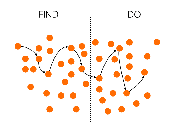
In this case, the whole thing is a mess. The Information Architecture is not well thought through, so finding what you’re looking for is extremely difficult. To add insult to injury, if you do manage to find your path and switch to doing, all those distractions remain in the interface, and you’re left to fend for yourself amidst the chaos.

Now, let’s see what happens if you look at this only as an Information Architecture problem, as I did at first:

We’re certainly making progress now. The list of things you can do is neatly ordered, so it’s much easier to navigate. But there’s still a problem: the interface remains consistent during the doing phase, so the probability to get confused is still high.

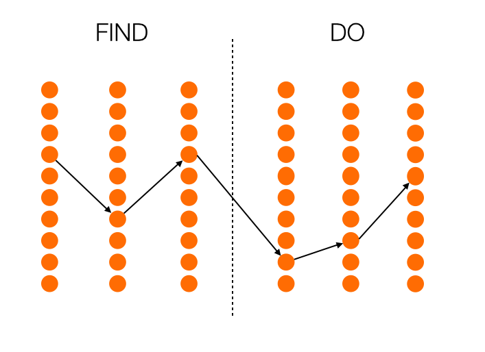
So what happens if we look at finding and doing as completely separate actions? What if we try to solve both the IA and the UI problems, depending on which phase we’re in? I think we end up with something like this:

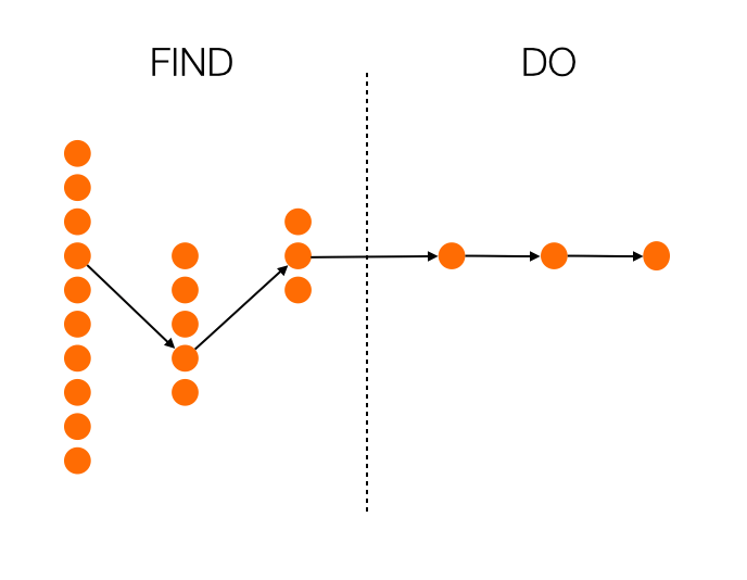
Now we’re talking. With every step, you get fewer choices, so you’re essentially getting guided to the most appropriate choice. And even more importantly, once you enter the doing phase, there is no more distraction. Everything is focused on completing the task at hand. Maybe this results in more clicks overall, maybe it doesn’t. That’s not important, though. What’s important is that the next action to take is as obvious as possible.

This approach is in direct contrast with progressive disclosure. Instead of starting with a few options, and opening up to more options as you go, you start with many options (which is essential in a complex UI like an admin console), and provide fewer options as you go. Perhaps we can call it regressive disclosure? I don’t know, I’m bad at naming things.

How is this thinking manifesting itself in my current project? Well, instead of providing a traditional navigation—however well thought out it might be—I’m leaning towards a design that is much more linear, and provides fewer choices as the user goes along. I’m also working on a full-screen design for the doing phase, where the rest of the IA disappears completely once you move on from finding. As an added bonus, this is a much more natural design on mobile is well, so it’s going to make our responsive efforts easier as well.

There’s still a long way to go, but at least I now feel like the framework is solid. Hopefully you can use this for something you’re working on as well!

How to improve Enterprise UX

A couple of weeks ago I did a talk on Enterprise UX at UX Burlington. You can now read a written version of the talk on A List Apart. From Unsuck the Enterprise:

So if you’re someone who works in enterprise software, come a bit closer—I need to tell you something…

I know the work can be difficult. I know there are an infinite number of factors involved in getting product live, and sometimes what gets launched isn’t what you had in mind. I know there are sleepless nights about this sometimes. But don’t give up. Don’t think that enterprise design has to be boring or tasteless. With a little bit of effort and a lot of tenacity, it’s possible to create great enterprise product. We need you to make it happen, though. Who else is going to do it?

Or if you have 20 minutes to spare, the video for the talk is also now available on Vimeo:

Feature prioritization with remote teams using Mural.ly and the Kano model

As if feature prioritization isn’t hard enough, many companies are starting to introduce another tricky variable into the mix: remote teams. If you’re a product manager who spends a lot of time on video calls with team members in different parts of the world, you’ll be forgiven for feeling like involving the team in prioritization is too much to deal with. But don’t give up on the dream yet. One of the teams on a project I’m working on is very much distributed, and I think we may have found a reasonably painless way to do prioritization together.

Here are the ingredients you’ll need:

Let’s discuss the recipe in detail…

On Mural.ly

Mural.ly is virtual whiteboard software. Before you scream “BLASPHEMY!”, I want to assure you that I still enjoy physical sticky notes as much as the next person. Nothing compares to the feeling of ripping a bad idea off the board and rage-throwing it into the closest trash can1. That said, physical sticky notes have two major drawbacks:

  • It’s hard to get remote teams involved in the process.
  • Transcribing them is such a chore.2

And that’s where Mural.ly comes in. It lets you create virtual sticky notes on a whiteboard, move them around, change their color, and best of all: the whole team can play along. You can do voting sessions, multiple people can edit at the same time, etc. This tool has really done wonders for our collaboration efforts across offices.

On the Kano model

The Kano model isn’t new, and it’s been fairly widely used in software product development for a while. Developed in the 1980s by Professor Noriaki Kano for the Japanese automotive industry, the model is a helpful method to prioritise product features by plotting them on the following 2-dimensional scale:

  • How well a particular user need is being fulfilled by a feature
  • What level of satisfaction the feature will give users

The model is generally used to classify features into three groups:

  • Excitement generators. Delightful, unexpected features that make a product both useful and usable.
  • Performance payoffs. Features that continue to increase satisfaction as improvements are made.
  • Basic expectations. Features that users expect as a given — if these aren’t available in a product, you’re in trouble.

Here is a visual representation of the Kano model:

So, as we started our prioritization exercise, I drew the x and y axes on a new mural. We then listed out all the features that we’re thinking about for the next few months—one feature per sticky note. We proceeded to go through each sticky note, and discuss where it fits on the Kano model—how far are we in meeting the need currently, and how satisfied do we believe users will be once we’ve met the need better?

We ended up with something like this:

(Yes, it’s small—unfortunately I can’t show the feature details. Maybe once they’re live…)

This now becomes a great tool for prioritization and release planning. There are couple of rules of thumb I like to stick to when doing sprint/release planning:

  • Make sure there is a balance between the 3 different types of features. Don’t overemphasize one type over the other.
  • Start with the features with the biggest upside. For Basic expectations, that means features on the far left, where a little work would result in a big increase in satisfaction. For Excitement generators that shifts to features closer to the y-axis, since the real benefits start to kick in exponentially once you go the extra mile on fulfilling the need. For Performance payoff features the story is a little less clear since the relationship is linear, but I would still argue for starting on the far left. The sooner you can get users on the “satisfied” side of the scale, the better.

We’re still learning our way through this, but so far I’m happy with the process. It’s a model that everyone understands and can rally around, and with Mural.ly at our side we get to involve the whole team. I believe marketers call that a win-win.


  1. Why do rage-throws always miss the basket? Such a let-down. 

  2. Funny how you never see photos of the lone product designer sitting in a room, tearfully writing down every sticky note in an Evernote document as everyone else leaves the room high-fiving each other. 

Don't sell features, sell outcomes

I don’t want Yelp; I want to know where to eat. I don’t care about Google Calendar; I care about not missing appointments. I don’t buy iPhones; I buy best-in-class pictures of my kids. I’m loyal only to results, and I suspect you are, too.

— From John Pavlus’s Apple and Google Race to See Who Can Kill the App First, a good reminder that users care about outcomes, not features