I recently had to convince a client to pause their redesign efforts and work on their content first. This is how I did it. I tried to stay away from UX jargon and overly technical arguments. There is obviously much more to say about Content Strategy and related disciplines, but this was an exercise in trying to make a succinct argument by only focusing on information that’s most relevant to the client. I’m posting it here in the event that it might be useful to those who have to make similar arguments to non-UX audiences.
Introduction
Since this is primarily an informational site with the goal of converting readers into customers, it is imperative that we start the design process by developing the core content first. This will ensure that we design a web site purposefully to help users find the information they need, and guide them towards desired actions, as opposed to designing the interface first without knowing what content will be displayed. For a more detailed overview of this strategy, see A Richer Canvas.
In this brief overview I will summarize the primary reasons for following this approach, and how I propose we go about it on a practical level.
What happens if we don’t follow a “content first” strategy?
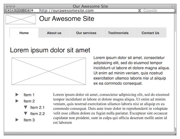
Let’s look at an example of starting the wireframe process before content is available. Let’s say we provide some wireframes of what the site might look like:

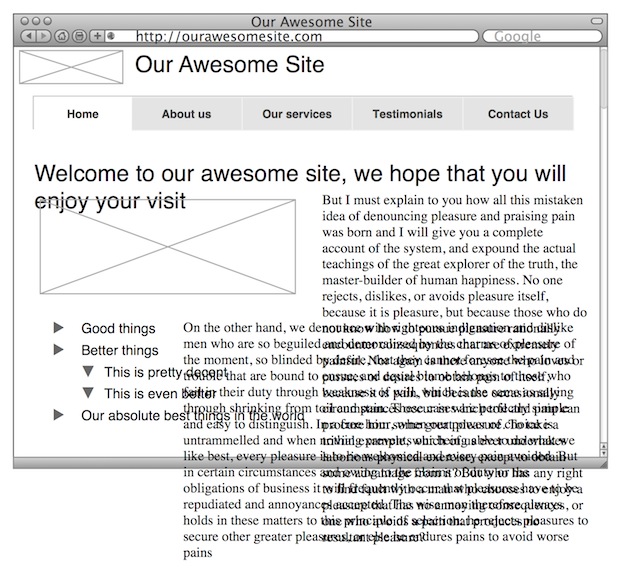
Now let’s say you love this approach and we proceed with graphic design, and eventually, towards the end, we finalize the content. We plug the content into the design, and then we discover we have a problem. Suddenly our design doesn’t work so well any more:

If we design before we have content, we effectively create the packaging before we know what’s going to go in it. And if the content doesn’t fit the package, there are only two options: start from scratch, or try to jam the content into the existing package. We don’t want that.
But it’s not just about making the design work. Developing the content first allows us to be much more strategic about the words we put on the page. It gives us the opportunity to start with user and business goals, and make sure our content meets those goals. Ahava Leibtag puts it as follows:
We need to start urging our clients to think about their content not just as a commodity, but as the starting point, the building blocks of a website. It’s time to stop building the house without knowing how many bedrooms it may need. It’s a paradigm shift in the way we think about building websites. But, it has to be done. Because you know what they call things that are beautiful, but have no function? Useless.
So how do we design with a “content first” approach?
The basic process of putting content at the core of a design (specifically a redesign such as this) is as follows:
- Audit. This is also referred to as a Content Inventory. We collect and document all our pages (like a site map), and we extract all the content from each page.
- Analysis. In the next step we work on context and goals. We look at our audit and document how the content on each page relates to other pages. We look at the goals of our site, and figure out what type of content we need to ensure we meet those goals. We look at the process for writing content and if there are areas for improvement. We evaluate our brand promise and define exactly how we want to communicate to our visitors to deliver on that promise.
- Content creation. Once we’ve laid down the guidelines for our content and agree on what we’re trying to achieve, we start writing. This involves rewriting existing content as well as writing new content if the audit and analysis showed us that we have some gaps.
For more on this process, see Getting to Grips with Content.
Who does this work?
The title of the person doing this type of work isn’t that important. The most important thing is that they have a thorough understanding of writing for the web, and how to connect users with the right content. In the web design industry this is often done by Information Architects or Content Strategists.
- Information Architects “categorize information into a coherent structure, preferably one that most people can understand quickly, if not inherently” (see Wikipedia). Another way of saying it is that they build bridges between users and the content and services they need (see Information Architect).
- Content Strategists “plan for the creation, publication, and governance of useful, usable content” (see The Discipline of Content Strategy).
So as I’ve said, the title isn’t important, only the outcome is. And the outcome is web content that meets user and business goals, and allows us to design an experience centred on guiding users along the desired path.
For the reasons outlined above, our strong recommendation is to engage a person with Information Architecture/Content Strategy skills to help us develop our core content before we proceed to the design stage.
End note: Of course, the argument is not always as simple as this. It is often impossible to have the majority of the content available before commencing design. That’s why I like the idea of Structure First. Content Always. But in this particular case, we needed content before we could do anything, so we had to put on the brakes until we had something useful to work with.
