We just announced Jive Circle, a new corporate directory app for iOS and Android that we’ve been working on since the beginning of the year. I’m really excited about this app, because we were able to follow a user-centered design process to ensure we’re launching a product that is both useful and usable. In this post I’d like to talk a bit about the process we followed, and some of the lessons we learned as a team.
So let’s start where every product should start: user needs.
Start at the beginning: user needs
Jive Circle is the 3rd product in what we’re calling our Workstyle apps. The first (Jive Daily) and second (Jive Chime) were released earlier this year. During the market research for these products the research team discovered a new pain point that was just waiting to be solved: corporate directories.
Accessing the corporate directory is something people do multiple times a day. The problem is that it’s a terrible experience. There are usually HR systems or intranets that try to give easy access, but the research showed that people rarely used these systems (for reasons ranging from “it sucks!” to “I forgot my password and can’t be bothered to reset it”). Instead, they do something that’s accessible but a really bad experience: they use Microsoft Outlook.
The most common way to look someone up in a corporate directory is this:
- Compose a new email message in Outlook
- Type in the person’s email address
- Right click on their name
- Go to their profile
- Copy the needed information
- Close out the (unsent) email
Not exactly an ideal process. We saw an opportunity to fix this. Enter Jive Circle.
Iteration is better than words: prototyping solutions
From the very beginning, we wanted the design process to be right. We agreed as a team that we want to get user feedback early and often, and that we’ll get a working prototype as quickly as possible so that we can iterate from there.
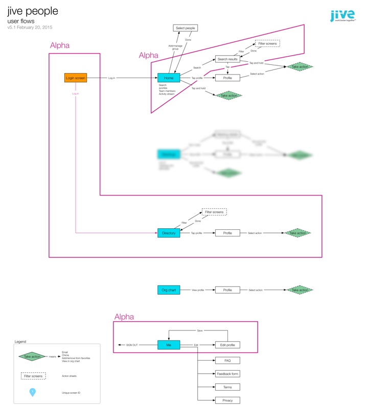
The first thing I wanted us to agree on—before starting any design work—was the basic user flows and information architecture. This took a couple of weeks to get right, but eventually v5.1 was the one we settled on (apologies for the blurring—there’s an upcoming feature I can’t tell you about yet…):
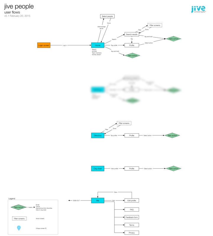
The flows have stayed mostly unchanged from this version. It was immensely helpful to start with user flows, as opposed to just making screens and hoping for the best. We came across a bunch of questions and issues as we worked through the IA, and it was much more efficient to work through them in this phase than it would have been once design had already started.
With the basic flows settled it was time to move on to design. I chose to use Proto.io for the initial prototypes. There are lots of alternatives, of course, but this is the one that came closest to what I needed (including a “long tap” gesture that none of the other tools had at the time).
Looking back over it now, it’s amazing to see the evolution of the app from the first prototype to our first Alpha dev build. Some things changed a lot, others remained largely the same. Here’s for example, is the Home screen from the very first prototype, compared to what is in the Beta version today:
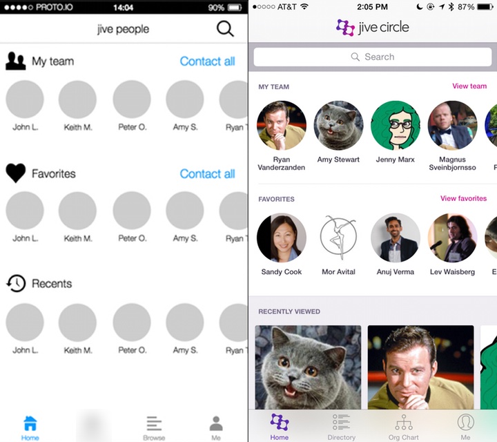
The more prominent search bar, dedicated “team” views, and card-based information at the bottom were all changes made as a direct result of usability testing—but more on that later.
Every couple of days I would publish a new version of the prototype based on team feedback, along with a list of what changed:
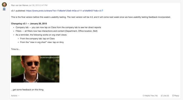
As you can see from the image above, by the time we hit v3.1, we realized it was time to get this thing in front of users before we went any further…
Save time and pain: usability testing
It was always really important to us to do at least two rounds of usability testing on this product: one round on a prototype, and one round on the first Alpha build. So with v3.1 of the prototype in hand I ran some usability tests to better understand how people currently use their corporate directories, and how well our proposed solution is working.
It was, as usual, incredibly insightful, and the changes we made based on that early feedback had a big impact on the utility and usability of the app. If we waited until we released the app to market to find that out… Well, that would have been an expensive mistake.
Two of the biggest insights we uncovered were:
- Knowing someone’s location, time zone, and availability is incredibly important, and the starting point for almost every interaction with that person. So this has to be a central component of the app.
- It’s surprising how often people want to look others up in an org chart—especially in large organizations. This meant that instead of having an org chart as a sub-set of a directory, we needed to make it another core aspect.
With our insights in hand we continued to make improvements to the prototype, until we arrived at v5.1. It was time to start visual design and development…
Making it real: From prototype to visual design and development
Early on in the development process we did something that I think is important to note. We decided to develop the first iteration of the app using a vertical as opposed to a horizontal approach. Here’s what I mean by that… With a horizontal approach you add all the features the app will have in the first iteration, and then start perfecting them. The problem with this is that you end up with a bunch of half-baked features, and if you run out of time before the release date, you’re screwed.
If you take a vertical approach you pick the features you want to work on first, and complete them front to back. You make sure they work well. You might have fewer features in the first release, but they’ll be fully baked, so you’ll have a useful app. And then you get to add some great stuff in upcoming releases. This is sometimes referred to as the cupcake theory of product development. For us, this meant focusing on a very specific feature-set that the entire team agreed on:
At this point our visual designers started working on the main screens and animations for the Alpha release, and the dev team started to build the back-end. We followed a very collaborative approach to development. It was challenging at times, since our dev team is in Tel Aviv, and the product and design teams are all on the US West Coast. But thanks to our internal collaboration software, lots of video calls, and a few weeks of in-person time, we made it work.
By the time the team published Alpha, we were all quite beside ourselves with excitement. The Alpha was already an amazing app, and we couldn’t wait to get it into the hands of users. So we moved on to the next phase…
Polishing a turd diamond in the rough: more usability testing
We did two things with the Alpha version:
- We released it as an internal Alpha to a subset of users in our own company, so that they could try to break it and help us fix bugs.
- We did another round of usability testing to do a few last course corrections if needed (and yes, we did need to!).
At this point we also started working on the fun parts of the app—those extra little animations and interactions that just make the app special. Our visual designers and developers did a fantastic job on the details here. Below are a couple of my favorite animations in the app:
Long press on an avatar:

Org chart animation:

These animations are subtle and not overbearing, but really help to bring some personality to the app.
Ship it already: knowing when you’re done
We probably could’ve kept going for forever, but the market waits for no person, so it was time to work towards our announcement date.
This is where our decision to follow a vertical approach really paid off. We were halfway through a feature when we ran out of time. In a horizontal approach that would have been a disaster. But because we completed each feature before starting on the next one, this wasn’t a problem. We just cut that feature out of the initial release, and we’ll add it as an update in coming months.
So now we wait for August 31st, our official release date! The app was submitted to the app stores today, so we’ll see how that part goes. All in all this is one of my favorite projects I’ve ever worked on. The team is amazing, the process was fantastic, and I can’t wait to get it out there and start adding even more useful things to it.
Most of all, I’m excited that we were able to make prototyping, usability testing, and rapid iteration part of the design process. It helped us focus on staying user-centered, and I’m convinced it saved us months of development time.
Lessons learned
There are a couple of important takeaways from the project that I want to note.
- Remote teams are hard. We all know this, but it sometimes feel like we pretend it’s going to be easier than it is. There are only two things I’ve found that make working in remote teams easier: (1) overcommunicate, and (2) travel to spend time together as much as possible.
- Prototyping really is the best way to go. I’m not going to say wireframes are dead—in fact, I would say quite the opposite. But if time and budget allows for it, nothing beats an interactive prototype for team communication and user feedback.
- Enterprise software CAN be designed and developed in a modern way. The whole team was on board with our user-centered design approach, and that made all the difference. Don’t think that just because you work in a large organization, you have to continue to work in BDUF, slow, waterfall environments.
As with all things design-related, this app is far from perfect. But I have confidence in our process. I have confidence in the utility of it. And I know that we’ll keep making improvements as the feedback from users come in, because that’s been a cornerstone of the project since the beginning. What more can a product designer ask for?