Menu

Designing cities for citizens of all ages

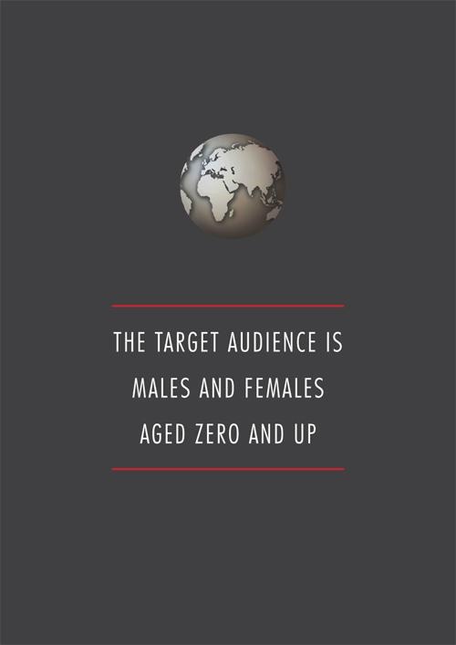
Dominic Basulto wrote an excellent summary of a recent McGraw Hill Financial Global Institute report called What the world’s best cities will look like in 2030. The main point the report makes is that people in cities are aging, and we’re not really paying attention to that. There are, however, several things we can do to make sure that older people can live comfortably in our cities:

First, the city of the future should have the infrastructure and transportation links to address the needs of citizens of all generations. Second, each city should build new housing options to enable older citizens to “age in place.” Thirdly, each city should include access to community health programs with innovative medical technology for seniors. And finally, the city of the future should have plenty of opportunities for continuing work, education, arts and recreation for all ages.

This reminds me of an attempted joke I made the other day about the font size in Facebook Messenger1:

From cities to software, the evidence is all around us that if there’s one thing we desperately need to build more inclusive products, it’s a more diverse workforce. It’s very hard for us to design for people and situations that we have no experience with. We need to make sure our workplaces are more diverse, and then we need to go out and understand our users.


  1. I’m ridiculously embarrassed about that typo. 

How to deal with difficult stakeholders

Daniel Zacarias has some tips for How to Deal with “Sinatra” Stakeholders—those people (usually HiPPOs1) who only want to design and build things their way. At the end he makes an important point:

These stakeholder attitudes don’t come out of the blue or from malfeasance. They result from misalignment and even when you can’t change your entire organization, you can definitely affect change around your product.

This is something I constantly have to remind myself about. If someone isn’t buying into our vision or “getting” the design, it’s not their fault. It’s ours. It is our responsibility to bring people along on the journey. We can’t blame them if they come into a project context-less and then ask difficult questions.


  1. Highest Paid Person’s Opinion 

Using ethnography to build better products

Craig Mod’s essay on doing design ethnography in Myanmar is so far my favorite piece of writing of the year. In The Facebook-Loving Farmers of Myanmar he shares some notes about the team’s visits and interviews:

There is a phrase repeated over and over again during my time in Myanmar: From no power to solar, from no banks to digital currencies, from no computers and no internet to capable smartphones with fast 3G connections. It is the mantra of consultants working in these emergent economies. And these emergent economies have one colossal advantage over the entrenched and techno-gluttonous west: There is little incumbency.

There is, however, instability—in government and currency. It’s one of the reasons why a country like Myanmar is just now getting these connections, these devices. The instability significantly increases risk for outside investors and companies. But the residual effect of that instability is a lack of incumbency and traditional infrastructure. And so there is no incumbent electric giant monopolizing rural areas to fight against solar, there is no incumbent bank which will lobby against bitcoin, there are no expectations about how a computer should work, how a digital book should feel. There is only hunger and curiosity. And so there is a wild and distinct freedom to the feeling of working in places like this. It is what intoxicates these consultants. You have seen and lived within a future, and believe—must believe—you can help bring some better version of it to light here. A place like Myanmar is a wireless mulligan. A chance to get things right in a way that we couldn’t or can’t now in our incumbent laden latticeworks back home.

It’s a long article, and it should be. There’s so much insight here, just from spending a few days with people observing, listening, understanding. I don’t understand why this truth is so hard for some product leaders to understand:

A common mistake in building products is to base them on assumptions around how a technology might be adopted. The goal of in-field interviewing in design ethnography is to undermine these assumptions, to be able to design tools and products aligned with actual observed use cases and needs.

Just imagine how different the world would be—and what incredible products we’d be able to build—if we always took the time to understand users and their needs in this way first.

The convergence of Product Management and User Experience Design

Melissa Perri in Changing the Conversation about Product Management vs. UX:

Product Management with no User Experience Design creates functional products that don’t make users excited. User Experience Design with no Product Management produces delightful products that don’t become businesses.

I have a few quibbles with this article (including the idea that the role of UX is to make users excited…), but I like this quote because it ties in with a common theme I write about: the importance of combining both user needs with business goals to create successful products.

When being alone on our smartphones, together, is okay

Emma Brockes wrote an essay for The Guardian called In praise of being alone on our smartphones, together:

The act of being with someone—or better yet, a group of people—and on one’s phone is just the modern iteration of a key pleasure of family life: to be among those whom one is sufficiently comfortable with to drift in and out of communication. Like doing homework at the kitchen table, it is the state of doing your own thing while others do theirs around you. The point is, whatever you are doing on your phone, it would be less pleasurable were you to be doing it alone in your room.

Screen addiction alters this, and there are levels of disengagement that can turn a sentient being into a piece of furniture, but the parameters of acceptable phone use should surely widen at this point to permit some middle way between being on one’s phone and considered rude, or turning the device off altogether.

The title of the essay is a clever reference to Sherry Turkle’s book Alone Together: Why We Expect More from Technology and Less from Each Other. It’s a book I enjoyed a lot, despite it being relentlessly full of depressing paragraphs like this:

Now demarcations blur as technology accompanies us everywhere, all the time. We are too quick to celebrate the continual presence of a technology that knows no respect for traditional and helpful lines in the sand.

[A] stream of messages makes it impossible to find moments of solitude, time when other people are showing us neither dependency nor affection. In solitude we don’t reject the world but have the space to think our own thoughts. But if your phone is always with you, seeking solitude can look suspiciously like hiding.

I recommend danah boyd’s It’s Complicated: The Social Lives of Networked Teens as a positive palate cleanser afterwards.

Anyway, back to Emma’s article. She also references Susan Dominus’s Motherhood, Screened Off, an article that was in heavy rotation towards the end of last year. Susan makes the point that smartphones result in a lack of transparency, since people (i.e. our kids…) don’t know what we’re up to when we’re on them:

It is that loss of transparency, more than anything, that makes me nostalgic for the pre-iPhone life. When my mother was curious about the weather, I saw her pick up the front page of the newspaper and scan for the information. The same, of course, could be said of how she apprised herself of the news. […] All was overt: There was much shared experience and little uncertainty. Now, by contrast, among our closest friends and family members, we operate furtively without even trying to, for no reason other than that we are using a nearly omnipresent, highly convenient tool, the specific use of which is almost never apparent.

And that’s where the answer to all of this comes back to “it’s complicated.” Yes, sometimes it’s ok to be alone on our devices, together in quiet contentment. But other times the lack of transparency about what we’re doing can be incredibly alienating to others. This wouldn’t be a problem if we could tell the difference between the two situations perfectly, every time. But alas, we are only human.

The streaming music ceiling

Cortney Harding makes some good points about the behaviors of different music buying personas in Is There a Streaming Ceiling?

The future is beginning to look like it will be a two tiered system — the top group of music fans will pay for streaming and everyone else will buy a handful of albums a year. Think of all the people you know who bought the Adele album, and I’ll bet that for many of them, it was the only album they bought this year. Many of these consumers aren’t all the interested in what streaming can offer them — they are content with hearing new music on the radio, buying one or two albums a year, and perhaps seeing one or two concerts.

It feels like the music industry has never been this complicated.

Service design for airport restrooms

The Transportation Research Board (TSB) recently published a 100-page PDF called Guidebook for Airport Terminal Restroom Planning and Design. If I know anything about the readers of this site, it’s that this is the kind of stuff we live for. Service design for airport toilets? Sign us up!

Ian Bogost provides a handy summary of this delightful document in The Airport Restroom of the Future:

The TSB report ends with an appendix on the “Airport Restroom of the Future.” After a surprisingly detailed history of public toilets, the TSB concludes that gender-neutral restrooms would offer travelers the most relief. Not only would they better address evolving gender identity norms, but they would also reduce congestion, maintenance, and accessibility by foregoing the barriers that help create the constriction of today’s restrooms. The TSB’s mockup puts individual sink basins in stalls to avoid flow to a common sink area, and adds a spacious waiting area flanked by two “art vitrines.”

I doubt airports care much about this, but it’s at least nice to see the TSB investing in this kind of service design research.

Wisdom quotes for the rest of us

Jennifer Kahn’s The Happiness Code, an article about bringing rationality to self-improvement, is interesting in and of itself. But it’s Hannah Whitaker‘s photo illustrations with lettering by Luke Lucas that really drew me in. I’m sure many of you despise pithy “wisdom quotes” as much as I do. So these are like smooth balm to a tortured soul.

Wisdom

Wisdom

Wisdom

Wisdom

You can see more of Hannah’s excellent work here. Luke’s personal website with some his great graphic design projects is here.

More

  1. 1
  2. ...
  3. 67
  4. 68
  5. 69
  6. 70
  7. 71
  8. ...
  9. 201