Menu

It’s about the thing you build, not the technology you use

James Hague in Don’t Fall in Love With Your Technology:

Don’t fall in love with your technology the way some Forth and Linux advocates have. If it gives you an edge, if it lets you get things done faster, then by all means use it. Use it to build what you’ve always wanted to build, then fall in love with that.

I know I’m in danger of that with iOS, Mac OS X, and my new-found love affair with text files and Markdown. Hoping that knowing I have a problem is indeed half the battle.

Clear: doing for To Do lists what Dropbox did for file syncing

I can only imagine the miles and miles of chaotic complexity that designers and developers had to wade through to arrive at the simplicity of Clear – a new To Do list app for the iPhone. As I started playing with the app, Rebekah Cox’s definition of design kept popping into my head:

Design is a set of decisions about a product. It’s not an interface or an aesthetic, it’s not a brand or a color. Design is the actual decisions.

And the decisions that Clear made are as close to perfect as I’ve ever seen. I can picture the endless, difficult meetings and arguments that must have happened to decide what features to include in the app. Should we have Projects and Contexts? No. How about Due Dates and Filters? Nope. Well, why not!? Because Clear is a prioritized list of tasks that is fast and easy to edit. That’s it. Nothing less, nothing more.

It reminds me of the Quora thread on why Dropbox became so popular:

“But,” you may ask, “so much more you could do! What about task management, calendaring, customized dashboards, virtual white boarding. More than just folders and files!”

No, shut up. People don’t use that crap. They just want a folder. A folder that syncs.

But let me stop gushing for a minute and step back a bit. Clear (which is getting quite a bit of attention) is absolutely fantastic as a way to view and prioritize a simple list of tasks, but it’s not a replacement for hardcore task management systems. Omnifocus will remain the application I use for all my work projects, and it’s always open on my Mac and iPad during the work day. But Omnifocus is hopeless overkill for simple tasks like “Make a car appointment” or “Get coffee at the store”. And that is the gap that Clear fills so effectively.

Clear is focused on two things that make it vastly superior to other similar apps:

  • Speed. It’s really fast. When it starts up you can instantly start typing. This is crucial to quickly capture that all-important thing you don’t want to forget. I still die a little bit inside every time I see the “Optimizing database” message while I wait for Omnifocus to start up.
  • Effortless editing. It’s completely gesture-based – no chrome, no fluff, no fancy visual design. You tap, you type, you swipe, you close. These gestures are easy to learn and intuitive:

clear-1.jpg


Francisco Inchauste calls Clearan app for the future“, and I completely agree. It feels different, but it feels right. And despite its (appropriate) lack of visual extravagance, it has an attention to detail that reminds of the meticulous design of Path. For example, when you create a new list and there are no to do items in it yet, you get a random quote about getting things done:

clear-2.jpg


I’m trying hard to find something negative to say about Clear, because every app has room for improvement. But at the moment my judgment is slightly clouded by how impressed I am with this team. It’s so hard to resist the temptation to build an app that tries to solve every problem for every person in the world. These guys walked through that fire and emerged on the other side probably bruised and battered, but also with a flawless app for listing tasks and editing them quickly. Want more in your To Do list app? Shut up and go buy Omnifocus.

It’s time to find your voice

I’ve been following the recent back-and-forth about blog comments closely, since I have the same question about this blog: should comments be turned on or off? I even mentioned recently that I’m going to turn comments off for a while and see how it goes.

Matt Gemmell is driving/documenting the debate in the most articulate way, and his recent post on pseudonyms is another example of that. Even though the conversation now mostly appears to have run its course, it occurred to me that the root of this debate is related to what Paul Ford calls the fundamental question of the web:

“Why wasn’t I consulted,” which I abbreviate as WWIC, is the fundamental question of the web. It is the rule from which other rules are derived. Humans have a fundamental need to be consulted, engaged, to exercise their knowledge (and thus power), and no other medium that came before has been able to tap into that as effectively.

The Internet gives people this idea that if they can’t respond directly to something someone else said on a web site, their fundamental right to be consulted is violated. And that’s just not true – we don’t have a right to be consulted on everything that happens around us. What is true, however, is that we all have a voice, and that finding that voice is extremely important for our own development.

So the thing is, we’re having the wrong discussion. We shouldn’t be arguing about whether comments should be turned on or off on a blog. What we should be talking about is how all of us can spend more time finding our own obsession and voice, and how we can share that with the world. Tom Standage argues that writing is the greatest invention:

It is not just one of the foundations of civilisation: it underpins the steady accumulation of intellectual achievement. By capturing ideas in physical form, it allows them to travel across space and time without distortion, and thus slip the bonds of human memory and oral transmission, not to mention the whims of tyrants and the vicissitudes of history.

So forget about comments – it doesn’t matter whether you have them turned on or not. The real question is which one of the many available options you’re going to choose to start writing and owning your voice.


Update: Reader Greg Mathes asks in an email, “What’s so important about finding our own voice?” To answer, I’d like to quote Clive Thompson in The Art of Public Thinking:

The process of writing exposes your own ignorance and half-baked assumptions: When I’m writing a Wired article, I often don’t realize what I don’t know until I’ve started writing, at which point my unanswered questions and lazy, autofill thinking becomes obvious. Then I freak out and panic and push myself way harder, because the article is soon going before two publics: First my editors, then eventually my readers. Blogging (or tumbling or posterousing or even, in a smaller way, tweeting) forces a similar clarity of mental purpose for me. As with Wired, I’m going before a public. I’m no longer just muttering to myself in a quiet room. It scarcely matters whether two or ten or a thousand people are going to read the blog post; the transition from nonpublic and public is nonlinear and powerful.

World IA Day: A lack of UX purpose (and what we can do about it)

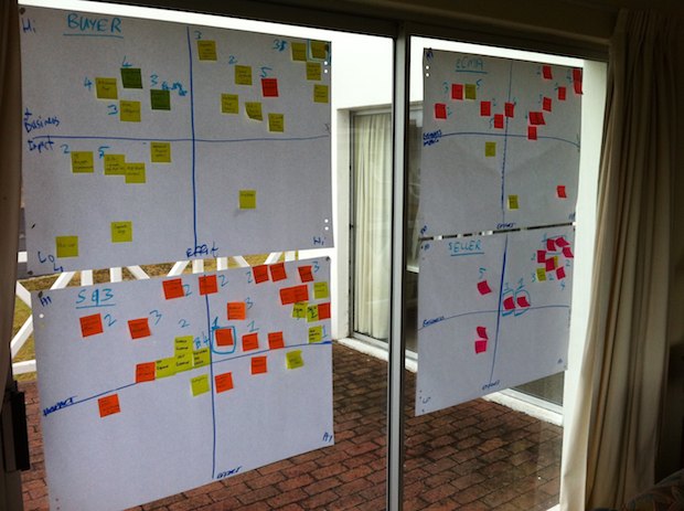
I flew up to Joburg this weekend to speak at one of the World IA Day events that were happening in 14 cities around the world. The bulk of the talk was about Customer Journey Maps, and specifically how we used the technique to help us prioritize our roadmap at kalahari.com. In this summary post I want to focus primarily on the topic I started the talk with. It’s about a particular gap I see in current UX work, and how Information Architecture is uniquely positioned to bridge this gap.

In 1955 David Ogilvey wrote a letter about his copywriting habits, and among other things, said the following about campaign work:

I write out a definition of the problem and a statement of the purpose which I wish the campaign to achieve. Then I go no further until the statement and its principles have been accepted by the client.

It seems that ther’s unfortunately plenty of UX work out there that jumps straight into wireframes without first understanding the design problem, as well as the purpose of the solution. Purpose – the reason for which something is done or created – often appears to be missing (*cough* Color.com *cough*). And this is where I believe Information Architecture can come to the rescue.

There are plenty of definitions of IA to choose from, but I like this one in particular by Peter Morville:

I like it because it brings into focus the idea that at its core, Information Architecture is about a unique way of seeing the world. A way that is essential to build successful user experiences.

I love the example Dan Klyn’s uses in Information Architecture is a Way of Seeing. You have to read the whole thing to appreciate it fully, but in short, he tells a story about having to deal with some pretty severe back pain recently. After visiting an MD who only gave him a prescription for Vicodin and some exercises that didn’t help at all, he ended up at a Chiropractor who was able to sort out the problem in just a few days (after taking an X-ray to help diagnose the problem). When asked why the MD didn’t originally take an X-ray to get to the root of the problem, the Chiropractor replied that it wouldn’t have mattered if she did:

Even if the MD had taken an X-Ray, she would not have seen what I saw. Show us each the same image and we see different stuff.

It’s this different way of seeing that makes the IA profession so crucial right now. IAs specialize in looking at a vast amount of information and making sense of it in a way that is credible, consumable, and relevant to users (and the business). Where most of us only see Navigation, they know that part is just the tip of the iceberg. Underneath it lie activities like Information organization, Information relationships, and IA research that all work together to give IAs their unique view of the world.

Within this large toolset that IAs have to choose from to do their work, Customer Journey Maps stand out as the one technique that can be most effective to bring purpose back to our UX work. As UX Matters defines it:

Customer journey maps are documents that visually illustrate an individual customer’s needs, the series of interactions that are necessary to fulfill those needs, and the resulting emotional states a customer experiences throughout the process.

These maps are important as a way to find UX purpose because it accomplishes the following goals:

  • It provides a common understanding within an organization about customer needs, product strategy, and business goals – i.e., the product’s reason to exist.
  • It’s an excellent product prioritization tool.
  • It’s a guiding light for design, always bringing the project and the process back to the customer journey and the purpose of the product.

There are many different ways to approach these maps, but I find the Adaptive Path way the most effective. It places a strong focus on user research, and forces you to think about the implications of the journey map, and how it can integrate with and guide the design process.

So, that was my story at the conference. Thanks to everyone who came out! Here are the slides from my talk:


The exhaust of our digital lives

Frank Chimero provides another eloquent take on frictionless sharing (automated posts in news feeds, like what song you’re listening to on Spotify):

The less engaged I become with social media, the more it begins to feel like huffing the exhaust of other peopl’s digital lives. It’s a bit of a weird situation: all that’s needed is a simple filter to prioritize manually posted content over automated messages.

He doesn’t explicitly say this, but the point in his post is clear. Automated content shows up in your stream not because it adds value to the network, but because it’s good Marketing ROI for brands.

You cannot design without content (structure)

Mark Boulton wrote a fantastic piece called Structure First. Content Always. He makes a strong case that it’s unrealistic (and just plain wrong) to require content to be written before design happens:

Let’s be really clear about this. It is unrealistic to write your content ““ or ask your client to write the content ““ before you design it. Most of the time. Content needs to be structured and structuring alters your content, designing alters content. It’s not “˜content then design’, or “˜content or design’. It’s “˜content and design’.

I often utter the phrase “you cannot design without content”, but in practice I still fall back on old habits when push comes to shove and content simply isn’t available. Mark provides a great solution in his post as he explains what content structure is all about, and how it fits into the design process.

An avalance of information and entertainment

How mankind will cope with the avalanche of information and entertainment about to descend upon it from the skies, only the future can show. Once again science, with its usual cheerful irresponsibility, has left another squalling infant on civilization’s doorstep.

Arthur C. Clarke in 1962

Should designers learn to code? Who cares, as long as they always remain curious.

Tucked away among the usual arguments for and against designers being able to code, Mandy Brown makes an interesting observation in Specialist or Generalist?, a roundtable discussion on the issue:

You do not need to be proficient in practices other than your own; but you ought to be curious. Curious enough to ask questions, to read about things, to get your hands dirty. It’s lack of curiosity about other disciplines that is deadly, not lack of skill.

This is a statement worth digging into, because curiosity is one of the most important characteristics of a good designer (well, of anyone, really). Sara Wachter-Boettcher explains the reason really well in her piece On Content and Curiosity:

Curiosity keeps us hungry. It leads us to tackle new challenges when the easy questions have all been answered. It makes us wonder how things could be better””even when they are, if w’d just pause to admit it, pretty damn good already.

There is a very legitimate counter-argument to being incurably curious, though. We might gain such shallow knowledge about so many different things that we end up unable to form or articulate opinions on anything because we just don’t know enough about a specific topic.

This is the core of the “specialist” argument, and it’s articulated very well in Stop Trying To Be Diverse, an interesting post about photographers on the Musea blog. The author tells the story of a particular photographer who spent his entire life shooting black-and-white portraits of people against a white or grey background. Boring, right? Well…

We don’t want to restrict ourselves to something like that because we feel that we will get bored. However, boredom is a great thing! What actually occurs is, boredom forces us to be more creative if we can push through it. Our work will improve if we find different ways to solve the same problem over and over, instead of switching between 10 independent problems. Avedon forced himself to come up with something new every time his subject stepped in front of his white seamless background. He had to find something unique about each individual, otherwise he would fail. The difference in his work came from what his subjects brought to the image, not by some new Photoshop filter or fancy off-camera lighting technique he used.

I’ll illustrate this with a story about my own online behavior. The other night I went online to do something (who knows what it was), and an hour later I found myself reading an article about a guy who feels that Louis C.K. was stupid because he made “only” $1 million from his standup comedy experiment. The person claimed that he could have helped Louis C.K. make $5 MILLION!!! I got to end of the article and all I could think was, “Why do I read this crap?” Well, I read it because my curiosity sometimes overcomes my importance filter. And getting that balance right is what we all need to make this curiosity thing work for good, not evil.

So, how do we arrive at (and maintain) this balance? How do we remain curious, and still manage to temper our gluttonous, Internet-fed thirst for All Things, All The Time? The core of the solution lies in learning what to cull from our lives, and what to surrender instead. In The Sad, Beautiful Fact That We’re All Going To Miss Almost Everything, Linda Holmes describes the two concepts as follows:

Culling is the choosing you do for yourself. It’s the sorting of what’s worth your time and what’s not worth your time. It’s saying, “I deem Keeping Up With The Kardashians a poor use of my time, and therefore, I choose not to watch it.” It’s saying, “I read the last Jonathan Franzen book and fell asleep six times, so I’m not going to read this one.”

Surrender, on the other hand, is the realization that you do not have time for everything that would be worth the time you invested in it if you had the time. Surrender is the moment when you say, “I bet every single one of those 1,000 books I’m supposed to read before I die is very, very good, but I cannot read them all, and they will have to go on the list of things I didn’t get to.”

We constantly need to learn how to make better decisions about culling and surrendering. For example, I should have culled that Louis C.K. article. And at some point I need to choose to surrender all the UX articles in my Instapaper queue and just freakin’ fire up Balsamiq.

Should designers learn to code? It depends entirely on each designer’s ability to decide if it’s a skill that should be learned or surrendered in the bigger picture of meeting his or her ultimate life/career goals. Put another way, there is no right answer, as long as the designer is at the very least curious enough to know how development works, and at best has made a conscious decision either to surrender the skill or dive in and learn it.

More

  1. 1
  2. ...
  3. 177
  4. 178
  5. 179
  6. 180
  7. 181
  8. ...
  9. 198