Menu

Android fragmentation: hunting for silver linings

Towards the end of Android Fragmentation Visualized, an article by OpenSignalMaps that analyzes 3,997 (!) distinct Android devices across different dimensions, comes this attempt at setting the world record for Silver-Lining Hunting:

One of the joys of developing for Android is you have no idea who’ll end up using your app.

Pardon my lack of eloquence, but, LOL! First, there’s the obvious logical fallacy: no-one knows who will end up using their apps, no matter what phone/platform they develop for1. Second, not knowing who will end up using your app is a bad thing. Most apps fail because they are unable to reach product/market fit. And one of the major reasons for not reaching product/market fit is not understanding your market — the people who will end up using your app.

The variety of resolutions visualized in the OpenSignalMaps post is staggering, and trying to spin it as anything but a nightmare for developers is commendable but misguided.


  1. User and market research can help you make educated guesses, but will only take you so far until you have a real product in the wild. 

Wish list for a mobile WordPress publishing platform

I was encouraged to read these words by Matt Mullenweg in his post Radically Simplified WordPress:

As John Borthwick put beautifully today, “A tablet is an incredible device that you can put in front of babies or 95-year-olds and they know how to use it.” How we democratize publishing on that sort of platform will not and should not work like WordPress’ current dashboard does. It’s not a matter of a responsive stylesheet or incremental UX improvements, it’s re-imagining and radically simplifying what we currently do, thinking outside the box of wp-admin.

This is great news, and I’d like to offer my 2 cents on what an ideal mobile WordPress platform might look like. Because despite several attempts I haven’t been able to figure out a good workflow for publishing to WordPress from my iPhone or iPad.

Let’s take this post as an example. I read Matt’s article in Instapaper. I used the awesome “Create Note in Simplenote” feature to send the above quote to my preferred writing app. I am writing these words in Simplenote for iOS using Markdown. Writing down the words is a breeze; geting those words to my blog is a mission (and usually results in a big time delay). I’m going to wait until I get home, open my laptop, and wait for nvALT to sync with the text I entered into Simplenote. Then I’ll copy the Markdown into MarsEdit, add some URL and keyword specifics, and hit Publish.

The WordPress iOS apps are not helpful to me, because they don’t allow you to add custom fields and URLs. For example, for link posts I have a custom field that turns the title of the RSS entry for that post into a link that takes the reader directly to the original article. I can’t do that in the iOS app.

But here’s the thing – I don’t want a better WordPress iOS app. I don’t even want a mobile-optimized WordPress Dashboard. Instead, I want all the apps I already use to integrate seamlessly with the WordPress backend. So my ideal mobile WordPress experience is this: make it dead easy for text editor apps to publish to WordPress.

Once I’m done writing this post in Simplenote I would like to tap a link that says “Publish to WordPress.” I would then like to see a customizable dialog that lets me add/edit all the fields I have chosen to include, hit Post, and be done. It could work similar to Tumblr integration on Instapaper, except with customizable fields:
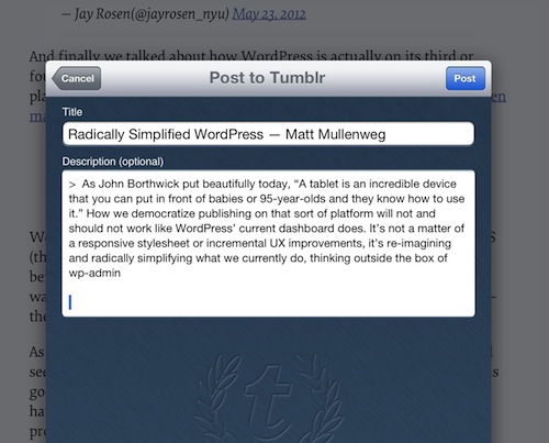
Instapaper and Tumblr integration

Maybe this is already what the WordPress team is thinking about – I certainly hope so. Either way, I know that this kind of seamless integration would truly free us to publish from anywhere, and will put a final nail in the coffin of the “iPad is only for consuming” argument.

It would be great to get more insight from the WordPress team on what they’re working on for mobile.

Clear: doing for To Do lists what Dropbox did for file syncing

I can only imagine the miles and miles of chaotic complexity that designers and developers had to wade through to arrive at the simplicity of Clear – a new To Do list app for the iPhone. As I started playing with the app, Rebekah Cox’s definition of design kept popping into my head:

Design is a set of decisions about a product. It’s not an interface or an aesthetic, it’s not a brand or a color. Design is the actual decisions.

And the decisions that Clear made are as close to perfect as I’ve ever seen. I can picture the endless, difficult meetings and arguments that must have happened to decide what features to include in the app. Should we have Projects and Contexts? No. How about Due Dates and Filters? Nope. Well, why not!? Because Clear is a prioritized list of tasks that is fast and easy to edit. That’s it. Nothing less, nothing more.

It reminds me of the Quora thread on why Dropbox became so popular:

“But,” you may ask, “so much more you could do! What about task management, calendaring, customized dashboards, virtual white boarding. More than just folders and files!”

No, shut up. People don’t use that crap. They just want a folder. A folder that syncs.

But let me stop gushing for a minute and step back a bit. Clear (which is getting quite a bit of attention) is absolutely fantastic as a way to view and prioritize a simple list of tasks, but it’s not a replacement for hardcore task management systems. Omnifocus will remain the application I use for all my work projects, and it’s always open on my Mac and iPad during the work day. But Omnifocus is hopeless overkill for simple tasks like “Make a car appointment” or “Get coffee at the store”. And that is the gap that Clear fills so effectively.

Clear is focused on two things that make it vastly superior to other similar apps:

  • Speed. It’s really fast. When it starts up you can instantly start typing. This is crucial to quickly capture that all-important thing you don’t want to forget. I still die a little bit inside every time I see the “Optimizing database” message while I wait for Omnifocus to start up.
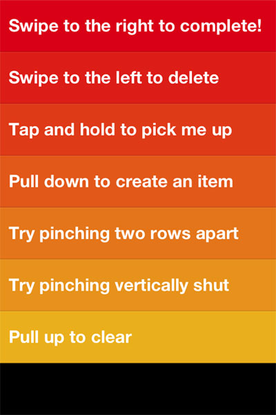
  • Effortless editing. It’s completely gesture-based – no chrome, no fluff, no fancy visual design. You tap, you type, you swipe, you close. These gestures are easy to learn and intuitive:

clear-1.jpg


Francisco Inchauste calls Clearan app for the future“, and I completely agree. It feels different, but it feels right. And despite its (appropriate) lack of visual extravagance, it has an attention to detail that reminds of the meticulous design of Path. For example, when you create a new list and there are no to do items in it yet, you get a random quote about getting things done:

clear-2.jpg


I’m trying hard to find something negative to say about Clear, because every app has room for improvement. But at the moment my judgment is slightly clouded by how impressed I am with this team. It’s so hard to resist the temptation to build an app that tries to solve every problem for every person in the world. These guys walked through that fire and emerged on the other side probably bruised and battered, but also with a flawless app for listing tasks and editing them quickly. Want more in your To Do list app? Shut up and go buy Omnifocus.

Mobile applications that trick kids into buying stuff

I completely agree with Gabe Weatherhead’s views on apps made for kids in The Value Of App Reviews:

My number one reason to give a bad rating and review is when an app made for kids has both up-sell and review requests plastered all over the screen. They are trying to prey on small children tapping anything that pops on the screen. If you make a kids app, do not put links to your other apps in the game. Put them in the preferences. Put them in the app description. Hell, put them in some kind of app documentation. But when they are in the game, you are telling me that you’re shady and unscrupulous and I can’t trust your app.

This is a dark pattern, and I simply delete the app if I come across this kind of design. For some better patterns to follow when designing apps for kids, see Luke Wroblewski’s Touch-based App Design for Toddlers.