In December 2011 Twitter unveiled a new UI, along with updated iPhone, Android, and web clients. The response from tech circles was immediate and extremely negative. Twitter 4.0 for iPhone got slammed particularly hard. Here’s John Gruber with a pretty good representation of the views expressed by many:
Twitter 4.0 for iPhone lacks the surprise, delight, and attention to detail of a deserving successor to Tweetie, offering instead a least common denominator experience that no one deserves.
By the time Twitter 4.0 came out I was already using Tweetbot, but I updated and played around with the app anyway, as I’m sure many did. I had three main issues:
- Severely limited functionality. Some things I do all the time in Tweetbot are either impossible or very difficult to do in Twitter for iPhone. This includes easily switching accounts, adding/removing people from lists, seeing someone’s @-reply stream, and quickly getting to saved searches.
- Inability to interact with tweets in the main stream. You can’t click on a link or someone’s profile from the main Tweet stream. You have to tap through to the Tweet detail — in many ways an unnecessary tap. More on this later.
- The Discover tab. Like most complainers I assumed Discover was just a thinly veiled attempt to start shoving ads in our faces. Back in Twitter 4.0 this was just a list of seemingly random tweets, probably based on some global trending topics. There was always talk of customization, but the initial incarnation of Discover didn’t have much of that.
So, like many others, I joked about it on Twitter1, and then moved back to Tweetbot without another thought.
But that was not the end of the story. Slowly but surely, Twitter has been working on putting the pieces together of that consistent user experience they’ve been talking about for a long time.
The story unfolds
In June 2012, Twitter rolled out expanded Tweets, a way to see more information about a single Tweet (like an embedded photo or an article summary). They called the technology behind this feature Twitter Cards.
Then, in July, Twitter 4.3 for iPhone came out with support for expanded Tweets. This was followed by Twitter 5.0 in September, which included a redesigned iPad app (a topic for a different blog post, so let’s just leave that for now), as well as profile header images.
And then came Twitter 5.1 on November 16. It was a point release, sure, but I think this is the version that finally brings together two separate threads that Twitter has been working on for a while: Twitter Cards and the Discover tab. The release notes for Twitter 5.1 said this:
See what’s popular within your network on Discover.
— Tweets, tailored just for you, now appear right in the stream
— These Tweets show photo, video, and article previews so you can engage easily
This time something weird happened in my Twitter stream. I started seeing a few positive tweets about the new app. I even saw a few positive mentions about the Discover tab. Fred Wilson blogged about it just today.
I decided to take another look. I worked with Alex to implement Twitter cards on this site. I moved Tweetbot to another screen and committed to trying Twitter for iPhone as my primary app for a week. And now I think I finally see where Twitter is going with all of this. And that maybe we should have trusted them a year ago. Possibly even apologize to them. But I’m getting ahead of myself. Let’s back up.
Information consumption on Twitter
When it comes to information consumption on Twitter, I think there are two overriding user needs:
- Get through as much content in as little time as possible.
- Know as quickly as possible if a link is worth clicking on.
The first requirement is technically difficult, but conceptually easy to meet. Just make the app as fast as it possibly can be. The second requirement is more difficult though. In the context of Twitter (specifically on mobile) there are two pieces of information that is important to decide if a link is worth clicking on:
- The source. This is easy to tell if you can see the URL, but since so many people still use URL-shorteners like bitly, the domain is often obscured, so you don’t know where the link is going to end up.
- A summary of the article. This is not easy to do in 120 characters2, especially if the Tweet just says “This!! –> bitly.com/blahblah”.
Why not just click on a link to see if it’s worth reading? Well, because it messes with that speed principle. Loading a site takes time. Especially if you don’t know if the bitly link goes to Mashable and you then have to download a 2MB page with a gazillion HTTP requests. Clicking on a link is expensive, so you only want to do it if it’s worth it.
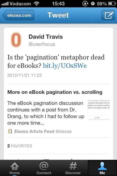
So this is where Twitter Cards come in. If someone tweets a link to sites that have implemented it, you can immediately see the source and a summary of the article to help you figure out if it’s really worth clicking through — even if a URL shortener is being used:

You also have to tap through to the tweet detail to click on the link; you can’t do it from the main stream. As I mentioned earlier, this extra tap used to annoy me, but I now think it’s a deliberate and important design decision. They are compromising immediate convenience for clarity of information. You might not agree with the decision, but it’s certainly not an oversight — I’m pretty sure it’s well thought through.
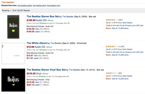
The implementation reminds me of the distinction between search results pages and product details pages on e-commerce sites. A search for “The Beatles” on Amazon doesn’t show you an “Add to cart” button on the search results page. You have to go to the product details page for that:

Twitter’s approach is similar. You have to view the summary before you can “commit”. The goal is to keep you inside the app until you’re absolutely sure you’re ready for the “purchase” — which in this case means clicking on a URL, emailing it to someone, sending it to Instapaper, etc. And now that the Discover tab is a much better customized version of photos and articles you might be interested in, the entire story is coming together really nicely.
There are still many features I miss in Twitter for iPhone. Having to poke around aimlessly for a while every time I’d like to see Tweets from a different list is probably the most frustrating issue at this point. But I have to say that Twitter Cards have made my experience so much more enjoyable and efficient that I’m going to stick with Twitter 5.1 for iPhone beyond my one-week experiment.
So what have we learned?
There are also some important product lessons to learn here. In his brilliant essay Subcompact Publishing Craig Mod sums it up nicely:
In product design, the simplest thought exercise is to make additions. It’s the easiest way to make an Old Thing feel like a New Thing. The more difficult exercise is to reconsider the product in the context of now. A now which may be very different from the then in which the product was originally conceived.
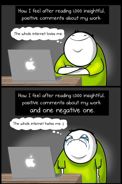
This is exactly what Twitter has done, starting with 4.0 almost a year ago. It was a gutsy move to rethink the entire experience — one they got a lot of ridicule for. And I’m sure the design team felt like this quite often:

(Source: The Oatmeal)
But to their credit, they stuck to their guns. They knew where they were going, and instead of surrendering to the extremely vocal complainers, they kept their eyes on the vision and went for it. That’s good product management. And now, almost a year later, I think they are finally seeing the tide turning as we’re getting a better sense of the end game.3
So, uh, I believe an apology is in order. I’m sorry, Twitter. I see where you’re going with this. And I like it.
