Menu

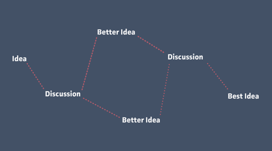
How to get buy-in on your design process

Coffee at Pink Boutique, Cape Town

I recently had a long conversation about coffee with the manager at the flagship TRUTH.coffeecult retail store. Talking to people who have a passion for their craft — regardless of what that craft is — always invigorates me in my own work as well. One of the things Dominic told me is that since they’re a roaster that supplies coffee to other businesses, TRUTH’s retail coffee shops aren’t their most lucrative business opportunity. So why do they even bother with retail spaces? His answer really got me thinking:

We want to give people the tools they need to tell that our coffee is better than others.

TRUTH realizes that for most people, coffee is just coffee. Whether it’s Starbucks, Denny’s, or Ricoffy doesn’t really matter, as long as it has caffeine in it. But people like Dominic and the team at TRUTH aren’t ok with that. They see a city full of people who are losing out on the joys of an artisan coffee experience, and they want to change that.

But they also know that in order to accomplish their goal, they can’t just give people a cup of TRUTH and leave them to it. They have to teach them why it’s better. They have to explain the roasting process, show the care and precision that goes into pulling an espresso shot, and provide guidance on the flavours they need to look for. Only then will their customers be able to appreciate why TRUTH is better than other coffees.

This is not unlike the work we do in web design. When we work with clients or internal teams who are not aesthetically inclined, or don’t immediately see the value in prototyping and user research, we can’t just yell, “BUT OUR WAY IS BETTER!” and storm off in a fit of righteous anger. Instead, we have to give clients and teams the tools they need to tell that an iterative, research-led approach is better than just pumping out some PSDs real quick. We have to show case studies, and we have to explain how the investment will result in major returns for the business. We need to show passion for our craft, we need to speak confidently about what we do and why we do it, and we need to communicate the benefits to them in a clear and concise way.

Dominic went on to tell me how one person came into TRUTH earlier that day and asked to see how they make a cappuccino. The barista brought her around, showed her how the machine works, and she ended up pulling her own shot and steaming her own milk. The barista didn’t care about sharing secrets, or letting some “lesser being” touch his espresso machine. Because his goal isn’t to show people how good he is. His goal is to get people to love coffee. And if that means letting someone pull their own shot — imperfect as it may be — then so be it.

Our role as designers isn’t to show people how good we are, either. It also shouldn’t be our primary goal to win industry awards. Our goal should be to get the people we work with to fall in love with the design process, and to utilize that passion in them and ourselves to design great solutions. And the only way we’re going to be successful at that is if we invite our clients and teams to step behind the counter to see how and why we do what we do.

What it takes to realize your ambitions

Jeff J. Lin looked at the life of director Ang Lee and pulled out some insights on what it takes to be successful. This part from Ang Lee and the uncertainty of success talks about the long periods of non-success that often occur:

If you’re an aspiring author, director, musician, startup founder, these long stretches of nothing are a huge reason why it’s important to pick something personally meaningful, something that you actually love to do. When external rewards and validation are nonexistent; when you suffer through bouts of jealousy, wondering “How come so-and-so got signed/is successful/got a deal/etc?”; when every new development seems like a kick in the stomach, the love of what you are doing gives you something to hang onto.

Much is made of genius and talent, but the foundation of any life where you get to realize your ambitions is simply being able to out-last everyone through the tough, crappy times — whether through sheer determination, a strong support network, or simply a lack of options.

Related, Paul Tough’s thesis on how children succeed:

Noncognitive skills, like persistence, self-control, curiosity, conscientiousness, grit and self-confidence, are more crucial than sheer brainpower to achieving success.

Design process: optimize for the scarcest resource

In his thoughts on design process Kevin Anderson quotes a very interesting paragraph from Fred Brooks’s book The Design of Design:

The critical thing about the design process is to identify your scarcest resource. Despite what you may think, that very often is not money. For example, in a NASA moon shot, money is abundant but lightness is scarce; every ounce of weight requires tons of material below. On the design of a beach vacation home, the limitation may be your ocean-front footage. You have to make sure your whole team understands what scarce resource you’re optimizing.

I’ve been thinking about this in the context of web design over the past couple of days. What is the scarcest resource in web design projects — assuming it’s not money? I’d say that in most cases, the user’s attention is the scarcest resource online. There are just so many distractions, interruptions, and other things vying for attention (I mean, there are goat videos to watch, after all). What does this mean for the design process? Here are some examples:

  • On e-commerce product pages users want to know if this is the product they’re looking for. The design process should optimise for information about the product, price, and availability (delivery details).
  • For registration and checkout flows users just want to get through the process with as little friction as possible. The design process should aim to minimise the number of form fields that has to be filled out, and to remove as much clutter as possible to eliminate distractions.
  • For content-heavy sites, users want to know if it’s worth spending time on a article. So the design process should focus on surfacing the right content to help them quickly make a decision to stay or click away. The Great Discontent does a great job at this — each interview engages readers immediately, and gives them a lot of summary information right at the beginning of the article.

The examples above are pretty obvious, but each design problem will have its own unique set of challenges, so I think this should be an important part of any process. When starting a new project, try to work with the team to agree on what the user’s scarcest resources are, and how you plan to optimize for that.

(link via @retinart)

The thing that breaks us

It’s not the load that breaks you down, it’s the way you carry it.

Lou Holtz (retired American football coach, author, and motivational speaker)

I can’t stop thinking about this quote ever since I saw it on Quote Vadis. At some point over the last three or four years, life became pretty heavy. The pressures of two kids, a career, and a life that’s just public enough to invite some nastiness every once in a while can really wear you down.

So it’s easy to fix your eyes on the load. The weight, the texture, the uncomfortableness of it all.

And then I read Austin Kleon’s words of encouragement in his post On writing post-fatherhood.

You owe your kid food, safety, and love, but you also owe him your example. You give up on The Thing, and then when the kid grows up, he might give up on His Thing, too.

So don’t give up on The Thing.

The Thing in this context is writing, but it applies to so much more. It’s the dream you can’t let go of — the products you want to build, the lives you want to affect positively, the tiny dent you want to make in the universe. If we let the load break us, The Thing will never happen, and worse — our kids will watch us give up on what’s important, and maybe do the same.

I can’t let that happen.

Here’s to carrying the load better.

Don’t let user experience design methods die

Des Traynor did a great interview with Ryan Singer, Product Manager at 37signals. I’m a huge fan of Ryan’s, and I agree with most of what he says in the interview. But there’s one part I’d like to challenge a bit.

Answering the question “Did you ever consider techniques like personas or user journeys, or any of those UX design methods?” Ryan says, “That stuff is all terrible”. He then obliterates the use of personas before going into a bit more detail a couple of questions later:

The things that get called User Experience come from the agency world. It really seems to be like that. Every time you meet people who are doing all of these UX methodologies they come from the consulting world. My background isn’t in the agency world; it’s in the product world. The whole game changes when you don’t have the pressure of delivering to a client on time, or trying to convince a client that you’re worth hiring or worth sticking with.

For example, if you’re working on products, and you’ve got a really capable team that can prototype things in real code, of course you don’t need wireframes, because you don’t need to get sign-off on something from a client.

This is where I disagree. I started my career in the product world. I worked at big companies, startups, and now an agency. I’ve used (and have observed others using) these “terrible” UX methods very successfully. Ryan is extremely lucky to work at a company like 37signals where personas, user journeys, and wireframes are not needed. But that is evidence of how great the 37signals culture is, not that certain UX methods are useless. I think Josh Brewer said it best:

To get a bit more specific, here are just a few scenarios and contexts where using personas, user journeys, and even wireframing (which was pronounced dead again this week) can be really useful:

  • At large organizations, not everyone is focused on and has an understanding of what experience design is about. There’s often a lot of “I am the user” thinking going on, and an inability to see interactions from the perspective of users. In those circumstances, personas and user journeys in particular can be enormously beneficial to help the organization see their products from a user’s perspective. Personas aren’t prescriptive, they’re descriptive. You can’t identify a persona and then try to predict people’s behavior off it. But you can use personas to help focus development efforts on users, and help define what features are included in (and just as importantly, excluded from) the product.
  • At startups as well as large organizations, we’ve used user journeys effectively to guide the organization away from systems thinking that’s focused on internal structures and technologies, to user process thinking that results in the design a of much better experience. Once again, when you’re dealing with people who come from non-UX backgrounds, making this shift can be tougher than it seems.
  • At agencies, we like to help companies wherever we can. To do this, we say that user experience and user-centred design scales well. Therefore, running a task-based usability test in a controlled lab environment will get the best results, but if there isn’t budget, guerilla testing is better than nothing. Similarly, sketching interfaces and then building a clickable prototype for iteration is absolutely the preferred way to go. But lacking budget, flat wireframes for quick iteration is better than doing no iteration at all. We can’t be so idealistic that we’re not willing to scale down our processes when we need to.

So, just to reiterate my point. 37signals appears to be an organization that is in lock-step agreement about their vision and goals. This means that they can build prototypes in code, iterate on that together, and they might not need reminders about their user personas and journeys. That is a fantastic place for a company to be in.

But to call UX methods “terrible” ignores the fact that most of us work in organizations where building good experiences is only 50% design challenge. The other 50% is organizational challenge to get all stakeholders pulling in the right direction. And in the right context, UX methods can be extremely helpful to address both types of challenges.

Further reading:

Design process: capturing and sharing sketches

Here’s some great advice from Joshua Porter: when you’re in a design meeting (or any other meeting, for that matter), Always be capturing:

“Always be capturing” is about the habit of continuously recording the value from your conversation. For example: If you’re talking about a new concept, you should be sketching it as you talk so your team has a shared understanding and an artifact of the conversation.

Joshua gives some great tips, including taking photos of your sketches and uploading them to Dropbox immediately. We do this as well, except instead of Dropbox, we add the photos directly to a Trello card related to the project at hand (using the iOS/Android app). Those photos are then immediately accessible to everyone who works on the project:

Trello sketches

We’re increasingly using Trello not just to schedule our work, but also to make our thoughts and sketches immediately available to the team within the context of the task at hand. That’s something Dropbox can’t do.

Using personas for more effective client work

In my latest article for Smashing Magazine I discuss How To Sell Your UX Design Solution To Clients:

How do you convince clients to trust you with their valuable and much-loved product? In my experience, the best way to sell work to clients is to apply user-centered design not only to the work we produce, but also to the clients who commission that work.

We have to understand who our clients are, what is important to them and what their goals are. And then we have to deliver work that not only meets the needs of end users, but also satisfies the personalities within the company itself.

I go through three different “client personas”, and how we adjust our process slightly for each. If you’re in the business of doing client work, I hope you’ll find the article useful.

Choose work based on impact, not profit

Jason Cavnar wrote a great piece for VentureBeat called Why developers should start choosing conscience over profit. He urges us to be Makers, not Takers:

Makers choose their work based on impact and happiness. They recognize the truths in the work of people like Daniel Pink and Simon Sinek — that income does not generate happiness or enjoyment, nor alleviate sadness or stress. They concern themselves with doing work that is important. With thinking about what moves society forward. With jobs and startups and weekend hacking and open-source contributions to things that have a real-world impact. They introduce and push fundamentally new technologies.

It reminds me of Matt Gemmell’s Makers and Takers:

People who make things, or Makers, contribute something to the universe. Makers are people like writers, musicians, artists, architects, software engineers, carpenters, and the chap at the coffee shop who makes your morning latte. He has a skill, and he applies it to create something that makes your day a little bit better. […]

When I’m choosing who to spend time with, or seek inspiration from, or learn from, or adopt as a role model, I’m exclusively looking at Makers. The fire and water, rather than the mere pipework. The lightning, not the rod. Surround yourself with Makers.

And one more, just for good measure. Here’s Mike Monteiro in Design Is a Job:

I urge each and every one of you to seek out projects that leave the world a better place than you found it. We used to design ways to get to the moon; now we design ways to never have to get out of bed. You have the power to change that.

So there you go — some nice midweek inspiration.

More

  1. 1
  2. ...
  3. 136
  4. 137
  5. 138
  6. 139
  7. 140
  8. ...
  9. 201