As if feature prioritization isn’t hard enough, many companies are starting to introduce another tricky variable into the mix: remote teams. If you’re a product manager who spends a lot of time on video calls with team members in different parts of the world, you’ll be forgiven for feeling like involving the team in prioritization is too much to deal with. But don’t give up on the dream yet. One of the teams on a project I’m working on is very much distributed, and I think we may have found a reasonably painless way to do prioritization together.
Here are the ingredients you’ll need:
- An account on Mural.ly
- A good understanding of the Kano model
Let’s discuss the recipe in detail…
On Mural.ly
Mural.ly is virtual whiteboard software. Before you scream “BLASPHEMY!”, I want to assure you that I still enjoy physical sticky notes as much as the next person. Nothing compares to the feeling of ripping a bad idea off the board and rage-throwing it into the closest trash can1. That said, physical sticky notes have two major drawbacks:
- It’s hard to get remote teams involved in the process.
- Transcribing them is such a chore.2
And that’s where Mural.ly comes in. It lets you create virtual sticky notes on a whiteboard, move them around, change their color, and best of all: the whole team can play along. You can do voting sessions, multiple people can edit at the same time, etc. This tool has really done wonders for our collaboration efforts across offices.
On the Kano model
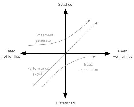
The Kano model isn’t new, and it’s been fairly widely used in software product development for a while. Developed in the 1980s by Professor Noriaki Kano for the Japanese automotive industry, the model is a helpful method to prioritise product features by plotting them on the following 2-dimensional scale:
- How well a particular user need is being fulfilled by a feature
- What level of satisfaction the feature will give users
The model is generally used to classify features into three groups:
- Excitement generators. Delightful, unexpected features that make a product both useful and usable.
- Performance payoffs. Features that continue to increase satisfaction as improvements are made.
- Basic expectations. Features that users expect as a given — if these aren’t available in a product, you’re in trouble.
Here is a visual representation of the Kano model:

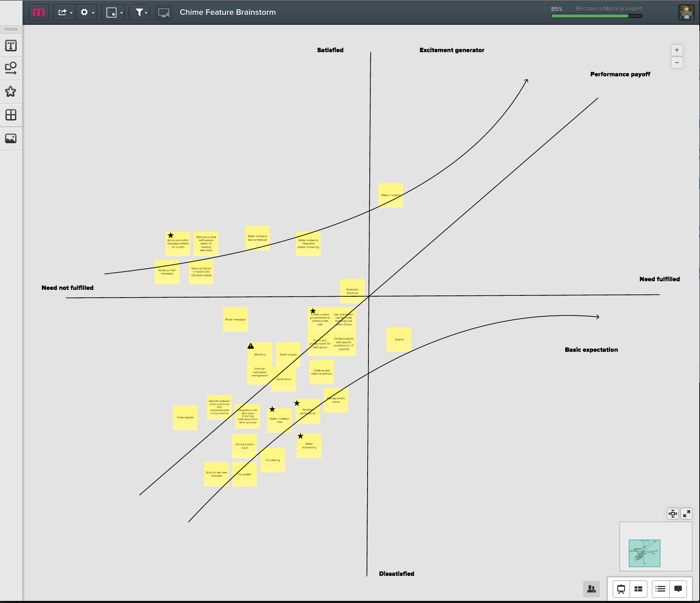
So, as we started our prioritization exercise, I drew the x and y axes on a new mural. We then listed out all the features that we’re thinking about for the next few months—one feature per sticky note. We proceeded to go through each sticky note, and discuss where it fits on the Kano model—how far are we in meeting the need currently, and how satisfied do we believe users will be once we’ve met the need better?
We ended up with something like this:

(Yes, it’s small—unfortunately I can’t show the feature details. Maybe once they’re live…)
This now becomes a great tool for prioritization and release planning. There are couple of rules of thumb I like to stick to when doing sprint/release planning:
- Make sure there is a balance between the 3 different types of features. Don’t overemphasize one type over the other.
- Start with the features with the biggest upside. For Basic expectations, that means features on the far left, where a little work would result in a big increase in satisfaction. For Excitement generators that shifts to features closer to the y-axis, since the real benefits start to kick in exponentially once you go the extra mile on fulfilling the need. For Performance payoff features the story is a little less clear since the relationship is linear, but I would still argue for starting on the far left. The sooner you can get users on the “satisfied” side of the scale, the better.
We’re still learning our way through this, but so far I’m happy with the process. It’s a model that everyone understands and can rally around, and with Mural.ly at our side we get to involve the whole team. I believe marketers call that a win-win.