I’ve been spending a lot of time thinking about how product design decisions aren’t neutral. The way we design a product has a direct effect on how people use it. This is obvious, but I think we often forget the real implication: Design wants something from its users. And we are the architects of those wants. We have a direct impact on user behavior, and we need to recognize the weight of that responsibility.
Let’s look at some recent product changes on Twitter as an example.
In October 2013, Twitter introduced more visual tweets, with photo previews within the timeline. It’s almost hard to imagine now, but before they introduced this you had to click on a link before you could see a photo.
This change had an immediate effect on how people used the product. I’m sure some of it was intentional — people began to tweet a lot more photos. Some of it was probably not intentional but still made sense: social media marketers caught on to the fact that if they attach a photo to an article tweet, they’ll get more attention since the tweet will take up more screen real estate. A little annoying, but ok, so far so good.
But then there was what must have been a fairly unexpected behavior change. People started to use screen shots of text to bypass Twitter’s 140 character limit. At first, only a few people did it. But then publishers and marketers started to notice, and it took off:
Yes, it’s crazy to share text as images on Twitter. But, look at the engagement increase: https://t.co/VRVglh6Bei https://t.co/ePo3pGtep0
— Chris Dixon (@cdixon) November 20, 2014
Some have even come up with guidelines for the best way to stand out in these “textshots”:
Following an exchange with MG Siegler a while back, I settled on a specific textshot style: sans-serif text with a sepia background pulled from Pocket. The idea of using the app’s sepia theme for these came from MG, who noticed that yellow screenshots had more contrast in Twitter’s native apps.
I’ll admit, the temptation to do this is strong. Earlier this week I used a textshot and it became my most retweeted tweet ever:
This post by @scottjenson on empathy in design is so good: “The Paradox of Empathy” - http://t.co/9mYXqWEVP0 pic.twitter.com/J3lekmt5DW
— Rian van der Merwe (@RianVDM) February 24, 2015
Nice, right? Win!
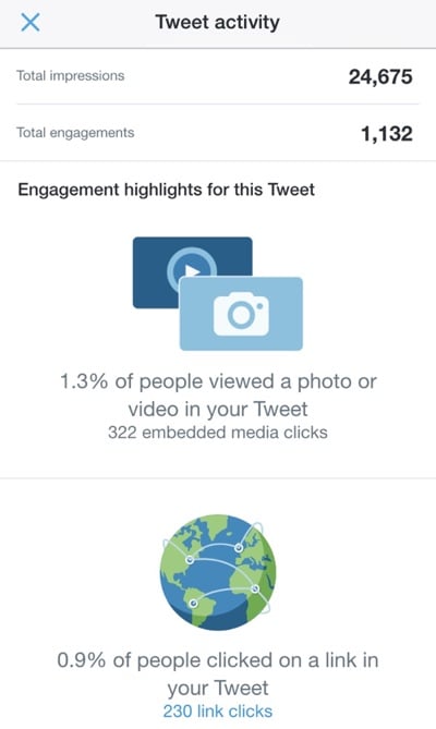
But wait… Let’s step back for a moment and have a look at the metrics on that tweet of mine:

Almost 25,000 impressions, with a 0.9% click-through rate. That’s worse than a crappy banner ad, and it’s the sum-total of the amount of traffic I sent to Scott’s excellent post. As Derek Thompson points out in The Unbearable Lightness of Tweeting:
Is the social web just a matrix of empty shares, of hollow generosity? As Chartbeat CEO Tony Haile once said, there is “effectively no correlation between social shares and people actually reading.” People read without sharing, but just as often, perhaps, they share without reading. […]
There used to be a vague sense that Twitter drives traffic, and traffic drives renown (or fame, or pride, or whatever word defines the psychic benefit of public recognition). Instead, the truth is that Twitter can drive one sort of renown (there are some people who are Twitter-famous), and traffic affords a different psychic currency. But they are nearly independent variables.
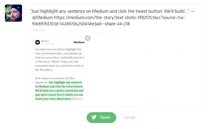
All of this culminated in Medium’s Text Shots announcement yesterday:

So there you have it. There is now a very real chance that most of our Twitter timelines will become nothing but screenshots of Medium articles that no one reads. That doesn’t help Medium, it doesn’t help authors, and it frankly doesn’t help us to experience and learn, which is kind of the point of reading. This trend does help Twitter, though. Quoting from The Unbearable Lightness of Tweeting again:
In the last month, I’ve created nearly 2 million impressions for Twitter. Whether that is good for my Twitter persona and my pride is a qualitative question whose answer resides outside the bounds of an analytics dashboard. But it is quantitatively not a good deal for The Atlantic. Something I already suspected has now been made crystal clear: 99 percent of my work on Twitter belongs to Twitter.
Twitter is a business, and impressions are how they make money, so this isn’t inherently evil or wrong. But Twitter is, if nothing else, not what we think it is. Not to get too curmudgeonly about “early Twitter”, but there was something amazing about the 140 character limit. Something about the constraint that brought out people’s creativity. And because it was all text, timelines were easy to scan. Now, all of that is different.
Putting all my personal feelings about this trend (and its implications on traffic and reading) aside, it’s time I get to the point. This fundamental change in the way Twitter is used can all be traced back to a single, fairly simple design decision back in 2013: expanding photos natively in the timeline. Without that change, none of this would have happened.
As designers we can’t possibly know how all the ways our decisions will affect behavior in a product. But we have to, at the very least, recognize that design has an opinion, and that it wants people to behave a certain way. I like the way Jared Spool phrases this:
Over the last year, we’ve started explaining design as “the rendering of intent.” The designer imagines an outcome and puts forth activities to make that outcome real.
We have a responsibility to do our best to ensure design wants things that are good for users as well as the business. We have to think ahead as much as possible, because what design wants is up to us. And once it wants the wrong things, it might be too late to change.