I’m attending the Breaking Development conference in San Diego this week, and will be posting my notes from a few of the talks here.
Luke Wroblewski kicked off BD Conf 2013 with a talk entitled “One Design to Rule Them All”. It was a bit of a State of the Nation on what’s going on in the device landscape today. Here are my notes from the talk.
- It’s impossible to determine what kind of experience we should design for by looking at standard device types (phone vs. tablet vs. laptop, etc.)
- For example, smartphones now go up to 7” screens and even a bit above.
- Tablet sizes are equally all over the map, and to make things worse, you now have devices that are basically giant desktops that can transform into tablets or even phones.
- What is the difference between a phone and a tablet anyway?
- Pixel densities are not that different any more
- Can’t reliably determine how big the device is
- Can’t rely on feature detection (like if it makes phone calls or not)
- We can no longer rely on knowing what type of device it is to figure out what to build.
- It’s not clear any more what a mobile device is, what the difference between a tablet and a laptop is, and whether it’s touch-enabled or not (see Leap Motion).
- We have to stop thinking about designing for phones, tablets, and laptops (device-specific).
- Instead, what makes more sense is to look at the ergonomics of each device:
- You get eye-sized or wrist-side devices, palm-sized devices, lap-sized devices, desk-sized devices, and wall devices like big-screen TVs
- Each of these types require subtle differences in the interfaces, which is where responsive design come in.
- This brings us to the principles of multi-device design:
- Work mobile first
- Support a continuum of screens
- Account for high resolutions
- Optimize for touch (can’t use mouse/cursor easily for touch)
- Support cursor & keyboard
- Good news: you only need one web design.
- Bad news: it’s a new and different way of doing web design.
- But wait, do we compromise the large screen experience if we go mobile first?
- No, we’re creating a good experience everywhere, and we enable people to do more things in more places.
- Look at Currys, Skinny Ties, and O’Neill as good examples.
- And what about “the mobile context”?
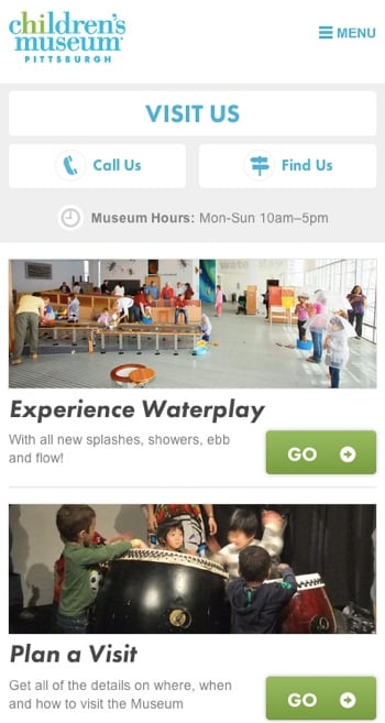
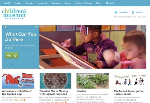
- Children’s Museum of Pittsburgh: on mobile, they bubble up relevant content like how to get there, and they deprioritize that content on larger screens.
- So you can still have one design, but use different priorities on mobile.
Smaller screens show important information about visiting like directions, hours, and contact details:

On larger screens that information is deprioritized:

It was a great high-level introduction to the conference, and I’m looking forward to the rest!