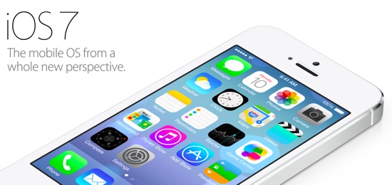
I’ve been watching the responses to iOS 7 with great interest. I’m most surprised (even though I shouldn’t be) by the extremely forceful and visceral negative reactions to the visual direction of the new OS. Most tweets about about it sound something like this:
First reaction: everything about iOS 7 feels… wrong.The typeface is hard to read, controls are totally inconsistent, and it’s flatly ugly.
— dustin curtis (@dcurtis) June 11, 2013
First, please let’s remember to give it five minutes before dismissing an entire operating system. iOS is an interface, not art. You can’t judge it without using it. You might think it’s ugly, and that’s fine. But you can’t go around quoting Steve Jobs’s “Design is how it works, not what it looks like” quote to everyone, and then get all worked up when Apple uses some colors and typography that you don’t like. If you truly believe that design is how it works, then you have to use iOS 7 to determine whether or not it works.
Also, why is it ok for startups to launch something unpolished, but when Apple redesigns their entire mobile operating system everything has to be perfect? Cap Watkins put it well in iOS 7. Unpolished By Design.:
And now we’re complaining that this completely revamped, new, version one interface isn’t perfect. Isn’t polished. Isn’t honed. We asked for a revolution and were delivered one which, all complexities considered, amounts to more than any one of our best first launches.
And then there are those who are calling this a copy of Windows Phone 8, and/or lamenting the fact that the design is flat as a board. No, it’s not. The icons might be flat, but as a design system, as John Gruber notes:
There is a profound reduction in the use of faux-3D visual effects and textures, but iOS 7 is anything but flat. It is three dimensional not just visually but logically. […] There’s a sense of place, depth, and spatiality in iOS 7 that makes it feel like hardware. A real thing, not pixels rendered on glass.
Finally, I agree with Jim Dalrymple’s assessment in Apple’s confidence:
One thing that became very clear to me early on in today’s keynote is that Apple was having fun again. They were really enjoying themselves.
And that’s a good thing. They’re finding their feet in the post-Jobs environment. So instead of tearing our clothes in despair, let’s celebrate the fact that Apple is moving forward with iOS, and that this new OS is a great new baseline for future improvements. Let’s give it five minutes.