One of the most often violated principles of visual design is, ironically, also its simplest — the principle of proximity:
Put things that are related close together, and space things that need to be seen as separate
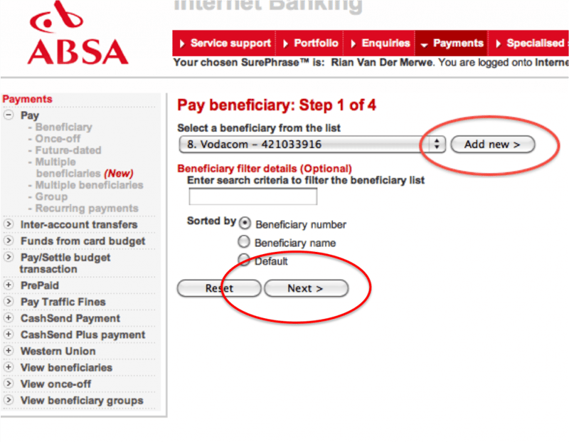
One of the more extreme and frustrating examples of this can be found on the online banking site for ABSA (a South African bank):
The problem here is that if I select a beneficiary from the list I have to click the “Next” button that is at the bottom of the screen — far removed from the action I took in the dropdown. Instead, the “Add new” button, used to create a brand new beneficiary, is in close proximity to the dropdown, and therefore gives the sense that the dropdown and the “Add new” buttons are grouped together. The solution to this problem is so incredibly simple: just switch the buttons around.
Another example I came across recently lives in Outlook for Mac 2011. Let me first say that as much as I’m not a fan of Microsoft, Outlook for Mac is still so much better than any version of Entourage, so for that I am eternally grateful. But the implementation of email search really needs some work.
Say, for example, I am looking for all emails that include the term “Clicktale.” My starting point is this text box, which states that I will be searching the current folder only. I knew that the email I was looking for wasn’t in the current folder, but on hover an additional message told me that after I searched I’d have the option to expand my scope, so I wasn’t too worried:
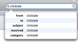
Things got tricky the minute I started searching though. As I typed, a dropdown appeared:
The email I was looking for had the word “clicktale” in the body, so none of these options applied to me. I didn’t know what to do, so I just stopped typing, wondering what to do next. Well, suddenly all email disappeared from my Inbox (current folder), so I assumed that meant the search somehow happened. But there was no feedback about this, I had to figure it out based on my knowledge of what’s in the folder and what I was looking for.
Well, ok then. Now to figure out how to expand the search to more folders. First I went down a completely wrong path. I clicked on “Advanced”, and found this dropdown:
Hmm, no good. I needed to expand to different folders, so clearly this was the wrong direction to go. I started over, and after much searching, found the “All mail” button. Can you spot it below? (Click to enlarge the picture)
Even by pointing out what you’re looking for, and removing some of the clutter in the rest of the page, I bet it took you some time to find it. Why? The design principle of proximity. The filtering action is so far removed from the search box where you type that your mind just doesn’t make the appropriate grouping.
Now, I appreciate what the designers tried to do here. Instead of presenting you with all options upfront they designed a good experience for the majority use case (searching within the same folder), and used progressive disclosure for advanced usage after the initial search is done. But by breaking the principle of proximity this results in a big reduction in usability.
These are two quick examples, but keep an eye out for proximity issues as you browse the web this week, and let’s make a point of adhering to this principle in our designs. There are so many hard usability problems to solve that we really should make use of the easy wins. This is one of them.
Read more about the proximity principle:


