Remember Plaxo? I do too, but up to now I remembered them like I remember MySpace: “That site that used to be popular for something-or-other.” But recently a bunch of people I used to work with moved to Plaxo, and they’re colleagues I respect, so I thought I’d check it out again. You know, one day. But to his credit, Preston‘s incessant tweeting about how awesome Plaxo is finally got me off my procrastinating butt to sign up for the thing.
And I am impressed.
I only signed up this morning so this isn’t really a review of the service, but I did want to make a couple of points about the sign-up process and some very effective use of microcopy. UX designer Joshua Porter has written extensively about the value of good microcopy, and so have the folks at Polon. To quote from Joshua’s post:
Microcopy is small yet powerful copy. It’s fast, light, and deadly. It’s a short sentence, a phrase, a few words. A single word. It’s the small copy that has the biggest impact. Don’t judge it on its size”¦judge it on its effectiveness.
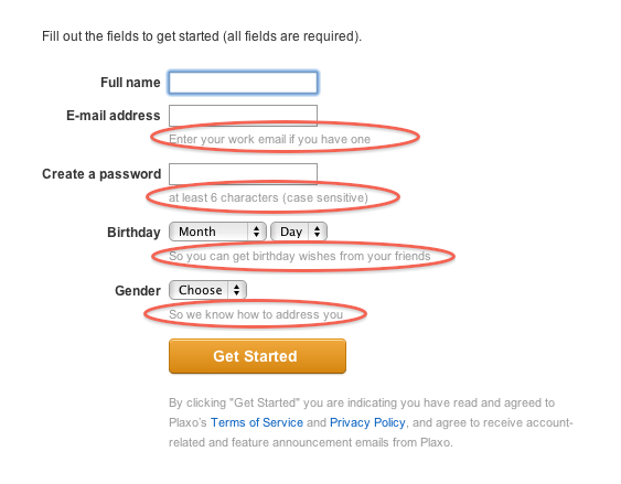
Below is the first screen in the Plaxo registration flow. I’ve circled the microcopy on the form:
The copy on Date of Birth and Gender are particularly interesting, for two reasons:
- They’re extraneous fields that you usually don’t see on sign-up forms that are optimized for maximum conversion. More fields usually equal higher drop-off, so this has the potential to be dangerous.
- In particular, these are fields that people feel a little uneasy about from a privacy perspective. People are especially skeptical about providing Date of Birth.
Plaxo does quite a few things right with this microcopy:
- Short messages to explain why the fields are required.
- Plainspoken language that is easy to understand – no legal jargon.
- The explanation is phrased as a user benefit. They want your date of birth not for some sinister reason, but so that your friends can wish you Happy Birthday. That’s good copy.
I’d love to see some data on the conversion rate of this form with and without the microcopy. Maybe Plaxo can do the user experience community a favor and run an A/B test for us? 🙂
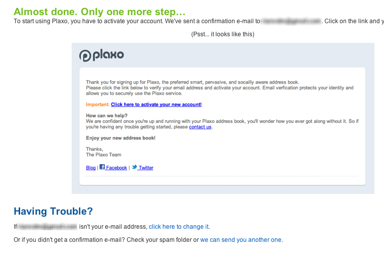
I also wanted to briefly mention the second screen in the sign-up flow:
 We’ve all seen these confirmation screens that tell us we need to confirm our email address. But I haven’t seen an image of what the email looks like on the confirmation screen before. In an age where users are terrified of fraud, this is another small detail that probably has a pretty significant impact on users’ comfort with the Plaxo service. Well done, guys.
But hey, it’s not all good. I spent about 10 minutes trying to set things up and I got pretty overwhelmed with all the information being thrown at me, so I took a break to write this post instead. I hope I’m the only one with that reaction…
