Earlier this week I was struggling, as usual, to navigate my way around our Web Analytics provider, Omniture (SiteCatalyst in particular). Specifically, I once again had to hover over every single icon in one of the views to figure out what they mean. I was looking for a specific menu item called “Add Metrics,” which ended up not being an icon at all, but rather a text link.
Anyway, in frustration I tweeted this screen shot, and implied that if your icons require users to hover over them to figure out what they mean, you’re dong it wrong:
To their credit and my surprise, quite a few people at Omniture follow mentions of the company on Twitter, so pretty soon I got this comment on the post from one of the Product Managers at Ominture:
Hi Rian - this is great feedback you have given us. We are taking steps to address your specific point in an upcoming release of SiteCatalyst. The icons will be clearer, and tool tips will not be necessary.
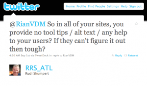
But not everyone was happy. I also received this reply from @RRS_ATL:
We moved the conversation to email, and Rudi is a really nice guy — we had a very healthy debate about the issue. I wanted to spend a little time here to summarize my thoughts on this particular issue and icon design in general.
First, let me say that I am not against tool tips and alt text when they provide additional context for text where space is limited, or more information about an element on the page. My specific issue with the Omniture icons is that they are not easily recognizable and mapped to what they actually do. That breaks an essential UI rule which states there needs to be a match between the system and the real world:
The system should speak the users’ language, with words, phrases and concepts familiar to the user, rather than system-oriented terms. Follow real-world conventions, making information appear in a natural and logical order. (from Nielsen’s 10 Usability Heuristics)
For example, as you can see in the photo above, the Omniture icon for “link to this report” has a chart and an arrow in it - that’s simply not intuitive enough.
What I am proposing in the Omniture case is one of two solutions:
- Redesign the icons to be more intuitive (which, from the PM’s comment on my post, is what they’re doing), or
- Turn them into text links (because what’s the use of icons if you have to use text to explain them?)
Icon design is hard, and I think it defeats the purpose if your icons are not easily understandable. In a great post on UX Magazine called Realism in UI design they discuss this issue in depth, and explain why it is so hard to get right:
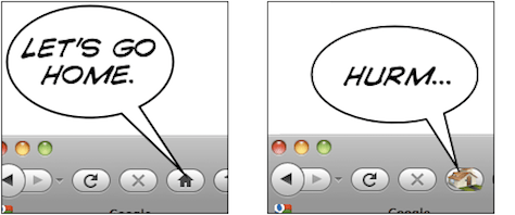
People are confused by symbols if they have too many or too few details. They will recognize UI elements which are somewhere in the middle.
The trick is to figure out which details help users identify the UI element, and which details distract from its intended meaning. Some details help users figure out what they’re looking at and how they can interact with it; other details distract from the idea you’re trying to convey. They turn your interface element from a concept into a specific thing. Thus, if an interface element is too distinct from its real-life counterpart, it becomes too hard to recognize. On the other hand, if it is too realistic, people are unable to figure out that you’re trying to communicate an idea, and what idea that might be.
This only scratches the surface of icon design, so for more interesting reading on the topic, see:
- 10 Mistakes in Icon Design
- 7 Principles of Effective Icon Design
- And for those who like their design mixed in with a little Science, there’s the excellent Icon Analysis from Boxes & Arrows.
To summarize, I stand by my view that if you have to hover over every single icon to see what it means, you either have to design better icons, or just use text. But I’m open to counter-arguments for sure… What do you think?


