This week I was in Johannesburg for the debut of Tech4Africa, a conference about web technology in the African context. It was a fantastic experience, an opportunity to learn from and meet some great people, and I will most certainly be back next year (but hey, Gareth, let’s move it to Cape Town next year!). Yes, there were the usual small conference hiccups, but nothing that can overshadow the importance and significance of this event.
The mere fact that we were able to listen to speakers like Clay Shirky, Andy Budd, and John Resig, as well as some top South African thinkers & doers, and discuss with them the uniquely challenging opportunities that exist here in Africa, made this conference a winner. The content was mostly great, but the conference was more than that — it was about being inspired and energized about being in this industry, at this time, in Africa. You should follow Tech4Africa and its head organizer, Gareth Knight, for updates on the conference. And no matter where you live, you should attend next year. This event is here to stay.
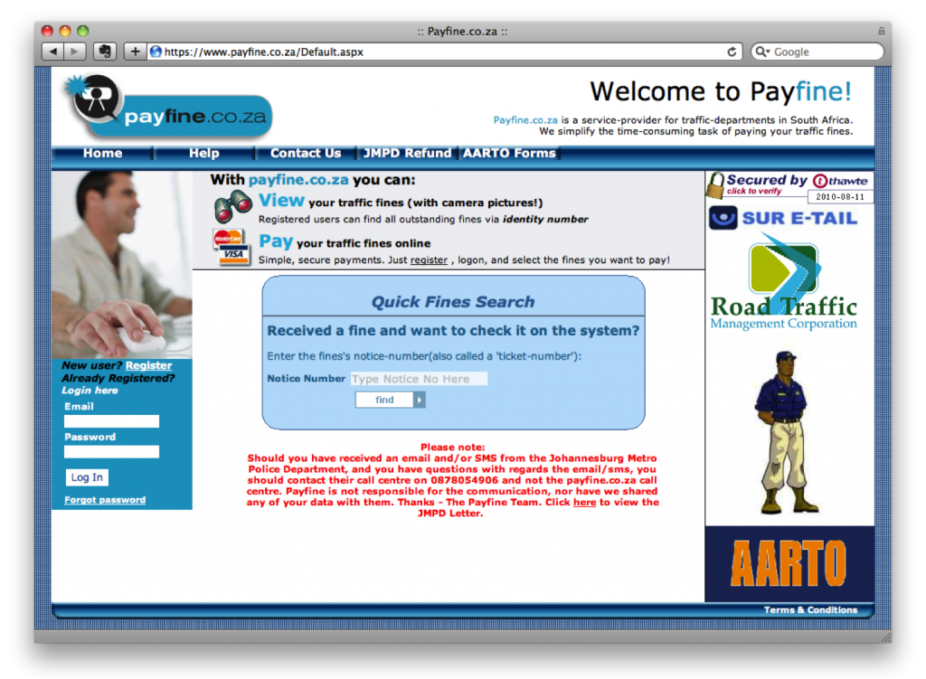
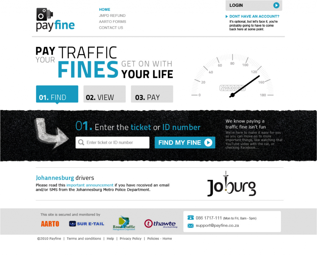
I also had the great opportunity to speak on a web design panel with Allan Kent, Basheera Khan, and Mike Lewis. We took a User-Centered Design (UCD) approach to redesigning Payfine.co.za, a web site that allows South Africans to pay the many traffic fines they get every… well… every month or so.
We’ve never met each other before the conference, and we were all in different locations. So, since we had to do this remotely and in our limited spare time, we broke the process up into three distinct user experience elements and each took responsibility for one of the tasks: content strategy (me), interaction design (Bash), and visual design (Mike). We collaborated a lot along the way, but we decided to each lead the creation of one piece of the puzzle, and then put it all together in a coherent story (this was Allan’s job!).
The end result? Well, you should judge for yourself. Here is what Payfine currently looks like:
And this is the proposed redesign:
The one thought I want to pull out above the rest about this process, is that UCD is not rocket science. It’s not easy, but it’s not rocket science. There is a process, and there are rules (they can be broken, but they help focus the design process).
But. It does require a mind shift (I hate that word — can anyone suggest something different?) in the African web space — a realization that the interfaces we currently have on our banking sites, our e-commerce sites — even our entertainment sites — are simply not good enough. And it requires a commitment by those companies to invest in the user experience of their sites, because it will have a positive effect on the business.
Below are the slides we went through during our session, which I amended to make it a little bit easier to read without the voice-over we provided. We’re all happy to answer any follow-up comments or questions on this, so please let us know if you have any. And I really want to thank the rest of the team — this has been a great experience — let’s do it again!

