This is a written version of a talk I gave at Industry Web Conference on April 23rd, 2014. It’s a great conference and you should definitely attend next year.
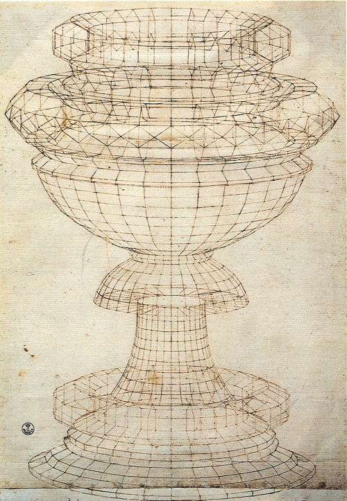
This is a photo of what many believe is the first wireframe ever created. It’s attributed to Paolo di Dono (aka Paolo Uccello), dating somewhere in the mid 1400s (source):
Back then, wireframes were used to accomplish very specific goals to help with the design of everyday objects (source):
- To view the model from any desired point
- To produce standard and auxiliary views
- To create perspective views more easily
- To analyze distances within the structure
- To check tolerances and interference
- To decrease the number of prototypes required
- To edit the model
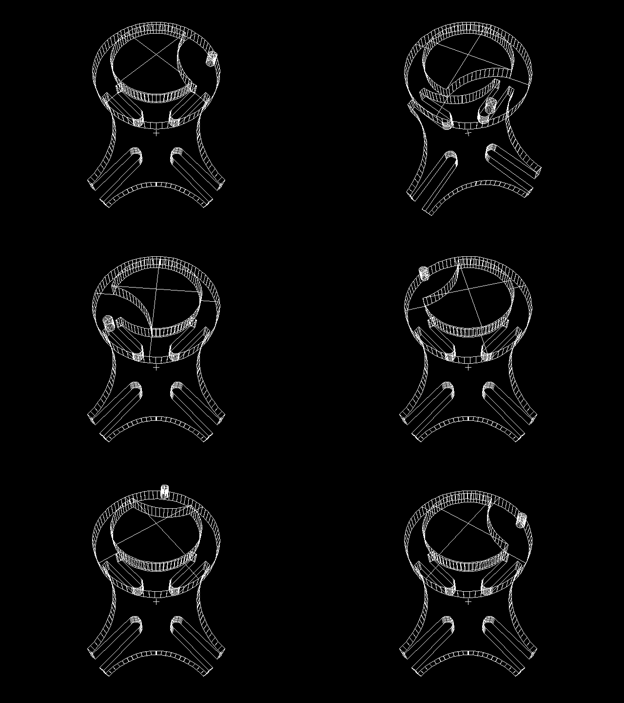
Wireframe models are particularly useful in the world of architecture, so it’s no surprise that software used to create CAD models incorporated wireframes as core to the product:
To clarify things a bit, wireframes were originally used to accomplish two product design goals: to reduce rework, and to speed up delivery. Those are words that will make any designer or developer’s ears perk up. Who doesn’t want that?
However, somewhere along the line we’ve watered down wireframes to something completely different. At worst they’re reverse-engineered artifacts based on completed PhotoShop files once an agency account manager remembers they’re supposed to “do UX” as part of the project they sold. At best they’re hailed as good communication tools — nothing more, nothing less. We’ve managed to reduce a highly useful design tool to something we fight over on Twitter. And it’s not just the humble wireframe that’s in the crosshairs. Personas. PSDs. Debrief presentations. They’re all looked on with the same disdain:
The reality is that there is a lot of truth to the criticism we lavish on “deliverables”. The Lean movement is right about the main reason for getting out of the deliverables business — whatever time we spend documenting stuff is time spent we’re not making stuff, and that’s a problem. It’s much better to create hypotheses, build them quickly, and test them with users to get feedback and iterate. I’m in complete agreement on that approach.
That said, there is a problem with this approach that has started to become more and more bothersome as I went on my own journey to stop making deliverables. The problem is that design is path-dependent. The choices we make early on in a design constrain the choices we can make later on. Ryan Singer sums this up really well in his answer on the Quora thread Should I focus on a good user experience, or push something out quickly?
On the very first iteration the design possibilities are wide open. The designer defines some screens and workflows and then the programmer builds those. On the next iteration, it’s not wide open anymore. The new design has to fit into the existing design, and the new code needs to fit into the existing code. Old code can be changed, but you don’t want to scrap everything. There is a pressure to keep moving with what is already there.
Our early design decisions are like bets whose outcome we will have to live with iteration after iteration. Since that’s the case, there is a strong incentive to be sure about our early bets. In other words, we want to reduce uncertainty on the first iterations.
So the main issue I kept running into as I stripped deliverables out of my design process is: how do I know where to start? How do I make sure I start in a place that isn’t going to limit me so much that I’ll have to start over completely at some point? And not just that, but what about that thing we all want to pretend doesn’t exist but we have to deal with every single day? You know, the S word. Stakeholders. Those people who need to know what’s going on and why, all the time. Without deliverables we’re kind of exposed to the elements on that, with nothing to lean on.
Something’s gotta give, and I think that something is the deliverables we make part of our design and development process. So I started thinking.

I started thinking about Jared Spool’s excellent piece from earlier this year, A Bias For Making, in which he wrote the following:
A bias for making doesn’t mean the team never plans. On the contrary, plans happen fluidly throughout the entire design process. The difference is they are evolving as the team learns from the process of making.
And then I started thinking about Giff Constable’s words in You Are Spending 3x-5x More Than You Should:
Agile/lean has helped people debunk the ‘big upfront design’ phase, but far too many replace it with nothing.
And as I kept thinking about all this stuff, I started to realize that there are some things that the right deliverables could actually be good at. For example:
- Deliverables could provide a better baseline to start a design from, particularly when it comes to device-agnostic design and development.
- Deliverables could help teams running along smoothly by anchoring everyone on the same vision, and serving as a communication tool to help executive teams understand the execution plan.
- Deliverables could help with building up organizational memory, so that when the inevitable leadership changes happen, everything doesn’t get scrapped to start over.
Of course, the next obvious question is, what are these right deliverables you speak of? If we’re all agreed that flat wireframes and millions of PSDs are against the spirit of Lean, what’s the alternative? How do we solve the problems that “no deliverables” present, and come up with something that helps us create better products (which is the end goal we all have in common)?
There are two kinds of deliverables that I’ve been working on as possible (work-in-progress) solutions to these issues, and in this post I’d like focus on one that clearly needs a better name: Expanded Customer Journey Maps.
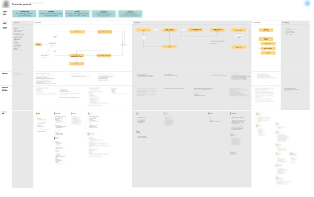
Journey maps are visual representations that help summarize research, highlight and prioritize user needs and opportunities, and give teams a common goal to work towards (see Adaptive Path’s excellent introduction at The Anatomy of an Experience Map). A product’s journey map is important because:
- It confirms a common understand of the users’ needs and goals, and the strategy you intend to follow to attend to those needs and goals.
- It is an excellent prioritization tool, since it allows companies to focus on the most important parts of an experience first, without losing sight of the overall picture.
- It is a guiding light for design. Every time a design idea comes along, a quick glance at the journey map helps us figure out if it’s a good idea that will accomplish the chosen strategy.
- It is an excellent conduit for content-first design, which fits in perfectly with responsive design approaches.
There are many different ways to create a customer journey map. It has some common elements, such as a visual representation of customer touchpoints, emotions, and key takeaways throughout their experience with a product. But that’s only useful up to a point, so we’ve started to expand on the concept. In addition to the usual elements, this document also becomes a representation of the information architecture and the product’s content plan, with personas (needs, goals, scenarios) serving as the starting point for everything — the glue that ties it all together.
This new document is a summary of everything we need to know to design the best possible product for users. It has the following elements:
- Unique selling points to keep us focused on what the site needs to communicate at all times. This comes straight from the persona needs and goals.
- Journey stages and model to remind us how the product fits into people’s lives, and what the primary calls to action need to be throughout the site. This section is a visual representation of a customer’s journey from realizing they might have a need for the product, until long after they’ve used it. This helps product managers keep a holistic view of the entire product and how it fits into users’ daily lives.
- Questions that our target personas are likely to ask in each phase of the journey, to focus the type of content we serve on each page. In an e-commerce context, these are questions like, “Can I trust this retailer?” or “When will my stuff arrive?”
- Takeaways and key principles to summarize the unique selling points, journey model, and user questions, and document how they translate into the design decisions and solutions we need to keep in mind throughout the design process.
- Content plan that maps each phase of the journey with the questions our personas will ask during that phase, and what it means for the specific content that needs to go on each page. We get very specific here — nothing gets on the page unless it’s in the content plan. And if we can’t identify a persona that would find the content useful, it doesn’t go on the list.
Below is an example of an expanded journey map. You can click through to see a larger slice of one of the sections.
There are a few things that we found this kind of expanded customer journey map does really well:
- It is completely device-agnostic. It starts with personas and content, and the entire design remains anchored on that.
- Once you get going, design cycles happen faster, because everyone is aligned on the vision and direction.
- During user testing we tend to find fewer usability issues because we already thought through the most common problems that might occur.
- As a team we tend to have better arguments — meaning we don’t fight about whether the button should be blue or yellow, but whether the design accomplished the goals we agreed on.
It’s not a perfect solution, of course. Everything has drawbacks. In the case of expanded journeys, we’ve found the following challenges that we still need to work through:
- There’s no denying it, the initial lead time before design starts is longer. That’s just the way it is, because thinking about a problem takes time. Once the design phase starts we actually make up that time in spades, as mentioned above, but it can still be an awkward time with clients and internal stakeholders if they can’t see “pictures” as quickly as they might want.
- It’s easy to get distracted if you’re a UX nerd. This stuff is so exciting for some people (ok, me) that it’s possible to stand in front of that white board for days if you don’t check yourself. This isn’t about making a nice piece of paper, it’s about making a better product. Give it your best shot, and then move on. Don’t get lost in analysis paralysis.
So where does this leave us? Yes, deliverables can slow us down and result in documentation that no one reads. But the right deliverables anchor teams in a united product vision, they provide early validation for product ideas, and they speed up (the right) making activities. That’s worth the drawbacks for me. Remember, deliverables aren’t bad. Bad deliverables are bad…
This is still a work in progress. I’d love to hear others’ thoughts on this methodology, and if they’ve expanded it in other directions. If you have thoughts or ideas please let me know on Twitter, or write a post and send it to me. I’ll link to it here.
