Menu

The value of Design Research

Jan Chipchase is writing a series on Design research in big corporations. In Part 2: A Backgrounder for Corporate Design Research he succinctly captures the benefits that Design research methodologies have over traditional Market Research methods:

The basic premise of design research is that spending time in the contexts where people do the things that they do can inform and inspire the design process with a nuanced understanding of what drives people’s behavior “” which can then be used as a foundation for understanding and exploring the opportunities for new products and services.

I don’t think you can overstate the value that in-person, observational research brings to product design.

No shortcuts to perfection

From Made Better in Japan:

“My boss won’t let me make espressos,” says the barista. “I need a year more, maybe two, before he’s ready to let customers drink my shots undiluted by milk. And I’ll need another whole year of practice after that if I want to be able to froth milk for cappuccinos.”

I’d say most of us look for shortcuts to becoming really good at what we do, when in fact all we need is lots of time and practice.

Don’t believe the rumors: User Experience Design is alive and well

I’ve never seen an industry as intent on un-defining itself as the field of User Experience Design. There’s a long list of articles proclaiming the death of this term that most us identify with at the moment. Just in the last few weeks we saw articles like User Experience Design is Dead; Long Live User Experience and Can We Drop the Term UX Design Already?.

I understand and appreciate the arguments these designers and writers are trying to make, but as someone who teaches introductory courses on User Experience Design, this plead to call ourselves something else (or nothing at all) is problematic. To people new to the industry, the term User Experience Design makes sense once the basic elements are explained to them. Even with all the arguments against it, many of us don’t have the luxury to wait around until we come up with a better way to describe what we do. So I’m going to go the other way and do something decidedly uncool: I’m going to spend time defining User Experience Design.

This short post is my simplified definition of User Experience Design, meant as an introduction to those who come to it from other areas of expertise. It’s not exhaustive by any means, but I find it useful in getting people into the flow of what we do, and interested to learn more. That said, I’d love to hear from you if you think I’m missing something, so please send me a tweet or an email if you have something to add – or, of course, write a response on your own site so we can all share in the discussion.

So, here we go.

User Experience Design, defined

User Experience Designers solve problems by uncovering user needs and helping to create products that meet those needs. If you break it down to its most basic level, Design is a set of decisions about a product.

The diagram below shows the primary elements that make up the process of User Experience Design.

The elements of User Experience Design

Strategic foundation

To provide a solid strategic foundation, User Research is a set of methodologies focused on users’ interaction with a product. Through mainly observational, task-based techniques, user needs and usability issues with a product or idea are uncovered.

Product Discovery uses the learnings from User Research, among other things, to ensure the right product is being built for the right users. By framing the problem, exploring multiple solutions, and then prioritizing and planning for the implementation of the best solutions, Product Discovery lays down the guiding principles for the product that is being built.

Structural interior

The inner workings of a product usually has three main components.

Information Architecture maps out the paths between the different pieces of information on a site. We usually associate Information Architecture with site navigation, but below the surface there are activities such as information organization, information relationship building, and customer journey mapping that form the backbone of a usable product.

Content Strategy plans for the creation, delivery, and governance of content. This doesn’t mean that we should always have content ready before we design, but we should at least know how the content will be structured. If done right, this usually includes a non-dickish SEO strategy.

Interaction Design defines the structure and behaviors of interactive products and services, and user interactions with those products and services. The outputs of Interaction Design are artifacts like flow diagrams, wireframes, and prototypes. Interaction Design is mostly concerned with layout, structure, and flow; not typography, colors, and aesthetics.

Sensory Exterior

Once the structure and flow of the product has been defined (and even while that’s still happening), we get to work on the part that most people associate with the word “Design”.

Visual Design is the art and profession of selecting and arranging visual elements — such as typography, images, symbols, and colors — to convey a message to an audience. The goals of visual design are to set the visual hierarchy of a page or flow, and elicit appropriate emotional responses about the product.

The Complexity at the Other Side

Once we understand the basic concepts of User Experience Design, the journey can start. True User Experience is more than the sum of these parts. It’s a “seamless merging of the services of multiple disciplines, including engineering, marketing, graphical and industrial design, and interface design” (from the NN Group definition) to provide efficient and enjoyable experiences to users. This takes time, continuous practice, and an understanding that we’ll never know everything there is to know about Design. But keeping these basic elements in mind ensures that we never think of Design as just eye-candy, or something we tack on to the end of a development process. Without these building blocks, the house collapses.

Learning to code is learning to think

Kyle Baxter in Programming Literacy:

I love the trend toward trying to teach people who aren’t going to necessarily develop software for their occupation how to think like programmers do. The sort of things you learn “” breaking a larger problem down into smaller problems, thinking very precisely and step-by-step, thinking about things as a system “” are skills that are widely applicable and useful. It teaches you how to analyze a problem, how to move from “we want this accomplished” to “to accomplish this, we are going to break it down into these pieces,” and it teaches you how to see how systems work. Both are incredibly powerful.

Baxter makes a good point that’s often missed in the “Should Designers learn to code?” debate. In many cases, learning to code is not about being able to build products. It’s about learning how to think better. And that’s a skill that we all need.

The real problem with Comic Sans

My wife recently asked me why designers hate Comic Sans so much. I waffled my way through an answer with phrases such as “abomination” and “hideous atrocity”, but I just sounded like I have some deeply buried psychological issues that will take years of therapy to address. Well, I’m happy to say that I’ve found the perfect answer to this question – and in the most obvious place: Robert Bringhurst’s The Elements of Typographic Style:

Letterforms have tone, timbre, character, just as words and sentences do. The moment a text and a typeface are chosen, two sets of habits, or if you like, two personalities, intersect. They need not live together contentedly forever, but they must not as a rule collide.

Letters are microscopic works of art as well as useful symbols. They mean what they are as well as what they say.

Typography is the art and craft of handling these doubly meaningful bits of information. A good typographer handles them in intelligent, coherent, sensitive ways. When the type is poorly chosen, what the words say linguistically and what the letters imply visually are disharmonious, dishonest, out of tune.

So the next time someone asks me about Comic Sans, I will simply pull out this quote and talk about the disharmony between the typeface and the text it tries to represent. Well, unless it’s a lemonade stand poster.

No Comic Sans please

(image via PassiveAggressiveNotes.com)

The thinness of digital work

Gruber already linked to this, but I can’t help myself – I have to do the same. Craig Mod wrote one of my favorite essays of the year so far in The Digital↔Physical: On building Flipboard for iPhone and Finding Edges for Our Digital Narratives. It’s an essay that makes me elated and jealous at the same time – which is what all great writing makes me feel like. Elated that someone was able to capture an emotion we all feel on a subconscious level, but no-one has been able to describe accurately – until now. And jealous, because damn – I wish I wrote this:

Ther’s a feeling of thinness that I believe many of us grapple with working digitally. It’s a product of the ethereality inherent to computer work. The more the entirety of the creation process lives in bits, the less solid the things w’re creating feel in our minds. Put in more concrete terms: a folder with one item looks just like a folder with a billion items. Feels just like a folder with a billion items. And even then, when open, with most of our current interfaces, we see at best only a screenful of information, a handful of items at a time.

He goes on to describe some of the unintended consequences of digital work:

When all the correspondence, designing, thinking, sketching “” the entirety of the creative process “” happens in bits, we lose a connection. It’s as if all that process is conceptually reduced to a single point “” something weightless and unbounded. Compounded over time, the understanding of where one is as a creative in a digital landscape collapses to the just-a-little-while-ago, the now, and maybe the tomorrow.

I won’t spoil the solution he came up with. Just go read the story.

Pinterest and Instagram: effortless sharing in a post-literate society

Alistair Fairweather wrote a good article about Pinterest and Instagram called A picture gets a thousand likes. He presents a theory on why these sites are so popular:

But what unites Pinterest and Instagram is their simplicity. You can add photos, comment on them and “like” them. That’s it. No apps, no games, no location based check-ins – in short, no clutter.

I agree with Fairweather on the role simplicity plays in the rapid rise of these networks. He goes on to link these sites to creativity:

But what both Pinterest and Instagram tap into is our almost universal need to create. With Instagram this is more literal: you take a photo of your surroundings and share it with the world. With Pinterest you are essentially sharing someone else’s images – but the act of choosing is a form of creativity. Pinterest users compete to construct the most beautiful mood boards, agonising over which photos to include and exclude.

I agree that it’s a need to create that drives people to these sites, but I think they’re successful because they provide a platform that’s built on a very effective false promise of creative pursuit.

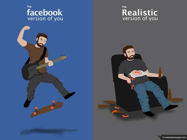
I believe these sites give users the illusion that they’re creating something without the necessary work that is required to make something good. Sharing pictures is effortless. And if we know anything about online behavior, it’s that people hate doing actual work when they can just click a button instead. In fact, Mashable recently said the following about Facebook’s “frictionless sharing”:

Facebook felt constrained by the Like button because it was an implicit endorsement of content. Facebook wants users to share everything they are doing, whether it’s watching a show or hiking a trail, so it decided to create a way to “express lightweight activity.”

So in essence they’re saying that clicking the Like button is too much of a commitment for people; the action is too heavy. In their view, we need something a little more indifferent and “lightweight”. Pinterest and Instagram are sufficiently “lightweight” when it comes to sharing. You just pin a photo, or if you’re really ambitious, you take one and apply a filter to it. You could argue whether or not that action constitutes “a form of creativity”, but I’m pretty sure which side of that argument Tolkien would have taken.

So why is this a big deal? I fear that the behavior on sites like these is moving us ever closer to a post-literate society:

Literacy: the ability to read and interpret the written word. What is post-literacy? It is the condition of semi-literacy, where most people can read and write to some extent, but where the literate sensibility no longer occupies a central position in culture, society, and politics. Post-literacy occurs when the ability to comprehend the written word decays. If post-literacy is now the ground of society questions arise: what happens to the reader, the writer, and the book in post-literary environment? What happens to thinking, resistance, and dissent when the ground becomes wordless?

When we start talking in pictures and likes only, don’t we lose our ability to think and argue? I hope not, but scanning through Instagram and Pinterest feeds I have to wonder if this is where we’re headed. Instead of pinning pictures, my vote is that we all start writing 500 words before 8am instead.

Where have all the Information Architects gone?

Lis Hubert wrote a thought-provoking piece for UX Magazine called The De-Evolution of UX Design. The link-bait title put me off a bit, but I’m glad I stuck with it. It’s a well-written article that you won’t be ambivalent about – you’ll either agree strongly, or disagree strongly. In essence, Hubert laments the decline of the Information Architecture function in UX:

It’s been seven years since I took that first step into IA, and, sadly, it seems that the practice of understanding and prioritizing information before designing the interface has been abandoned. And because of that, we are facing a huge problem in the world of UX, which is, simply put, that we are devolving.

She goes over the problems of skipping the IA phase, and then offers some solutions. Her point is in line with the thoughts I shared in my World IA Day talk called A lack of UX purpose (and what we can do about it):

It seems that ther’s unfortunately plenty of UX work out there that jumps straight into wireframes without first understanding the design problem, as well as the purpose of the solution. Purpose ““ the reason for which something is done or created ““ often appears to be missing. And this is where I believe Information Architecture can come to the rescue.

So, needless to say, I’m in the strongly agree camp on Hubert’s article. But maybe you won’t be, so definitely give it a read.

More

  1. 1
  2. ...
  3. 171
  4. 172
  5. 173
  6. 174
  7. 175
  8. ...
  9. 195