Menu

What I learned about design in 2012

One of my favorite articles of 2011 was What I Learned About the Web in 2011 on A List Apart. In particular, Erin Kissane’s call to respect complexity stayed with me all through 2012:

If a single idea has followed me around this year, from politics to art and work to friendships, it’s been this one: “it’s more complicated than that.”

It’s centrally important to seek simplicity, and especially to avoid making things hard to use or understand. But if we want to make things that are usefully simple without being truncated or simplistic, we have to recognize and respect complexity—both in the design problems we address, and in the way we do our work.

So it was with a sense of great surprise and gratitude that I responded to a request to participate in the 2012 version of that article, What We Learned in 2012. The section I wrote is entitled “Confidence versus humility”, and in a sense, it’s a continuation of Erin’s plea in 2012:

The biggest thing I learned last year is that the two most important characteristics of a good designer are ones that, at first, appear to contradict one another.

I won’t quote the section in full, because I’d love for you to check out the whole article. There are some real gems in there from a bunch of designers and writers I really admire.

The growing complexity creep in Apple’s products

It’s a somewhat uneven article, but Dave Wiskus makes some good points in The secret of Apple’s design success: the humane interface. I did get a bit uneasy when I got to this part:

Where Apple differs from its competition isn’t in aesthetic beauty, it’s in the company’s ability and willingness to make decisions on behalf of its users. […] Apple’s take is to remove complexity and make choices long before the user sees the product.

It’s an argument that’s often used by Apple fans to defend the “Apple prison” accusations — I’ve used this line of reasoning myself. But here’s the thing — and I’m saying this as a die-hard Apple fan — even though this used to be true when the iPhone and iOS first came out, I don’t think our argument holds water any more. We’re starting to see more complexity sneaking into iOS and Mac OS X, and even though the veneer of simplicity is still highly visible, there be trouble beneath the surface.

And then I read Federico Viticci’s excellent interview with John Siracusa, in which John sums up the situation perfectly:

Simplicity is great, as iOS has shown. But there’s a difference between conceptual simplicity and visual simplicity. Just hiding controls does make things appear simpler, but it doesn’t actually make them any simpler. The complexity is now just hidden. Similarly, removing features that few people use is a good idea, but like any good idea, it can be taken too far. At a certain point, you’re just making your application worse for everyone, even new users.

You can’t always tweak or refactor an existing application into the beautiful thing you’re envisioning. Sometimes the only way to achieve true simplicity is to start over with a new concept for the whole app.

The first iterations of iOS and Mac OS X were great because they did just that — they started over with a new concept. But complexity creep is inevitable, and the big challenge for Apple now is how they’re going to manage that. Jonathan Ive’s influence will certainly help, but perhaps there’s even a case to be made for (gasp!) borrowing a page from Google’s playbook.

The power of good distractions

In The Redemption of Distraction James Shelly goes into the etymology of the word “distraction”. He points out that the original meaning implies being “pulled away” from something, so the word doesn’t always deserve its bad reputation. Being pulled away from less valuable activities to focus on something with more value could be quite useful to increase productivity:

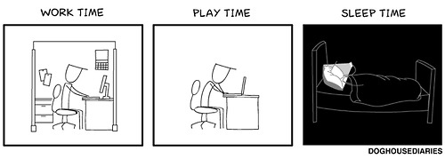
Perhaps we ought to get over our cultish demonization of distractions so that we can effectively utilize them. Perhaps we would benefit from instituting better distractions — not necessarily less of them. Perhaps the spreadsheet, artwork, or document before us needs its own interval or chime. Perhaps eliminating so-called ‘negative’ distractions is only half the story: a monastery is designed to eliminate interruptions, and yet sights, sounds, and smells are still employed to ‘pull away’ one’s focus from intruding, wandering thoughts. Such a place does not provide the absence of distraction, it utilizes distraction. Intentional distractions ‘pull away’ our thoughts from useless tangents, in order to ‘contract’ our focus back where we want it.

Of course, these days, most of our distractions are more destructive than they are productive. Jean Jullien sums it up nicely:

Never alone

The future of PSD deliverables

In The Post-PSD Era: A problem of expectations Dan Mall continues a Photoshop discussion started by Brad Frost a few days ago. Dan’s conclusion is worth pondering:

As an industry, we sell websites like paintings. Instead, we should be selling beautiful and easy access to content, agnostic of device, screen size, or context. If you can get your client to believe in the sales process that you’ll do that for them, they won’t care what the site looks like.

I agree with Dan’s viewpoint on what we should sell to clients, but not that they won’t care what it looks like. They always care. A little earlier in the post Dan says this:

I don’t think we’re in a post-PSD era, but I do think we’re moving towards a post-“full-comp” era.

Now that I agree with completely. At Flow our deliverables to clients have increasingly moved away from a PSD for every page on the site, to a combination of clickable prototypes, style tiles, and PSDs for key pages. Developers and Product Managers love this because they can play around with the prototype to see how the site/app works, not just what it looks like. Other decision-makers love the style tiles in particular, because it allows them to guide what the site looks like without getting distracted by the intricacies of the interaction design (which requires a different type of discussion/feedback cycle).

In other words: we should sell clients on our design process, agree upfront on what deliverables will help them accomplish their goals, and make the appropriate amount of PSDs part of those deliverables as needed.

The role of intentionality in good design

Julie Zhuo discusses some characteristics of bad designers in 7 Reasons to No-Hire a Product Designer (Part I). This point stood out for me:

Look for hints of random decision making. Good designers do not do things randomly, or for the hell of it, or just because it seemed cool.

This ties in well with Rebekah Cox’s definition of Design in her Web2.0 Expo Presentation:

Design is a set of decisions about a product. It’s not an interface or an aesthetic, it’s not a brand or a color. Design is the actual decisions.

The thing is, if you don’t follow a rigorous design process that identifies user needs, explores different solutions, iterates collaboratively, etc., you’re still making decisions about the product. You’re still designing. But your sins of omission will result in implicit, subconscious decisions that have a high likelihood of being wrong. This is why what Julie calls intentionality in her post is so important. Design decisions should always be deliberate and defendable, not random and accidental.

To carousel, or not to carousel

The use of carousels in web design has become quite the controversial topic. Brad Frost takes it on very well in his post Carousels. He starts by explaining that in most cases, it’s not a good idea to use carousels, because of reasons like this:

From universities to giant retailers, large organizations endure their fair share of politics. And boy does that homepage look like a juicy piece of prime real estate to a roomful of stakeholders. It’s hard to navigate these mini turf wars, so tools like carousels are used as appeasers to keep everyone from beating the shit out of each other.

It’s far harder to have an honest content strategy conversation and determine what truly deserves to be on the homepage.

Brad goes further to give some good tips for improving the UX of carousels — if you really need to use them. For more, also check out Peep Laja’s roundup of thoughts and research on carousel usage at Don’t Use Automatic Image Sliders or Carousels, Ignore the Fad.

Startups, failure, and focusing on customer problems

Peter Matthaei wrote down some thoughts on failure, startups, and product development in ALL THE USE CASES. He makes some good points, like this one:

Every great company started by being great at solving just a single problem. Quite often, a very humble one. But they solved that one problem incredibly well, picked up momentum, and with large doses of relentless ambition, good timing, vision and luck kept on going.

Dropbox is, of course, the poster child for this line of thinking. One of my favorite Quora answers is still Michael Wolfe’s response to Why is Dropbox more popular than other programs with similar functionality?:

“But,” you may ask, “so much more you could do! What about task management, calendaring, customized dashboards, virtual white boarding. More than just folders and files!”

No, shut up. People don’t use that crap. They just want a folder. A folder that syncs.

I would add that I think the problem with most startups is not necessarily that they’re trying to solve too many problems; it’s that they’re trying to provide solutions to problems that don’t exist. I love this quote from Pragmatic Marketing in their post Who Needs Product Management?:

It is vastly easier to identify market problems and solve them with technology than it is to find buyers for
your existing technology.

My thesis continues to be that the single biggest cause of startup failure is focusing on finding buyers for cool technology, as opposed to identifying (and fully understanding) market problems first.

2013: the year of social network quitting

I can’t shake this feeling that this might be the year that quitting social networks goes mainstream. We’re not even through January, and already the posts are flooding in. Here’s Brent Simmons in Brave new network: Why I hope Apple never releases a smart watch:

I want to stay human, in other words. I want to like things in the thousand different ways there are to like things, rather than just click on a Like button. I want to say and think things that take more than 140 characters.

I want to not take a photograph, because no picture, no matter how beautifully filtered, can express what it’s like for one person to walk in the woods alone. I need to remember.

And here’s Keri Maijala in Why I’m not on Facebook:

I felt bad about myself after browsing Facebook.

I get that Facebook is like a reverse funhouse mirror that makes everything look better. It’s a sublimely distorted world filled with families and trips and drinks and straight white teeth. And I was just as guilty of perpetuating that myth, carefully choosing photos and crafting updates that supported how I wanted to be perceived: Happy, healthy, independent, adventurous, courageous, and with straight white teeth. Only half of those things are true. And ultimately, I found I felt depressed after browsing Facebook.

Or as Alex Charchar said on Twitter recently, we’re starting to get bored by our distractions. I think that’s a good thing, though. Boredom leads to creativity.

More

  1. 1
  2. ...
  3. 134
  4. 135
  5. 136
  6. 137
  7. 138
  8. ...
  9. 196