I just got back from a week of Product Management/UX training and consulting in Tehran, Iran. I am still trying to process it all, but I consider it one of the highlights of my career. What I experienced in Iran is so different from what I expected that it feels like I’m dealing with some kind of assumption whiplash that I’ll need quite a bit of time to recover from. But I want to write down my thoughts before I forget some of it, so here goes.
I’d like to use this post to discuss both the work that we did, as well as the cultural experience. I think the best way to do that is to take it day by day and go through how my impressions were moulded through each day’s interactions. It’s a long post, but I think this is important. Because if you’re anything like I was before this trip, you have a completely wrong impression of Iran.
How it happened
I was brought over to Tehran by Sarava, the first VC fund focused on investment in technology startups in Iran. Their Founder and CEO, Said Rahmani Khezri, has a vision for the company that I can completely get behind. He finds smart entrepreneurs in Iran, and then he invests heavily in their skills to help them build up their businesses. Said recognized a big need for Product Management and UX training, so Sarava approached Flow to see if we could help.

After months of planning, and almost running out of time trying to get my visa approved, I got on a plane to Tehran on Sept 27th. Our plan was to do 4 days of training, followed by 2 days of usability testing and analysis on two of Sarava’s investments, Beeptunes (online music buying) and Digikala (Iran’s biggest e-commerce site). We also planned the trip around the UX Tehran event, so that I could deliver a talk there.
I knew it was going to be a full week, but I didn’t quite expect how intense it would be. After 6 very long days I was exhausted but exhilarated, and my mind still can’t stop spinning.
Day 1
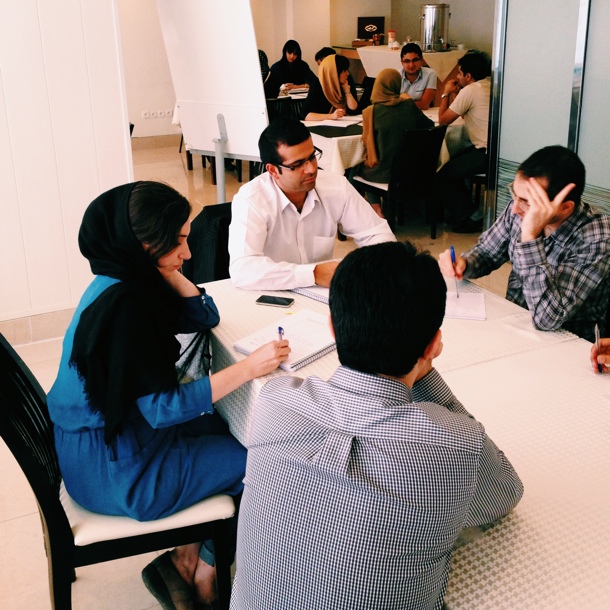
The training was attended by about 16 people, representing 5 of Sarava’s investments. All the attendees were entrepreneurs heavily involved in their businesses, so it was a big commitment for them to take 4 days out of their work to attend this training (no pressure!).

We spent the first two days on Product Management training, discussing the details of product planning and product execution. I was quite apprehensive going into the first day. I wasn’t sure if the material would connect with people, and I was especially worried about the language barrier. But it went exceptionally well. In fact, we were miles behind after the first day, because we got completely stuck on customer journey maps. The group just didn’t want me to move on until they understood completely.
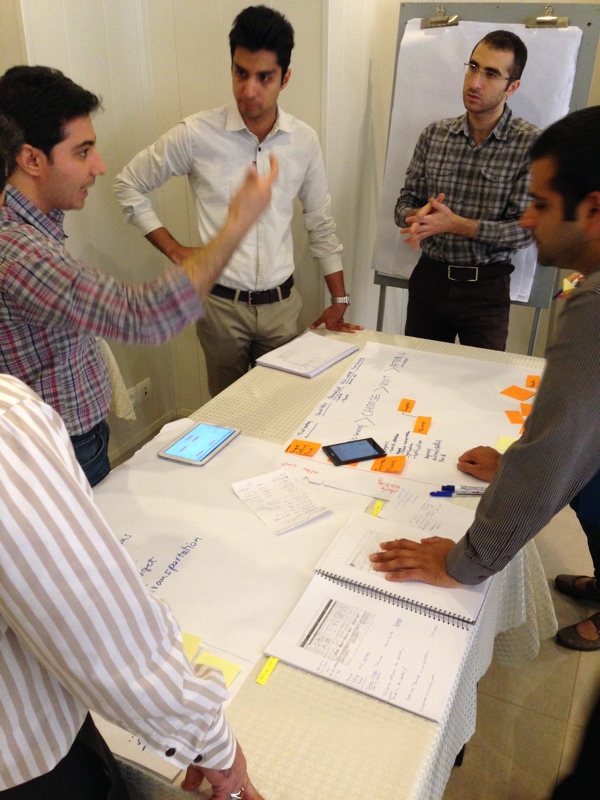
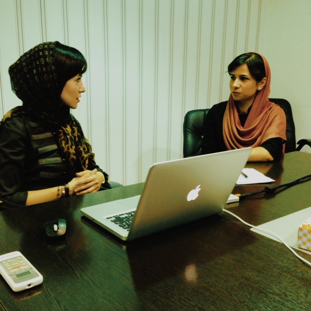
So we spent a lot of time on the nuts and bolts of customer journey maps, and then I gave them “homework” to go read a bunch of articles about it before coming back the next morning to work on their own journey maps. Here’s one team arguing passionately about their journey map:

Day 1 was my first clue that Iran is not what I expected, and that this was a very special group of people. I immediately saw that Tehran has a small but passionate startup community who are determined to move the web forward in Iran. They challenged me with their questions, and they took to the group work with more enthusiasm than most places I’ve done training. From that first day I felt privileged to be part of this movement.
That night I had dinner with some people my age (30s), and it was amazing to hear their perspectives on living in Iran. Many of the people in our course have lived abroad — London, Canada, US. But they came back because they love Iran and want to contribute to its growth.

Interestingly, none of the women I spoke to about life in Tehran feel oppressed. When men discriminate against them, they don’t take it personally. They just laugh it off as the behaviour of an uneducated, older generation. They are all highly skilled and educated, and they don’t feel any more discriminated against in Iran than they did in their corporate jobs in London or elsewhere in the world.
This generation remains extremely frustrated that the world has such a warped view of Iran, and they are determined to change this view, even if they do it one person at a time. It certainly worked on me, from the moment I stepped off the plane.
Day 2
Day 2 of our training kicked off with more work on customer journeys. I had to adjust my methods and content a bit to adapt to how the group learned. They ask a lot of questions, and take nothing at face value. It’s not that they don’t trust the material. They just want to understand how it works completely so that they can use it on their own products. Here’s a 15s video of one team discussing their journey map:
I also quickly realized that I wasn’t going to get any rest. The group has both an insatiable thirst for knowledge, as well as unlimited stamina to keep working and working and working until they’re satisfied with the result. We went from 8am to 6pm most days, and then they had homework most nights as well. No one complained, ever.
Day 3
Day 3 was another roller coaster ride of a day, starting with an unfortunate Taxi incident where we got lost and I had no idea how to communicate with the driver. I did make a vow never to take another taxi alone in Tehran.
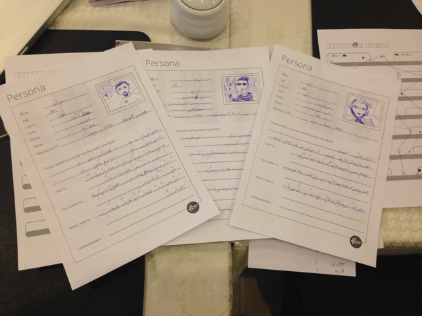
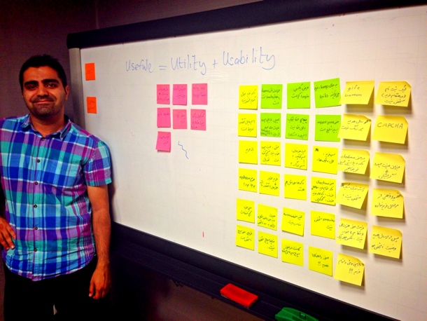
We finished up the Product Management course in the morning, and then started on the UX course. We focused on personas and sketching for much of the day. The picture below shows some of the personas one team created – in Farsi. It’s still amazing to see these techniques applied in a language so completely foreign to my eyes and ears.

Day 4
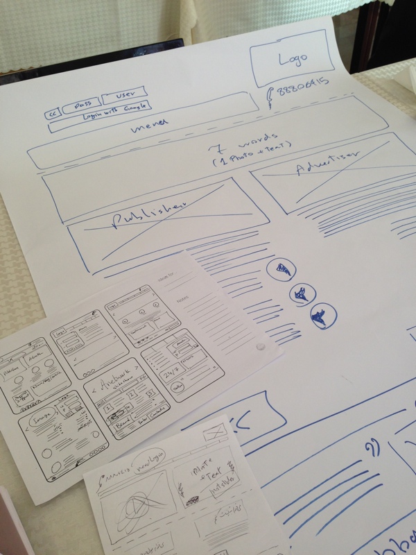
On Day 4 we finished up the training part of the trip with lots of sketching (design studio with 6-ups to 1-ups to full page wireframes). I was left with an enormous respect for this group as they meticulously applied every step of the process to their businesses. Here’s one group’s journey from 6-ups to final sketch.

One of my many incorrect assumptions about Iran was that everyone obsesses about politics every day. I assumed people here would be fearful, constantly worrying about the government, discussing topics like nuclear weapons and sanctions, etc. Not so. Instead, what I found is normal people living in a normal city with normal problems (traffic!) and normal social life (food!).
One thing is different though. They’re not waiting. For anything. They’re not waiting for a government handout, they’re not waiting for someone to give them a good job with a good salary, they’re not waiting for education to somehow fall out of the air and hit them on the head. No. They work.
The startup culture is amazing, and the entrepreneurial spirit is strong. They find ways to learn, they find ways to build businesses, and they do it not just because they want to make money. They do it because they understand the power of technology to affect people in a positive way — perhaps more than we in the West do. Their drive doesn’t come from wanting to buy more stuff. Their drive comes from something much stronger: a desire to improve their country, and the firm belief that they have the power to do so.
Everyone I spent time with had a deep sense of urgency to them. They want to learn quickly, they want to make great products, they want the world to change their opinion of them. Their enthusiasm is contagious and inspiring.
Day 5

On Day 5 I moved from training to consulting. We started with setting up and running 4 usability tests for Beeptunes. It was so great to see the team take control and run with it. The moderator did great, the note takers did great, everyone played their parts with confidence and skill. The Beeptunes team took it in stride, even though it was hard for them, because users struggle a great deal on their site. But they’re keen to fix things, and happy to see concrete data on usability issues.
From there we drove to UX Tehran, where I spoke to about 300 people about responsive design in emerging markets. There were some challenging questions, as I’ve come to expect.
At the beginning of the week I took these types of questions quite personally, wondering if they think I’m full of it. But I quickly learned that’s not the case. It’s just part of the culture to have strong opinions and be vocal about them. And, from what I hear, complaining about things is practically a national sport in Iran — one they enjoy immensely. From traffic to sanctions to the president, they just love challenging status quo. So I should probably feel flattered that they took me seriously enough to challenge the ideas in my talk. I still have no idea if my answers were satisfactory, but the talk appears to have been well received, at least.
From there we went back to the Beeptunes office to do analysis on the usability testing data. They’re such fast learners that I didn’t have to do much except point them in the right direction. I gave some advice and answered questions about sticking points, but for the most part they went through the analysis exercise with the passion and dedication I’ve now come to expect from Iranians.

Day 6
The last work day started with an amazing breakfast at Cafe Leon. Iranian breads and cheeses, vegetable omelette, a variety of spreads… So good. And a very nice view.

After that, we sped to the office to not only run 5 usability tests on Digikala.com, but also start the analysis process. That was insane and we were all so tired by this point that I’m not sure how much progress we made. But like buddies on a battlefield, we were in it together, and our spirits remained high.
What this trip meant to me
I think above all this trip has given me a renewed drive for the work we do to try to make the web a better place. This has been a difficult year in many ways. I struggled not only with the usual demands of agency life, but also with a frustration when I look around too much and compare myself to others. And even though my passion still lies heavily on the product side, I’ve made peace with the fact that shipping your own product might not be the only way to have an impact in tech. That will probably sound like heresy to some, and I understand that because “just ship” has become such a refrain in our community. It can make those of us who spend most of our time on the product strategy and early design phases feel quite inferior.
I may not have shipped a product last week, but I know that 5 startups in Tehran are going to spend the next few weeks analysing usability test data, and transforming their companies to follow a user-centered design methodology. So I’m going to stop comparing for a second and be ok with that. Because that? That is awesome.
Yet I’m still trying to wrap my head around Iran, and it will probably take a while, because it’s a place of contradictions. The infrastructure is lacking greatly, but there are pockets of extreme modernness, sometimes in the most random places. One night we drove through rough neighbourhoods and dirt streets only to arrive at an amazing Lebanese restaurant. And that’s Tehran. There are derelict buildings everywhere, but you can suddenly turn a corner and see a modern, luxurious villa or movie theater or apartment complex. It’s all very strange.

I’ve heard enough opinions from people in Iran now to know that it is what you make of it. Those who don’t like it will leave. Others will stick around, and work to make things better. There is extreme poverty, the economy is in shambles, the government is not popular, and yet most of the people I’ve met have a positive outlook and firmly believe they have the power to improve the lives of ordinary Iranians. They are fiercely proud of their heritage and will defend it to their last breaths. (I got into lots of trouble criticising the affordances of doors in Tehran… I’m glad that’s the only negative thing I had to say!).
That attitude is a force to be reckoned with, and I enthusiastically align myself with the startup community in Tehran. They taught me a great deal about passion and perseverance, and for that I am grateful. So to my hosts at Sarava and the people of Iran I say: Mersi, Khoda hafez, and I’ll definitely be back.
There are some more photos of the trip on Flickr.


