I’m currently designing an Admin Console for enterprise software, and it’s going pretty much as you’d expect it to go, which is like this:

Every time I think I’ve made a breakthrough and sit back to enjoy my handiwork, I realize I missed something, and back into the abyss I go. I’ll probably write an emotional case study once this is all said and done, but for now there’s one breakthrough that has actually lived up to repeated scrutiny, so I wanted to share that.
First, let’s define what an admin console is. It’s that area of a site where admin users go to manage users, content, billing, notifications, and all kinds of other admin-y things. It’s also the area of a site that mostly gets ignored because (1) very few people have to use it, and (2) it’s freaking hard to design. There can be hundreds of options, and figuring out how to make it all fit together while still providing a good user experience can drive a grown man to tears very quickly. But if you don’t spend the time on this, and admins can’t do what they need to do, the whole site can fall down for its users.
So onward we go.
Initially I approached the design as primarily an Information Architecture problem to solve. I assumed that the main concern for admin consoles is findability of features. Where do you go to send invites? Manage authentication options? Set up analytics? But as I thought about it more, I realized that when it comes to admin consoles, there are actually two very distinct user actions, and they need to different design paradigms:
- First, there’s the action of finding the thing you’re looking for. And yes, that’s primarily an Information Architecture problem to solve.
- Second, there’s the action of doing the thing you found. And that is less of an IA problem, and much more a user experience problem to solve.
In most admin consoles the acts of finding and doing are both built on the same interface. What this usually means is that even if you get your IA right, performing the action you go there to do can be really difficult and confusing because the interface is still in finding mode. What we need is to separate those two actions. How do we do that? I have pictures!
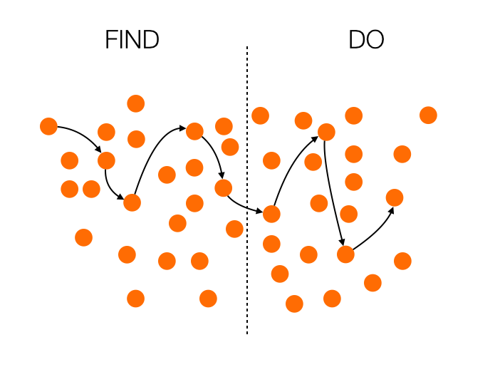
Let’s begin with how most admin consoles work:

In this case, the whole thing is a mess. The Information Architecture is not well thought through, so finding what you’re looking for is extremely difficult. To add insult to injury, if you do manage to find your path and switch to doing, all those distractions remain in the interface, and you’re left to fend for yourself amidst the chaos.
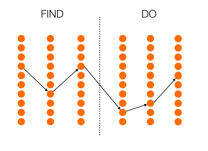
Now, let’s see what happens if you look at this only as an Information Architecture problem, as I did at first:

We’re certainly making progress now. The list of things you can do is neatly ordered, so it’s much easier to navigate. But there’s still a problem: the interface remains consistent during the doing phase, so the probability to get confused is still high.
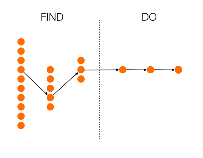
So what happens if we look at finding and doing as completely separate actions? What if we try to solve both the IA and the UI problems, depending on which phase we’re in? I think we end up with something like this:

Now we’re talking. With every step, you get fewer choices, so you’re essentially getting guided to the most appropriate choice. And even more importantly, once you enter the doing phase, there is no more distraction. Everything is focused on completing the task at hand. Maybe this results in more clicks overall, maybe it doesn’t. That’s not important, though. What’s important is that the next action to take is as obvious as possible.
This approach is in direct contrast with progressive disclosure. Instead of starting with a few options, and opening up to more options as you go, you start with many options (which is essential in a complex UI like an admin console), and provide fewer options as you go. Perhaps we can call it regressive disclosure? I don’t know, I’m bad at naming things.
How is this thinking manifesting itself in my current project? Well, instead of providing a traditional navigation—however well thought out it might be—I’m leaning towards a design that is much more linear, and provides fewer choices as the user goes along. I’m also working on a full-screen design for the doing phase, where the rest of the IA disappears completely once you move on from finding. As an added bonus, this is a much more natural design on mobile is well, so it’s going to make our responsive efforts easier as well.
There’s still a long way to go, but at least I now feel like the framework is solid. Hopefully you can use this for something you’re working on as well!