We recently had an opportunity to work with one of my favorite companies, Praekelt Foundation. They do amazing work with projects like MAMA (using mobile technologies to improve the health and lives of mothers in developing nations) and TxtAlert (automated, personalized SMS reminders to patients on chronic medication).
One of their products is called Vumi — a conversation engine for the delivery of SMS, USSD (Star Menu), and chat messages to diverse audiences. Vumi is a custom development platform that usually requires Praekelt involvement to set up, but they also have a self-service portal called Vumi Go, which they wanted to improve and scale so that they can move more of their clients to self-service. And that’s where Flow comes in. Towards the end of last year we started working with the Praekelt team on a redesign of the Vumi Go interface (you should follow Simon and Ben, they’re great). The internal Flow team consisted of me and Philip.
This is one of the hardest interface problems we’ve ever encountered at Flow. Which means it’s exactly the kind of project we love working on. We were tasked with taking some very low-end mobile technologies (SMS and USSD), along with IM (Gchat in particular), and create an easy interface on top of that to allow people to not only understand how the technology works, but also to create complex conversations and surveys using these technologies.
So, we dug in. We started by working with the team to create Personas for the Vumi Go product, so that we could always keep top-of-mind who we’re designing for. Our first goal was to come up with dimension that accurately reflect the different types of people who use Vumi, and would be inclined to go self-service:
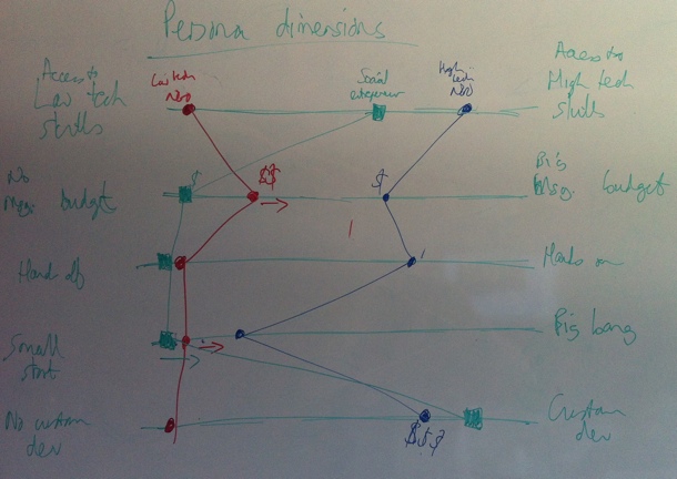
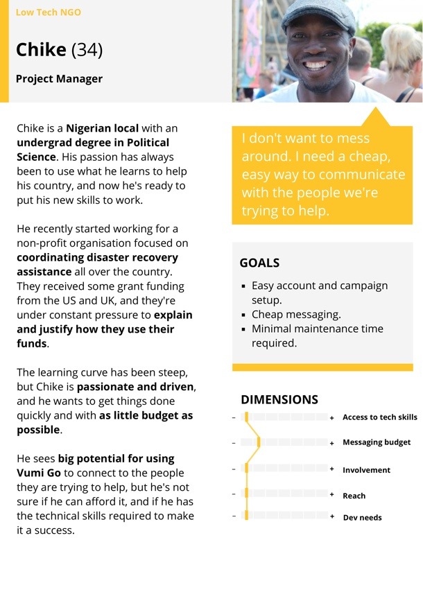
We ended up identifying and fleshing out three target Personas for Vumi Go: The NGO with very little technical knowledge, the NGO with significant technical knowledge, and the social entrepreneur. Here’s our Low-tech Persona:
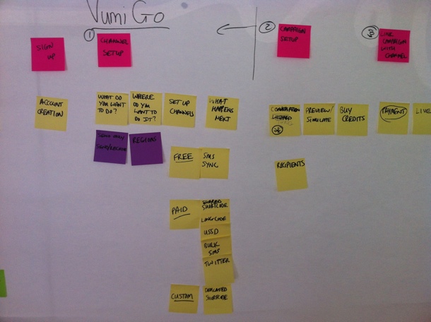
Our next step was to create the ideal customer journey map for the Vumi Go experience. We wanted to outline how people find out about Vumi, and how we can guide them through this complex flow in the simplest possible way. We started with a lot of sticky notes on a whiteboard to define all the possible actions that users needed to perform to set up their conversations. We then proceeded to order those steps in a way that makes the most logical sense (and would allow us to progressively disclose the right information at the right time). This was an essential step because the process of setting up a campaign in Vumi Go can be quite overwhelming, so it was imperative to figure out the right order of steps. That’s why sticky notes were such a great initial approach, since we could move things around at will:
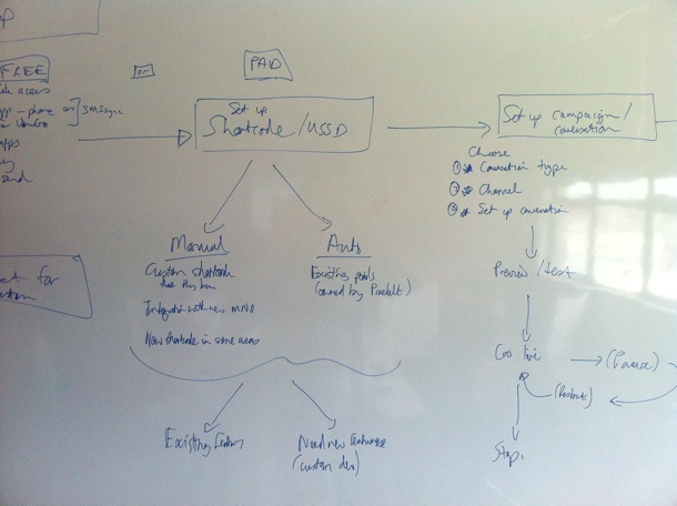
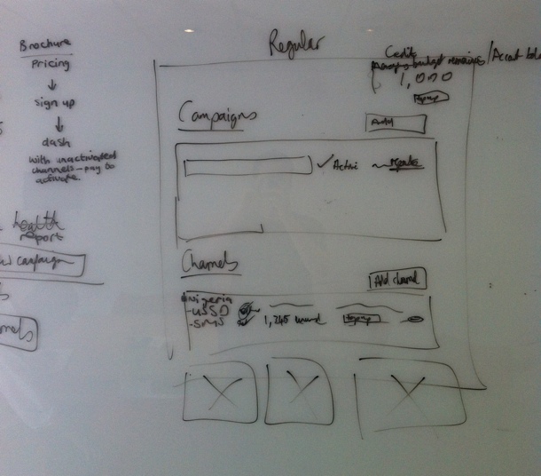
Those sticky notes eventually turned into a user journey sketch on the whiteboard, once we were getting sure about the best way forward:
After quite a bit of discussion and refinement, we got to a journey map that we were happy with. This version is too small to give much detail, but it gives a general idea of what we were building for:

This also allowed us to start working on the Information Architecture. Since we used the journey map as the starting point for the IA, we were confident that we had a good handle on the screens we needed to design, and the order of those screens:
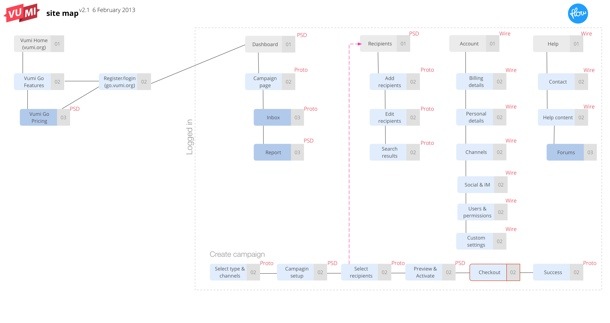
One detail I want to point out here is that we also defined what our deliverables will be for each screen — Sketch, Prototype, or PSD. We find this step really important to avoid miscommunication and surprises down the line.
Armed with a solid user journey and Information Architecture, we were finally ready to start designing the interface. We really needed this upfront time to define the problem properly, otherwise we would’ve gotten stuck along the way and it probably would have resulted in tons of rework. We did our sketching with the team using a combination of white board and paper, so that we could quickly try out different solutions without feeling too bad about the many designs we erased/threw out:
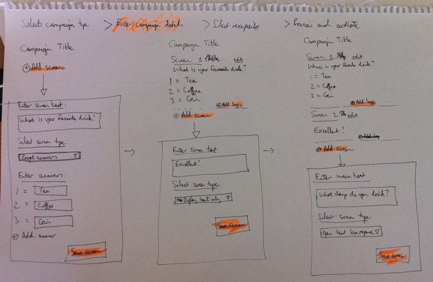
Once we eliminated the designs we believed wouldn’t work well for our target Personas, and settled on a concept we wanted to refine further, we started building an interactive prototype in Axure so that we could test it with real target users. We went through 22 iterations in total before settling on a direction we were confident about. Each of those iterations were based on either internal or user feedback.
The user testing phase was quite tricky. We could do some of it locally in our lab, but most of it had to be done remotely, since the target users reside in places like Kenya and Nigeria. We ended up using TeamViewer for the remote tests, but honestly, we won’t do that again. I’d much rather use Google Hangouts (or Skype screen sharing as a second prize). Teamviewer was just such a mission to set up, and it doesn’t deal well with less-than-perfect internet connections. Google Hangouts seem to be a lot more forgiving when Internet connections slow down (in low-bandwith situations it reduces video quality before it reduces voice quality).
Below is a screenshot of one of the prototype screens. If you’d like to play around with one of the prototypes yourself, you can do so here.
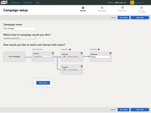
One thing we realized pretty early on is that this is utility, and it needs to be treated as such. Our research showed that people wanted to get through this process as quickly as possible. The complexity forced us to strip out any kind of ornamentation out of the interface. Not that we set out to make an ugly interface, but there were many decisions we had to make in the interest of utility and usability over “look and feel” (sorry, I hate that term too).
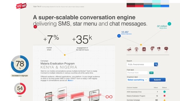
During the final stages of prototyping we started working on Style Tiles to get a sense of the graphic direction of the application. Style Tiles are a great way to discuss graphics without getting bogged down in UI details, since it’s not concerned with layout but exclusively with interface elements: typography, color palettes, button behavior, etc. Here’s an example of one of the Style Tiles that Philip created:
Once we had a refined prototype based on user testing, as well as Style Tiles to guide the graphic direction, it was fairly easy to go to the PSD stage. The prototype and strong style guide also allowed us to not have to create the entire site in Photoshop. We could just create a few key pages, and rely on the rest of it to be defined during development (yep, I admit we’re not quite Post-PSD). Here are a couple of examples of the graphic design:
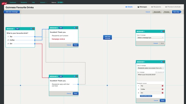
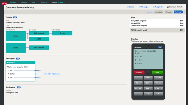
Again, as you can see, there’s nothing flashy here, and that’s by design. Based on our Personas and user journey, our conscious decision was to create this web application as an easy-to-use utility. It’s not a general consumer site, and it’s not an e-commerce site — it’s an essential cog in the larger machine of what businesses (and NGOs in particular) need to accomplish.
At this point the Praekelt developers (who were involved throughout) took over the process to get the application live. Ben talks about the development of the site more on the Vumi blog (see The inside scoop on our recent Vumi launch), so I won’t cover that here. I’ll just end by saying that this is one of the most gratifying projects I’ve ever worked on. We always talk about doing meaningful work in the design community, and this was one of those projects where we absolutely know that the product we helped build is going to affect people in a positive way. And the fact that it was such a hard problem to solve only made the experience better.
Congratulations to the Praekelt team on their relaunch. From everyone at Flow, we love you guys.