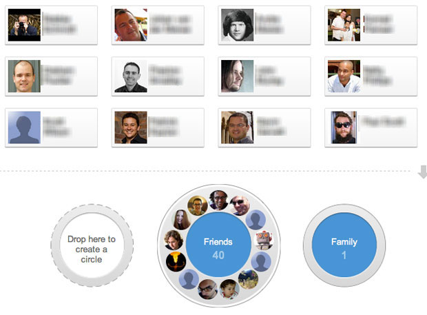
When Google+ first came out there was plenty of praise for its UI design[1], particularly the “un-Google like” design of the Circles feature. Oliver Reichenstein wrote:
Every interaction seems to have been thought through and designed until its last little bits (and those matter as much as the big bits). It even has room for some warmth (like the circle rolling away when you delete it) which is rare for Google’s cold UID approach.
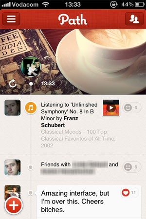
We’re seeing the same thing with last week’s release of Path 2.0. I agree with the entire Internet on this: the design is gorgeous with lots of small delightful details. Here’s Geoff Teehan in Going down the right Path:
It feels familiar, but they’ve made some smart decisions that break away from the norm without wandering off into obtuse interactions or under/over-designed visuals. The decisions they’ve made not only make things better, they add personality and delight ““ something that is crucial, and often overlooked when designing something functional.
Here’s the thing. Google Circles aims to solve a real problem with social networks, but the solution is tedious. Path has a beautiful interface, but I can’t figure out what user need it’s trying to solve. And those issues are problematic if you want to get to product/market fit.
Google Circles
There are inherent problems with binary social networks. The idea that someone is either full-on in your life (and therefore has access to everything about you) or not at all is not how it works offline. You tend to share certain information only with certain groups of people. Only some people will be interested in photos of your new puppy, whereas those same people will probably not be interested in blog posts about your work.
Google Circles aims to solve these problems by allowing you to drag and drop people into distinct buckets, and letting you only share what you want with each circle. And yes, the UI makes it really easy to do this. It’s great design.

The problem is that it’s just too much work. I’ve long since given up trying to maintain my Circles, and I’m pretty sure I’m not alone. Circles also lost its core utility for me. After I put about 100 people into different buckets I couldn’t remember who I put where, and what I was supposed to share with which Circle. So I just gave up and started sharing everything publicly.
It doesn’t matter how great and fun an experience is, good UI design cannot fix a broken solution.
Path 2.0
I get the same feeling when I play around with Path. Let me be clear: I love this app. I wish I could dump Facebook and use Path all the time. Sometimes I go in and scroll up and down just to see the clock animation. When I open the app in the morning I tell it that I’m awake just so I can see what the weather is going to be like today. Fantastic design.

There’s a problem, though. I don’t know what I’m supposed to be doing with this app. Yes, I know it’s still early and not a lot of people are on the network yet (even though it’s now starting to gain some real traction). But here’s one reason the app might not have enough staying power to grow out of its initial “Hey, that’s cool!” phase: what unmet user need does it solve? Is it doing anything that’s not already being addressed by a number of general and niche social networks? I don’t think so.
Once again: it doesn’t matter how great and fun an experience is, good UI design cannot fix a broken solution. Good design can effectively differentiate a good solution, and bad design can completely ruin a good solution. But good design simply cannot make up for a solution that doesn’t address a core user need really well. As a recent post on ZURBlog proclaimed, people don’t buy products – they buy the benefit.
I’m afraid that in the case of both Google Circles and Path 2.0, they might just be flawed solutions wrapped in a layer of beautiful UI design. It’s fun to play with for a while, but when it inevitably becomes tedious you eventually just forget to use it. Forever.
- When I talk about UI design in the context of this article, I mean specifically Interaction Design and Visual Design. I don’t mean to imply that Design = Making Things Pretty, or that UX is only about those elements. I use this term in the interest of simplicity since this is not an article about the elements of a User-Centered Design process. ↩
Update: Luke Bornheimer pointed me to his answer on Quora where he argues that Path’s biggest differentiator is how it easily enables private/public sharing.