Alex Maughan voices some things I’ve been thinking about as well in a great post on user journey mapping. After one particular project he observed this:
This user flow may seem an obvious solution, but it wasn’t obvious to the company hired to design the app before I got involved, which had up to that point resulted in some very limiting and confusing design flows. I don’t say this to blow my own horn. The point I’m making is had they explored the designs with some rough, high-level journey sketching upfront, they probably would have realised this themselves.
I’ve become increasingly convinced that there is no complicated design problem that can’t be solved with a few hours of collective thinking and some boxes and arrows. Yeah, I get some eye-rolls for my boxes-and-arrows reliance sometimes—especially because the outcome sometimes feels just too simple. But I’m with Alex on this one—these things are only simple in retrospect.
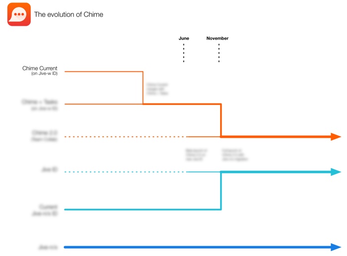
I recently worked on a project where we had to figure out the migration paths of 6 different products, and how they will all work together. We were talking for a long time, but we didn’t really get anywhere until I started drawing it out on the whiteboard. The end result was deceptively simple (some parts blurred out because it’s roadmap stuff):

“That’s it?” we all said of what came to be known as the Tron diagram. Yep, we realized together: that’s it. But it took a few hours of discussion and drawing to get us to the “that’s it” state. So this is me adding my voice to Alex’s in saying: never underestimate the power of sketching flows and user journeys to help us solve difficult problems.