This navigation article by Gerry McGovern is from 2006, but it’s still so spot on. I’ll quote this one bit from Web Navigation is About Moving Forward, but you should definitely read the whole thing:
Navigation should primarily be about helping us keep on going in the direction we have chosen. If I choose a link for “notebooks” then I have made a decision. Continuing to present me with links for servers and desktops decreases my ability to focus on the notebook direction I have chosen.
When I choose a link for “ultralight notebooks” that indicates that I am not interested in multimedia notebooks. Once I arrive at the ultralight notebooks webpage, the overwhelming focus of the navigation must be to help me find the right ultralight notebook.
Good web navigation design is not about giving people lots and lots of choices. It is not about second guessing decisions we have made. It’s not about asking what if we want to get back to where we were. It’s about looking forward, not about looking backward.
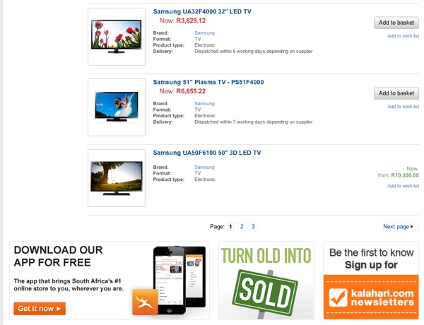
This is unfortunately still such a common practice on e-commerce sites. Why continue to show users unrelated product ads once they’ve made a decision on what they want? Here’s the search results page on Kalahari.com when I do a search for “Samsung TV”:

This isn’t the time to punt apps, newsletters, and the marketplace. I’ve indicated that I want a Samsung TV, so sell me a Samsung TV!