One of the many things I do that proves that I need to get out more is collect examples of placeholder text that ends up in a final interface. But I’ve also noticed that the issue happens more and more in the offline world as well. As I looked through my folder this morning I realized that, in the interest of science, I should post some of my favorites here. If you have any other good examples, please let me know!
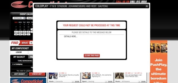
Let’s start with a very common one. Even though error messages are extremely important, they’re often forgotten about:
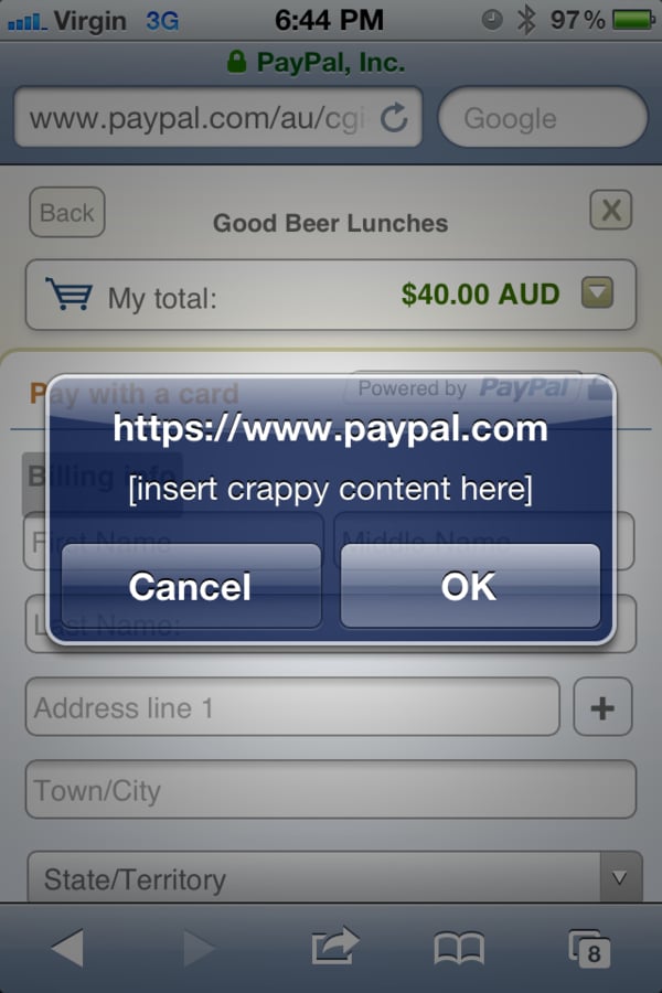
I have a feeling that this was done very late one night:
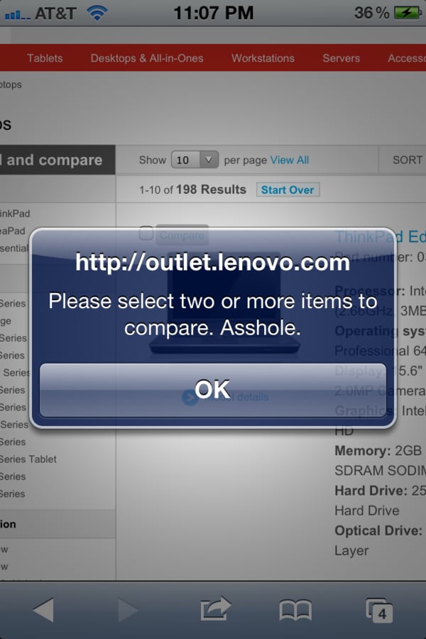
Speaking of disgruntled employees:
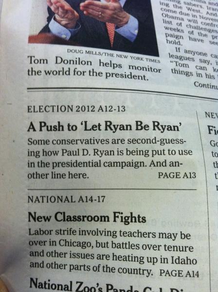
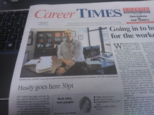
Placeholder text shows up surprisingly often in newspapers. And another line.
At least we know what the font size should be:
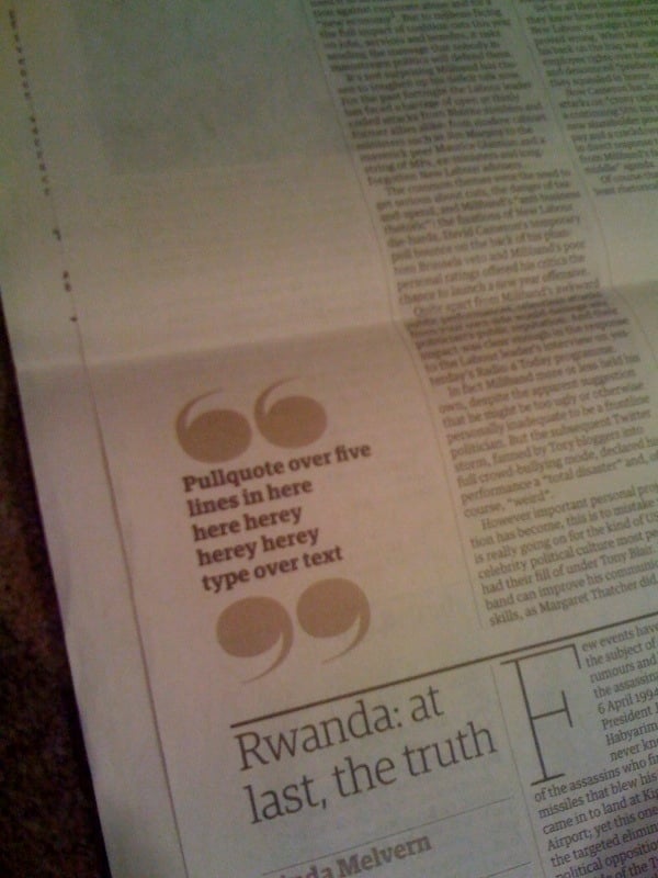
Pull quotes are optional:
I often feel the same way about sportsball:
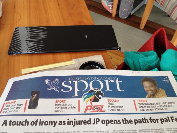
Who cares about these people:

But I think my all-time favorite is still this teaser that went up all over Cape Town one morning:

And finally: here you go, have a glass of Lorem Ipsum-inspired wine:

Yes, it’s funny, but these examples also prove a very important point: the consequences of thinking about content after the design process is completed can be pretty embarrassing. Content-first design is where it’s at.