By now it’s been well drilled into our heads that web design starts with content, not with graphics. However, in practice, getting real content before the design process starts is challenging at the best of times, and it’s made even more difficult by the fact that we have to try to get to content parity across all types of devices.
So to deal with this complexity we come up with more pragmatic guidelines. Mark Boulton’s “Structure First. Content Always.” is certainly a more realistic approach:
You can create good experiences without knowing the content. What you can’t do is create good experiences without knowing your content structure. What is your content made from, not what your content is. An important distinction.
So you have to start with the structure not the words. […] How do we design around the fluidity? Well, we define structure; of our content, and the templates that content inhabits. We define the rules of the system to display the content in different ways (if we can) to help the reader understand the content better.
The problem with all these approaches has always been the same for me: It sounds awesome in theory, but I don’t know how to make it part of our workflow when we’re in the weeds with client work. So we tend to try to make physical things that help us get there1. First we created expanded customer journey maps to define a content plan based on user needs and personas.
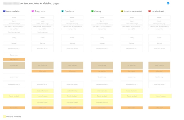
That helped a lot, but on the next project we got stuck on content structure again — how do we create different page templates with different types of content, without getting into interaction design too soon? So we came up with the idea of Content Modules: diagrams that show the relative importance and length of different types of content, in a Mobile First context. Here’s an example:

This document has a few key components:
- Each block outline represent a distinct content chunk that can be used on any other page.
- The primary call to action is highlighted (in orange in the example above) so that we can easily check for consistency and impact across different pages.
- Some pages will have optional modules — those are also highlighted (in yellow in the example above).
- A gap in a column doesn’t mean there’s going to be empty space on the page. This is not a layout diagram. It just shows the relative importance of each chunk. It also allows one to easily compare which page templates have which types of content on the page. This lets you easily spot if there’s some missing content (or unneccesary duplication).
- Each page template looks like a mobile view. That’s by design. It helps us to move straight into designing mobile views first, using the content hierarchy defined in the document, and then scale that up to larger views.
Creating content modules was the missing step we needed to bridge the gap between the content plan in our expanded customer journey maps, and starting the interaction design / prototyping phase. I was constantly worried that we’d start projects with content at the centre, but then gradually backslide into old ways as the project progresses. This document helps us to move seamlessly from content planning to interaction design, confident that we’re designing on the right content-led foundation.
-
I’m really trying to avoid the word “deliverables”, but I’m struggling. ↩