Ken Norton wrote a really nice post about the problem with prioritized feature lists in product development, using his team’s early work on Google Docs as an example. Specifically, here is the problem he highlights in Babe Ruth and Feature Lists (Why Prioritized Feature Lists Can Be Poisonous):
Our wish list approach also created false equivalence. There was a huge chasm between what #1 meant to us and what it meant to our users. For us, it was first amongst equals. To them it was a painful tumor overdue for removal.
Orders of magnitude separated #1 from the rest of the list. That urgency didn’t come through until we got a bunch of them in the room and let them vent.
It’s worth reading the whole post before continuing, because the context is important. Ken highlights a really important point about prioritised feature lists — they are too one-dimensional to give you enough confidence about the product development decisions you’re making. That’s why it’s so important to plot priorities on multiple dimensions to aid in decision-making.
The method that springs to mind immediately in the case of the Google Docs example is something I’ve written about before, the Kano model. Ken explains that even though they saw text formatting within Google Docs as an important feature to work on, users saw it as a major frustration, and a fundamental bug that needed to be fixed.
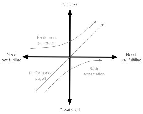
Plotting their list of features using the Kano model could have highlighted this disconnect earlier in the process. To recap, the Kano model, developed in the 1980s by Professor Noriaki Kano for the Japanese automotive industry, is a helpful method to prioritise product features by plotting them on the following 2-dimensional scale:
- How well a particular user need is being fulfilled by a feature
- What level of satisfaction the feature will give users
The model is generally used to classify features into three groups:
- Excitement generators. Delightful, unexpected features that make a product both useful and usable.
- Performance payoffs. Features that continue to increase satisfaction as improvements are made.
- Basic expectations. Features that users expect as a given — if these aren’t available in a product, you’re in trouble.
Here is a visual representation of the Kano model:

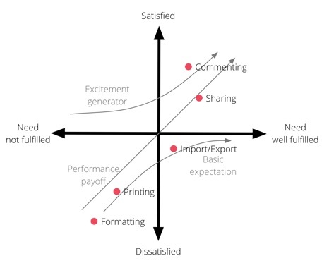
Now, let’s take Ken’s original list of prioritised features and plot them on the Kano model. Obviously I don’t have the background that the team would have had, so this is just a guess to illustrate the point:

With these added dimensions (and let’s assume there are 10 or more features on this graph), Product Managers can begin to make plans for what they need to work on by always keeping a balance between Basic expectations, Excitement generators, and Performance payoff features.
Now, I’m sure we could quibble about where exactly each feature should be plotted, but it’s immediately clear from this example that Formatting is a Basic expectation that needs to be very well met for Google Docs to get even close to parity with other word processors. That’s where they needed to start, and only once the basic expectations were met, should they have moved on to adding additional features to Formatting. At the same time, working on features like improved Sharing and Commenting would also have shown users that the product continues to get better over time (while generating some much-needed excitement).
So, with that said, I’d like to add a bit of a “yes, and” to Ken’s post. Yes, prioritized feature lists can poisonous, and one way to make sure that doesn’t happen is to add additional dimensions to the list to improve the accuracy of the decision-making. The Kano model is one approach, and I also discuss a couple more in The ultimate product question: How do you know what’s important?