Back in 2009, whenever an overly enthusiastic Foursquare user managed to capture the attention of an unsuspecting potential victim long enough to try to convince them to download the app, the conversation went something like this:
“It’s really cool. See? You ‘check in’ to the cafés and restaurants you visit.”
“Why?”
“Because if you check in enough times, you become the mayor of that place.”
“Why?”
“Because being the mayor is cool!”
“You keep using that word. I don’t think it means what you think it means. I think the word you’re looking for is lame.”
The discussion would usually dampen the Foursquare user’s enthusiasm a little bit, but only for a day or two. Then they’d be at it again, continuing their quest to spread the word about a service they don’t quite understand, but can’t help but be excited about.
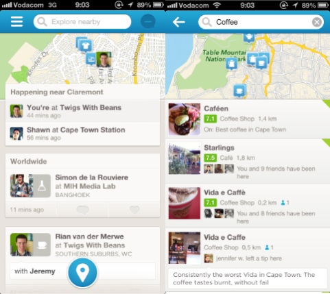
Yesterday, Foursquare 6.0 was released for iOS and Android. And it continues a slow, steady move away from a focus on the ‘check-in’ to a way to discover great places to explore. If you squint and look at Foursquare just right, you’ll realize that they are becoming what Path wants to be: a social network for close friends and family.
The new Foursquare home screen continues the trend to reduce the hierarchy of the check-in action in favor of telling you what’s happening in your network, and what places you might like to visit (see left side of the screen below). A tap inside the (much more prominent) search bar brings up the interface to show recommended places to visit within a specified category (see right side of screen below).

See, what Foursquare realized a while ago is that their real power is not in the mayorships and badges that defined them in 2009. The real power — as usual — is the data. It’s knowing what people like and don’t like. It’s knowing where to find good coffee, what restaurants to avoid, and where you should go when you’re in a new city. And they have been shifting towards that vision with steadfast tenacity. Dan Frommer discussed this when Foursquare 5.0 was launched in June 2012:
So: Foursquare has been evolving to a company that no longer simply answers “where are my friends?” but instead “where should I go right now?” This is smart: Everyone’s gotta eat. That’s why Explore is rapidly becoming Foursquare’s most important feature. This has always been part of the plan, I think. But it’s certainly carrying more emphasis in this new version of the app than ever before.
With Foursquare 6.0, the company’s move towards a discovery engine powered by people you like and trust appears to be almost complete. That said, it’s clear that they’re not done (watch out, Path). I’m sure they are thinking of more ways to make the experience better. So even though there are some design irregularities in version 6.0, those will be ironed out through constant iteration while they’re moving towards a clear vision for the future. Like Anil Dash said at the beginning of 2012 in Foursquare: Today’s best-executing startup:
Foursquare’s removed features from the core app a few times, constantly changes the design of its flagship iOS application, and in general asserts its authority over the experience that users have within the Foursquare application. Yet, unlike every single other major social application, they don’t inspire mass user revolts or negative press every time they iterate. […] Part of this is the small, well-paced timing of iteration on the application where there are always small things changing in ways that aren’t wildly disruptive, but do enough to set a tone that users know to expect the furniture might get rearranged once in a while.
So, with all of that said… If you’ve tried Foursquare before and found it lame, I think you should give it another go. It’s not lame any more. Any service that can help you avoid bad coffee makes the world a better place, right? Foursquare is such a service, and so much more.
Oh, one more thing. Posting your Foursquare check-ins to Facebook and Twitter? Still lame.