A few months ago Nilay Patel did a good interview with Tony Fadell, the creator of the Nest thermostat. From Inside the Nest on The Verge:
Fadell looks out at the Manhattan skyline and says that he always wanted to be an architect; that buildings stay beautiful forever but digital devices are quickly obsolete. “You look at hardware or software five years later? They’re crap. You would never use them again. People use architecture all the time.”
His voice rises. “What is our form of architecture? What is the thing that lasts of beauty?”
I’ve been thinking about this for a while now, and the reason I can’t get the interview out of my head is that I just can’t think of a good answer to Fadell’s question.
In web design, what is the thing that lasts of beauty?
Aesthetics and beauty in web design is so subjective, so polarizing, that I wonder if anything lasts of beauty in what we do. As one example among many, the current trend set by Path and Feedly seems to capture everyone’s imaginations. Beautiful, high-quality, full-screen photography with functional interactions and copy elegantly embedded:

I also find these sites beautiful – and functional. But will it last? 2010 and most of 2011 were mostly about minimalism, and now the pendelum seems to be swinging towards a more emotive aesthetic again. That’s fine because our field is fluid and dynamic, and unlike buildings, things change very rapidly in what we do.
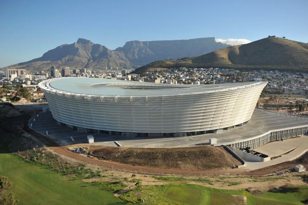
But I do wonder: where are our timeless stadiums?

In a recent article on Russian architecture Dmitry Fadeyev describes metro stations in Moscow and ends with the following remark:
What’s interesting about this type of architecture is that its aim goes far beyond that of creating a functional underground system. Its aim is to promote a political ideal, and it does it through beauty by enriching lives of the people who get to experience it. The question here isn’t: how do we solve the problem of creating a metro station in an efficient manner – instead the question is: how do we create a station that elevates people’s mood and inspires their lives. This architecture isn’t there just to help you live – it makes life worth living.
Maybe that’s why I think it’s important to talk about lasting beauty in web design. I wonder what would happen if we felt the weight of responsibility a little more when we’re designing. What if we go into each project as if the design will be around for 100 years or more? Would we make it fit into the web environment better, aim to give it a timeless aesthetic, and spend more time considering the consequences of our design decisions? Would we try to design something that “makes life worth living”?
Update 1/10/02: Francisco Inchauste wrote a great comment on Google+. Instead of summarizing it, I’ll post it here in its entirety. His point about content being that thing that lasts of beauty is particularly interesting. Francisco writes:
Our raw material doesn’t have a cost. You can cut up pixels and add to them. You can only cut a stone or wood once. Then it’s in a final form. We never find a final form for our digital goods, because by nature they are in a state of flux. The real beauty could be the changing connections of nodes that make up our Web.
The lens (browsers/devices) to view that work is always different and also evolving everyday. I think that’s why people have landed on content as the focus again. The content can evolve in presentation, but at the core is still the same content. So, maybe the goal of lasting beauty is in content, instead?