I love opening the App Store to see what updates are available for my iOS apps. Sometimes I forget to go there for a week or so and as the loading spinner comes up I play a little guessing game – will there be four updates? Seven? Double figures!?
Yes, I know I need to get out more. But I do believe my irrational excitement about something so inane points to an underutilized product marketing opportunity: Software version numbers as part of a delightful customer experience.
Before SaaS and the ease of over-the-air updates, version numbers made sense. In most cases v2.0 came after v1.0, and it was followed by v3.0, or maybe v2.1 for a non-significant update. Companies like Microsoft went a little more granular, but that was usually the exception. 1985-1992 saw the release of Windows 1.01 through 3.1, with only a few point releases in between[1].
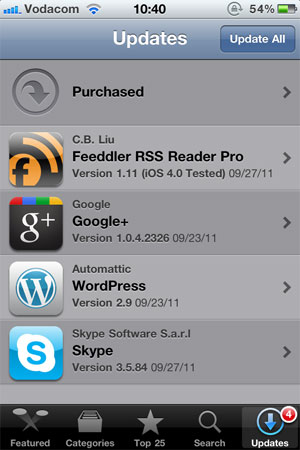
These days, with updates and releases coming with much more frequency than it used to, it’s not uncommon to see an update screen like this one:

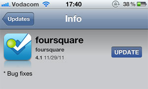
Since there is no common standard for version numbers, it’s not easy to tell which of these updates are significant without going into the release notes for each one. I can guess that Google+ 1.0.4.2326 and Skype 3.5.84 are bug fix releases, but I can’t tell for sure. I have a feeling that WordPress 2.9 is a fairly big release, but is it in the same order of magnitude as Feeddler 1.11? No idea. Especially since sometimes a seemingly big point release turns out to be pretty unexciting:

Jeff Atwood is full of praise for the virtues of continuous software updates, and I agree with him. In The Infinite Version he explains how he stopped caring about version numbers after an experience with Google Chrome:
Chrome’s version number has been changing so rapidly lately that every time someone opens a Chrome bug on a Stack Exchange site, I have to check my version against theirs just to make sure we’re still talking about the same software. And once – I swear I am not making this up – the version incremented while I was checking the version.
From a software development perspective frequent software updates are great – you’re able to iterate rapidly and respond to bugs quickly. However, I think this continuing disregard for sensible version numbers is a mistake. We are missing out on an important part of the customer experience: that excited feeling that goes along with getting something new. For paid apps especially, giving users new features “for free” has the potential to delight them and build long-term loyalty. But how will they easily know that they’re getting something new without the visual cues of well-defined version numbers?
There is probably no easy fix for this. We can’t just send the Internet a memo that this is now how we’re doing things. But I hope that software developers will at least start seeing version numbers as part of their product marketing efforts. It would also be helpful to adopt a simple, rough guide to version numbers:
- x.0 for major redesigns or a re-imagining of the application (such as Path 2.0 and Instapaper 4.0)
- x.y for the addition of significant new features
- x.y.z for bug fixes and minor improvements
If we don’t go deeper than three levels (even if z is a four-digit number) and all developers adopt this basic taxonomy, users will eventually start recognizing the pattern. This will give them the necessary cues to understand and appreciate app updates. They’ll know to click through and read the release notes for x.0 and x.y release, but that it’s probably not necessary to bother with x.y.z releases.
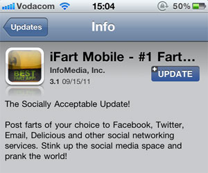
This naturally leads into a discussion about the importance of writing good release notes to go along with a consistent version number strategy, but that’s beyond the scope of this article. I’ll just leave you with an example of an app that sees release notes as part of their”¦ um”¦ “brand experience”?
