When I arrived at kalahari.com in December 2010 the site hasn’t seen any significant UI improvements during the 10+ years of its existence. My job description was pretty straightforward: do something about that.
In this post I’d like to talk about the work our team did over the past 12 months to get where we are today. When I look at the site now I still see so much wrong with it – there are way too many things that we still need to fix. So this isn’t an attempt to hold up our work as some kind of standard. I’m doing this in the interest of sharing our methods and lessons learned with the larger design community. I’ve learned so much from others who have shared their stories that it seems only fair that I do the same. So here’s our journey so far.
Making sense of the landscape
Here’s what kalahari.com looked like on December 1, 2010:
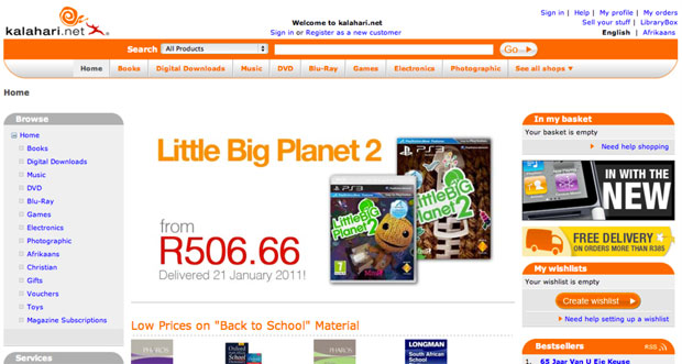
If you stepped through the site back then you probably would have felt as overwhelmed as I did. Where do we start? What order should we do things in? After the first few days of having too much coffee and talking to people all over the organization I realized that we had two primary challenges:
- No formal prioritization or product development process. It was the same situation I’ve seen many times before. Requirements went straight from “The Business” to developers. That kicked off an endless back and forth about what was needed, with only a cursory nod to Design. The “First In First Out” approach to prioritization was also quite common. The result was, well, not ideal. We needed to fix this.
- No formal user experience design. This was no surprise, and it was the reason I took the job in the first place. There was no user research, no content strategy, no interaction design, and no visual design beyond marketing and merchandizing materials. This is the part that really excited me: the opportunity to introduce User Experience Design into an organization that was (to their enormous credit) hungry for it but didn’t know where to start.
So we immediately got to work on both those problems.
Hello, I’m a Product Manager
Introducing a Product Management layer into an organization that’s used to working without it is tricky. If you do it wrong it can become a political nightmare and end up ruining your chances of shipping anything good. You might have the best of intentions, but there is always the danger that the only thing people will think when they look at a Product Manager is, “Hey, I used to be responsible for that, jackass!”
We certainly didn’t make this transition perfectly, but I believe the key is to make sure that you talk to as many people as possible about what their organizational issues are, and how they think it can be done better. You have to take the time to explain the benefits of having a Product Team that takes responsible for strategy, vision, and execution of a product (and takes the fall if it fails). And then, most importantly, you have to make the development process fair[1].
We now have a team of Product Managers who are responsible for delivering measurable business results through product solutions that meet both market needs and company goals. They work closely with their teams to develop the strategy and vision for their products. They ensure that designers and developers are included throughout the process. And most importantly: they make sure we ship.
The Intergalactic Product Force
One concept we introduced that I think is worth talking about is the Product Council[2] – a formalized way to deal with prioritization.
The Product Council is made up of the heads (VPs) of every department in the organization: Engineering, Marketing, Support, Category, etc. We have a weekly meeting where we discuss the current product roadmap and priorities. We ask ourselves, Are we still working on the most important things? If something more important comes up, we prioritize it higher in the roadmap, and something else shifts down. If w’re happy with the direction, we do nothing. If a new opportunity arises we ask ourselves, Is this more important than what w’re working on right now? Or is this something we should work on next? If so, what moves down in the priority list?
From here, I communicate any changes to the Product Team, and we discuss this to make sure no one missed anything. But then — and this is important — the Product Manager has complete autonomy and ownership over the implementation of his or her roadmap. The Product Council sets the priorities (with input from all parts of the organization), but the Product Managers work with their development teams (and others) to set the timeline, the implementation details, the design, everything.
Ther’s more to it, but in the interest of brevity I’ll stop there. This process has three main advantages:
- It gives the management team complete transparency into what the Product team is working on, and it allows for anyone to make the case for a change in priorities. Why this kind of transparency is so essential is a subject for a different blog post, but in short, it takes away a vast majority of the politics you see in many organizations, and it frees up the teams to do what they do best — execute.
- It prevents scope creep. Nothing can go on the roadmap without something else moving out or down. As anyone who ever worked at a large organization knows, this is an absolutely critical part of a successful development cycle.
- It gives the Product Manager and their teams what they need to be successful: direction and autonomy. As Jocelyn Glei says: “Give your team members what they need to thrive, and then get out of the way.”
Hello, I’m a User Experience Designer
I knew that we needed to build a great team if we were going to follow a user-centered approach to identifying and addressing the main issues on the kalahari.com site. But building a team takes time and money, and it’s hard to justify a large headcount request before you’ve proven that you can have a real impact on the business.
So we started small. I fulfilled the UX Design role, and we hired one visual designer since that was the primary need at that stage. Then we got stuck in. On a site of this size, and with the pressure we had to make improvements quickly, we decided on a dual approach:
- Make some initial and obvious changes to the visual design to improve hierarchy and the general aesthetic.
- At the same time, work on a long-term UX strategy to address some of the more fundamental user experience issues on the site.
The goal was to show quickly that we know what we are doing, and then use those successes to build out the team further and attack the areas where we can have the biggest effect on conversion rates.
Building a roadmap
We started this process with a small team of three Product Managers and two Designers, so we didn’t initially have the luxury of user research and a long period of product discovery to build out a roadmap. Instead, we went offsite for a day and built a customer experience map for our different user journeys. It was a great way to focus on what the core experience is that we need to improve.
We also went a bit further. Based on a heuristic evaluation of the site we annotated each of the steps in the user journey with obvious improvements we could make. This gave us a flexible framework for the year, and guided our roadmap throughout.
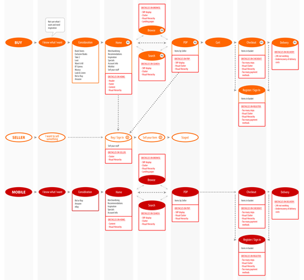
We decided early on to realign, not redesign. Our approach was to make relentless incremental progress as opposed to doing a 6-9 month project with a big bang release[3]. Our goal was to release every 3-4 weeks, depending on the size of the project.
In our first two releases we took care of some basics. I won’t bore you with the whole list, but here are the highlights:
- Released a new header and footer.
- Shifted from heavy reliance on orange to a more muted color scheme that allows products to draw more attention.
- Removed several links in the header and footer that didn’t get much use.
- Increased the visual hierarchy of Search.
- Decreased the visual hierarchy of several non-important features.
- Introduced a formal button strategy (primary=orange, secondary=silver).
- Moved from liquid width to a 960px 16-column fixed width design (including the ability to do single-column or two-column designs – every page used to be three columns).
- Started to separate CSS from HTML (better late than never, right?).
- Started to build a UI component library.

These changes had exactly the desired effect. User response was immediate and universally positive. In combination with some good specials, traffic started to increase. And most importantly: we were able to start growing our team to add designers, a researcher, and a front-end developer. Game on.
We spent the rest of the year systematically working through our customer experience map, starting with the most important areas where improved UX can have the biggest effects (Registration, Checkout, Product Details Page, etc.). Our process grew organically and ended up hitting a good stride towards the middle of the year:
- Define the area we’re working on, and define what success looks like (what are the metrics we’re trying to improve?).
- Work in small teams of PM’s, Designers, and Developers to sketch out new flows and develop wireframes.
- Test wireframes with users, utilizing the RITE method so that the outcome is improved designs, not PowerPoint decks with recommendations.
- Refine the designs as they evolve into high-fidelity visual designs (with more user testing as required), and deliver high quality HTML and CSS as the final output.
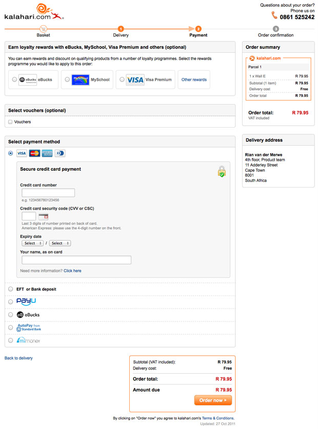
The outcome is a site that is drastically different from where we were a year ago, with real improvements in the success metrics we set for ourselves (% conversion on registration, checkout, and other flows). The changes include not just the main site, but also a brand new mobile-optimized version, as well as some significant changes to our Marketplace for 3rd party sellers. Here’s just one sample of our Checkout redesign, including one of the initial wireframes[4].
Old Checkout:
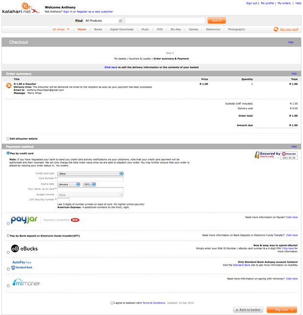
New Checkout:
Initial wireframe:
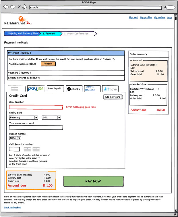
Final design:
Three more things
My biggest regret about this year is that we couldn’t do more. We made some great improvements to the site, but it is still so far from where it needs to be. And I know everyone on the team feels this way. We set out to build a culture of quality above all else, and it physically hurts when you have to make compromises and do something that’s counter to that culture. Before you jump in and say that there’s never an excuse to compromise, let me remind you of something Erin Kissane said in What I Learned About the Web in 2011:
If a single idea has followed me around this year, from politics to art and work to friendships, it’s been this one: “it’s more complicated than that.”
It’s centrally important to seek simplicity, and especially to avoid making things hard to use or understand. But if we want to make things that are usefully simple without being truncated or simplistic, we have to recognize and respect complexity — both in the design problems we address, and in the way we do our work.
So, yes, I agree with you – you should never compromise on quality. But it’s complicated. You sometimes run into technical and business complexities that force you to say, “We’ll have to do this later.” It sucks, but that’s life.
I’m exiting this year with three major takeaways – lessons learned and re-learned through our successes and failures:
- Love your developers. Too many companies see their developers as “resources” whose only reason for existence is to make The Codes. When you pull developers into product planning and design, everything changes. You build better products, and everyone has more fun.
- User Experience Design is a real thing. I saw way too many dismissive comments about UX this year. If you do it right, it will improve conversion rates and/or make more money. If you don’t believe me, come sign an NDA and I’ll show you our metrics.
- Culture is everything. In one story out of the Steve Jobs biography, Bud Tribble (one of the Macintosh team members) is quoted as saying, “Hey, if w’re going to make things in our lives, we might as well make them beautiful.” You need a team that has a relentless focus on quality. A team that cares enough to fight for moving that button 3px to the left. It’s the only way to find real meaning in your work.
We have a lot of work to do on our site (sorry, did I mention that already?). But I’m happy that we’ve been able to introduce a fair and effective product development process into the organization. We made user experience an intricate part of how we build product. And we now have a 14-person team of brilliant and dedicated Product Managers and User Experience Designers who care deeply about the product.
It was a good year.
- I wrote more about this in The most important characteristic of a good Product Manager ↩
- No one liked my “Intergalactic Product Force” suggestion ↩
- I wrote more about this for Smashing Magazine in The Data-Pixel Approach To Improving User Experience ↩
- I’ll spend some time over the break putting together some more before-and-after shots, including stories about the process we followed (if anyone is interested) ↩