I’ve been doing some work on threaded discussions and comment threads in our web and mobile apps, and I thought it might be useful to summarize some of my findings here. The particular issue we’re trying to address is how to deal with infinitely threaded discussions, like the kind you find on Hacker News and Reddit1:

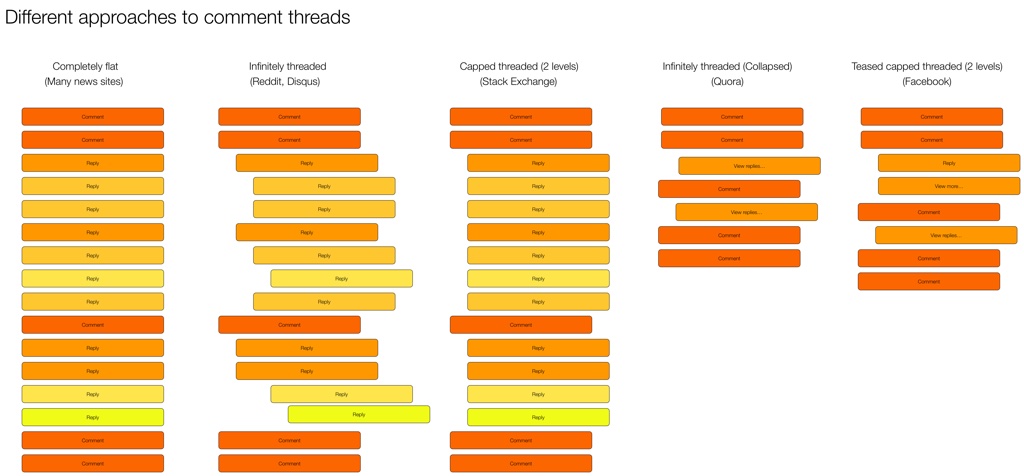
The first thing I did was some research on the different approaches currently used on the web and mobile for discussions and comments. There are some weird outliers, but in general there are five major ways threads are handled:

I did some further digging and came up with the following list of pros and cons for each approach.
Completely flat
- Example: New York Times
- Pros:
- Easy to navigate—just scroll down
- Content not pushed off screen
- Cons:
- No context available
- Difficult to follow conversation or see what a comment/reply refers to
Infinitely threaded
- Example: Reddit
- Pros:
- Context always visible
- Can have deep side conversations
- Cons:
- Difficult to navigate
- Hard to find new replies on a thread
- Pushes content off screen (as threading continues to reduce column width)
- Doesn’t let you decide which tangents (reply threads) you want to dig into2
Capped threaded
- Example: Stack Exchange
- Pros:
- Sets expectations that replies can’t go on forever
- Keeps context visible (up to a point)
- Content not being pushed off the screen
- Cons:
- Deeper levels of replies not possible
Infinitely threaded (collapsed)
- Example: Quora
- Pros:
- Context available on demand
- Easy to scroll and decide which tangents to go off on
- Less cognitive load to scroll through
- Cons:
- An extra action needed to view context
Teased capped threaded3
- Example: Facebook
- Pros:
- Context available on demand
- Easy to scroll and decide which tangents to go off on
- Less cognitive load to scroll through
- Can highlight relevant content as teasers
- Cons:
- New comments in thread can be confusing without their context
Our approach
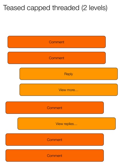
All design in a business is compromise. In our case, we need to figure out what we’re willing to gain, and what we’re willing to give up for it. In our case, our existing product uses infinitely threaded comments. So any change from that will obviously be… complicated. But considering that we want a single approach on mobile and web, it currently looks like we’re going to go with the Teased capped threaded approach:

This seems to strike the best compromise between easy scanning and the ability to drill into specific conversations. The “teaser reply” is particularly interesting, because it opens up some neat ways to provide relevant content to users. Perhaps you show the first unread reply, or the latest reply by someone you follow, or the most-liked reply. We’re still trying to figure out what would be most useful.
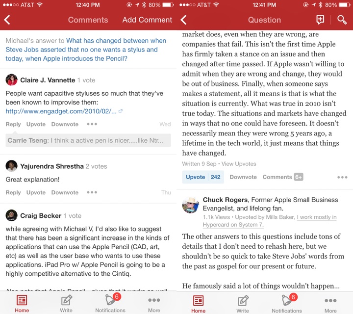
Another outstanding issue is if/how to deal with this approach differently on desktop and mobile. Some apps (like Quora and Facebook) split the view into two pages. The first page has the content and the first level of comments, and the second page has only the reply threads. In digging into it a bit more, it looks like this is mostly to make the app more performant. Here’s how Facebook does it:

And here’s Quora:

Youtube, on the other hand, does it all on one page:

We’ll need to dig into the performance issue, but my preference would be for a single page with truncated replies, like YouTube does it. Our current working hypothesis for a good solution is this:
- Show entire comment thread on the same screen (replies not on a separate screen) to make the flow better (easier to scan and dig into individual threads)
- Cap each individual comment at 5 lines (with a way to expand) (Mobile only)
- Show first reply to a comment, with “View more replies” to load 5 more (“View more” on mobile only)
- Show first 10 comments on a post, with “View more comments” to load the next 10 (“View more” on mobile only)
I like this hypothesis because it keeps the approach the same across devices, but still allows for differences in screen real estate available on mobile and desktop. We’re still in the middle of the debate, so if anyone has any recommendations or anything to add, please let me know!
-
Yes, Reddit starts capping threaded replies at some point, but they’re the best example out there of threads that go on forever. ↩
-
Jeff Atwood did a good deep-dive on these issues in his post Web Discussions: Flat by Design ↩
-
Yeah, I know I’m not good at naming things… ↩