UX deliverables had a rocky year so far. I feel particularly bad for the humble wireframe, which took some serious knocks over the past few months. There’s also a growing skepticism about the value of Personas. The Persona thing made me particularly uneasy because I’ve always been a huge fan, and we still start most of our projects with a workshop to define Personas and User Journeys.
That unease led me to introspection, which is a good thing, because it made me step back and revisit why we use Personas, and how we use them on a very practical level to design better products. The problem is, I came up short… I realized that though Personas are extremely useful to help clients figure out who their target market is, and understand those users better, they’re often not very useful once we go into the Interaction Design phase of the project1.
In contrast, the User Journey map that we create at the beginning of every project remains open in a tab until everything is done and dusted. I cannot overstate the usefulness of user journey mapping as a UX method. And then there’s the content plan — another essential part of the puzzle that we always create before the design phase starts. Once we’ve done a version of the Information Architecture, the content plan maps what kind of content needs to go on each page. But these are all separate documents, and you can only reference so many PDFs on any given day before it gets terribly distracting.
I realized that one of the problems with Personas is that it takes extra work to turn those user insights into artefacts that are useful for design. And that led me to the realization that there is probably a better way to group all these disparate UX deliverables together to help us create better products.
I decided to test my theory, so on a project we recently started, our User Journey map became more than just a journey with touchpoints, emotions, takeaways, etc. It also became a representation of the Information Architecture and the content plan, with our Personas (needs, goals, scenarios) serving as the starting point for everything — sort of like the glue that ties it all together.
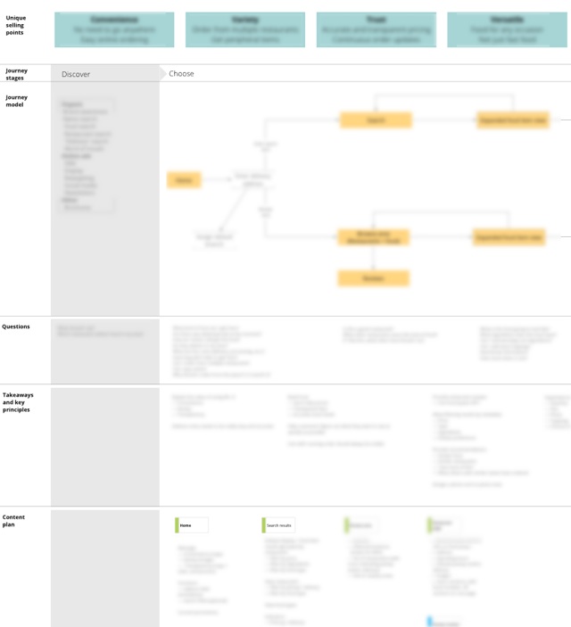
The project is still very much in progress, so I can’t show the full end result yet, but here’s a slightly blurry snapshot of one section of the journey:

This document is a summary of everything we need to know to design the best possible product for users. It has the following elements:
- Unique selling points to keep us focused on what the site needs to communicate at all times. This comes straight from the Persona needs and goals.
- Journey stages and model to remind us how the product fit into people’s lives, and what the primary calls to action need to be throughout the site.
- Questions that our target Personas are likely to ask in each phase of the journey, to focus the type of content we serve on each page. In an e-commerce context, these are questions like, “Can I trust this retailer?” or “When will my stuff arrive?”
- Takeaways and key principles to summarise the above sections (which primarily act as problem definitions/requirements) and document how that translates into the design decisions and solutions we need to keep in mind throughout the design process.
- Content plan that maps each phase of the journey with the questions our Personas will ask during that phase, and what it means for the specific content that needs to go on each page. We get very specific here — nothing gets on the page unless it’s in the content plan. And if we can’t identify a Persona that would find the content useful, it just doesn’t go on the list.
Even though the Personas aren’t explicitly referenced on this document, we extract the key points from each and turn those into information that is actually useful for design — namely the content they are most likely to be interested in. The Persona step is essential to help us get to this point, so we can’t skip it, but we don’t need to show faces and names and stories on the User Journey map to make that information useful.
So, in the spirit of “getting out of the deliverables business”, this expanded User Journey map becomes the only document we use to guide us throughout the design process. You can think of this as the UX Strategy document. It incorporates Persona-based user needs and business goals with site structure and content planning in a way that really works for us. It also places content at the centre of the design process, which makes it easier to follow mobile first and responsive design strategies.
I’m sure it’s not perfect, but so far this has been an extremely useful artefact for us.
-
Des Traynor wrote a good article about this. ↩