The gap between the technical skills required to use the software we make, and what the majority of people are actually capable of, is widening at an alarming rate. Not only that, but we often appear to not even like the people we design and develop for. We champion empathy as a core tenet of user experience design, yet we are mighty quick to point out how bad our moms are at “computers”, and how we hate going home for the holidays because we end up spending all our time on family tech support.
I worry that technology is advancing so quickly that it’s no longer able to ground our thinking in a bit of reality. Some might see this as a good thing, but I don’t. Unless we make a conscious effort to get back into the minds of our users — and not chuckle at what we find when we peek in there — we’re going to run away with the web and leave most of the world standing around in bewilderment, wondering what just happened.
Don’t believe me that this is a thing? Ok, here are some examples. First, CNET’s Greg Sandoval describes the downfall of Netflix in his must-read article Netflix’s lost year: The inside story of the price-hike train wreck. It’s long, so it’s easy to skip over this sentence that perfectly sums up why things went so wrong for Netflix:
But even visionaries can misread their customers when they are blinded by their past success.
CEO Reed Hastings thought he had his customers figured out, but he didn’t. At all.
The second example is Digg, which, of course, made headlines last week because they were sold to Betaworks for $500,000 after once being valued at more than $160 million. From Kevin Rose: Digg Failed Because ‘Social Media Grew Up’:
Among the missteps: Digg botched its re-launch in the summer of 2010, and, more importantly, he said the company was slow to respond to the criticism. ‘We were desperately trying to figure out how to get traffic back,’ he said. ‘A bunch of the community had already revolted by the time we fixed it.’
Once again, they thought they knew their customers, and once again, they didn’t.
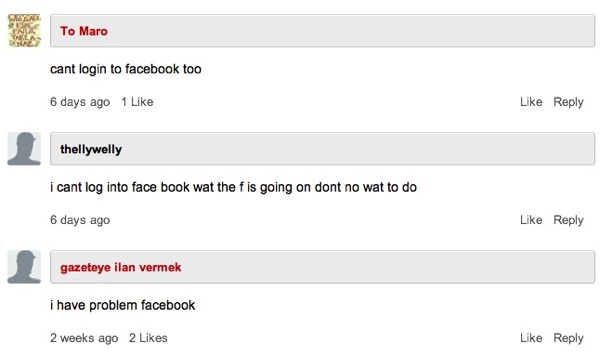
For the last example we’ll go even further down the technical totem pole, lest we forget what goes on in the bottom half of the Internet. In 2010 ReadWriteReb wrote an article about Facebook Connect and AOL Instant Messenger called Facebook Wants To Be Your One True Login. But their SEO was so good that if you went to Google and typed in “Facebook login”, that article would be the first result. It wasn’t long before they started receiving comments like this:

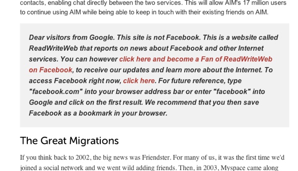
That’s right — people thought that they were on Facebook, and that the “new design” had inexplicably taken away the ability to log in. Things got so bad that they had to put up this message in the middle of the article, which is still there today:

The editors of ReadWriteWeb made one more mistake, though. They assumed that people know what a browser is. Watch this:
You may be asking yourself, “How do these people survive on the Internet? How do they get anything done online?” Well, we’d better believe it — they’re here, walking among us in plain sight. One can argue that things have gotten even worse since that article and video came out. Matthew Berk recently did an analysis of 1.3 Billion URLs and found that 22% of Web pages contain Facebook URLs. Google used to equal Browser for most people. Now Facebook is becoming the browser — it is people’s viewport to the Web.
And what are we doing about this? Well, mostly nothing, because we can’t be bothered to notice. We’re too busy arguing about Twitter’s API, and whether it’s worth reviewing a tablet that doesn’t exist yet. Speaking of the Surface, let’s not forget Greg Cox’s point about the people who are likely to buy it, which serves as another example for the point I’m trying to make:
Ha ha, we scoff. Who wants to do Microsoft Office on a tablet? Office is boring. And tablets have a completely different use case to laptops. Who would want one to run full Windows?
Answer: Lots of people. People with different priorities, working different jobs, living in different countries. People we don’t quite understand.
The rabbit hole just doesn’t end, no matter how deep you go. We haven’t even talked about YouTube comments or Clients From Hell. But I’ll stop here, and just say this: the landscape we create software for is scary. It’s terribly comfortable over here on Twitter, but how can we design software and applications for people we don’t hang out with?
It seems like such a simple problem to solve, but I’m not seeing much evidence that talking to customers is a widespread thing among startups and even many established companies. We love talking about User Experience Design in the abstract — especially if it means we can argue about whether it exists or not.
But you know who are the real heroes of UX (you know, if it actually exists)? The ethnographers. The user researchers (who had to change their name from “usability engineers” because definitions blah blah blah). The real heroes are the people who spend their days understanding user needs, and fighting with all their might to get people to make things that solve real needs, not things that floor us with their beauty and radiance and lack of utility. Douwe Osinga’s description of Google Wave comes to mind:
Wave started with some fairly easy to understand ideas about online collaboration and communication. But in order to make it more general and universal, more ideas were added until the entire thing could only be explained in a 90 minute mind blowing demo that left people speechless but a little later wondering what the hell this was for.
Let’s stop that from happening to the things we make. We don’t have to leave this job to The Researchers. We can all talk to the people who use (or might use) our software. We can go to a coffee shop and get feedback on wireframes for the price of a few cappuccinos. We can sit and watch some of our family members use the web, and make notes. We can try to spend a fixed percentage of every week talking to users. If we don’t, we’ll continue to widen what Jakob Nielsen calls the Usability Divide:
Far worse than the [digital] economic divide is the fact that technology remains so complicated that many people couldn’t use a computer even if they got one for free. Many others can use computers, but don’t achieve the modern world’s full benefits because most of the available services are too difficult for them to understand.
Whereas the [digital] economic divide is closing rapidly, I see little progress on the usability divide. Usability is improving for higher-end users. For this group, websites get easier every year, generating vast profits for site owners. That’s all great news for high-end users, but the less-skilled 40% of users have seen little in the way of usability improvement. We know how to help these users — we’re simply not doing it.
We know how to help these users — we’re simply not doing it. We don’t have a choice, we have to talk to them. It’s easy to start: take your laptop with you on one of your coffee breaks, and ask some people if you can show them what you’re working on. They’ll love giving you feedback, and you’ll walk away with a better understanding of the usability divide — and some very real ideas about how to narrow it.