I can only imagine the miles and miles of chaotic complexity that designers and developers had to wade through to arrive at the simplicity of Clear – a new To Do list app for the iPhone. As I started playing with the app, Rebekah Cox’s definition of design kept popping into my head:
Design is a set of decisions about a product. It’s not an interface or an aesthetic, it’s not a brand or a color. Design is the actual decisions.
And the decisions that Clear made are as close to perfect as I’ve ever seen. I can picture the endless, difficult meetings and arguments that must have happened to decide what features to include in the app. Should we have Projects and Contexts? No. How about Due Dates and Filters? Nope. Well, why not!? Because Clear is a prioritized list of tasks that is fast and easy to edit. That’s it. Nothing less, nothing more.
It reminds me of the Quora thread on why Dropbox became so popular:
“But,” you may ask, “so much more you could do! What about task management, calendaring, customized dashboards, virtual white boarding. More than just folders and files!”
No, shut up. People don’t use that crap. They just want a folder. A folder that syncs.
But let me stop gushing for a minute and step back a bit. Clear (which is getting quite a bit of attention) is absolutely fantastic as a way to view and prioritize a simple list of tasks, but it’s not a replacement for hardcore task management systems. Omnifocus will remain the application I use for all my work projects, and it’s always open on my Mac and iPad during the work day. But Omnifocus is hopeless overkill for simple tasks like “Make a car appointment” or “Get coffee at the store”. And that is the gap that Clear fills so effectively.
Clear is focused on two things that make it vastly superior to other similar apps:
- Speed. It’s really fast. When it starts up you can instantly start typing. This is crucial to quickly capture that all-important thing you don’t want to forget. I still die a little bit inside every time I see the “Optimizing database” message while I wait for Omnifocus to start up.
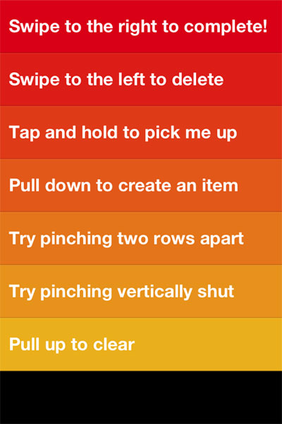
- Effortless editing. It’s completely gesture-based – no chrome, no fluff, no fancy visual design. You tap, you type, you swipe, you close. These gestures are easy to learn and intuitive:

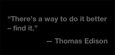
Francisco Inchauste calls Clear “an app for the future“, and I completely agree. It feels different, but it feels right. And despite its (appropriate) lack of visual extravagance, it has an attention to detail that reminds of the meticulous design of Path. For example, when you create a new list and there are no to do items in it yet, you get a random quote about getting things done:

I’m trying hard to find something negative to say about Clear, because every app has room for improvement. But at the moment my judgment is slightly clouded by how impressed I am with this team. It’s so hard to resist the temptation to build an app that tries to solve every problem for every person in the world. These guys walked through that fire and emerged on the other side probably bruised and battered, but also with a flawless app for listing tasks and editing them quickly. Want more in your To Do list app? Shut up and go buy Omnifocus.