In The Pummeling Pages, Brent Simmons sums up the experience of reading on the web, which is something I’ve become increasingly frustrated with as well:
I was there because I just wanted to read something. Words. Black text on a white background, more-or-less. And what I saw “” at a professional publication, a site with the purpose of giving people something good to read “” was just about the farthest thing from readable.
The site has good writing. But the pages do everything possible to convince people not to try. “Don’t bother,” the pages say. “It’s hopeless. Oh “” and good luck not having a seizure!”
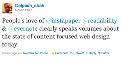
I see the sentiment echoed everywhere, including tweets like this one by Alpesh Shah:

Just to be clear about what we’re talking about, here are a few examples that illustrate why there is such a growing frustration with reading on the web.
First, here is an article on Harvard Business Review that not only blocks me from reading anything until I click to dismiss the ad, it also messes with the other ads on the page:

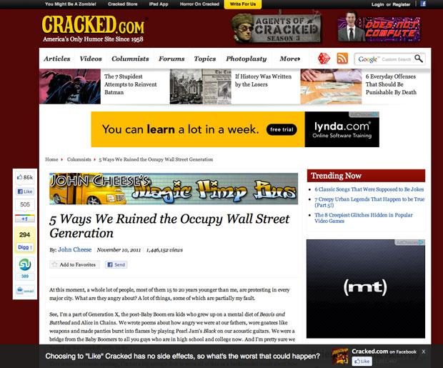
Here’s a story from Cracked.com, where in my unscientific estimation about 15% of the page above the fold is devoted to the actual text of the article:

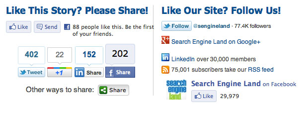
And finally, an example from Search Engine Land that illustrates the following sentiment in Brent’s article:
They’re filled with ads and social-media sharing buttons “” and more ads. And Google plus-onesies and Facebook likeys. And also more ads. Plus tweet-this-es. Plus ads. (And, under-the-hood, a whole cruise-ship-full of analytics. The page required well-more than 100 http calls.)

Is this the future of reading on the web? I sincerely hope not. I keep reminding myself of these words by Jeffery Zeldman:
Most of all, I worry about web users. Because, after ten-plus years of commercial web development, they still have a tough time finding what they’re looking for, and they still wonder why it’s so damned unpleasant to read text on the web “” which is what most of them do when they’re online.
The scary thing is that Zeldman wrote that in 1999 (he revised the post slightly in 2005). And many years later the experience of reading text on the web seems to be getting worse, not better. As I wrote in The demise of quality content on the web, I’m worried that the wells of attention are being drilled to depletion by linkbait headlines, ad-infested pages, “jumps” and random pagination, and content that is engineered to be “consumed” in 1 minute or less of quick scanning ““ just enough time to capture those almighty eyeballs.
As advertising clickthrough rates continue to drop, the ads become more desperate and invasive, and readers are starting to notice and do something about it. I’m doing the majority of my reading in RSS and Instapaper where I can read in peace without being pummeled by distractions.
The thing is, there are better ways to make money from writing – ways that are more respectful of readers. Ad networks like The Deck come to mind, as well as the growing number of sites that offer memberships (like The Loop and Daring Fireball).
It’s time for publishers to think different.