Menu

Breaking Development: Build on the present to develop for the future

Breaking Development is a conference about the future — as it should be. But as I reflect on the past couple of days of talks about going beyond the desktop, there’s one thought I can’t get out of my head:

We need to push the limits at both ends of the technology spectrum.

I’ll come back to that. First, I wanted to summarize the major themes that stood out for me at the San Diego conference on 22-23 July:

  • Forget about device classes like phone, tablet, laptop, and desktop. Instead, let ergonomics, input methods, and multiple-screen experiences guide design decisions.
    • We need to start thinking about designing for wrist devices (smart watch) and eye devices (Google Glass), as well as wall devices like TVs (think Xbox One) (see my notes on Luke Wroblewski’s talk).
    • The biggest development challenges are going to come from new input methods like voice control and gesture devices like Leap Motion (see the slides from Jason Grigsby’s talk).
    • The problem is that we can’t reliably detect screen sizes and input methods (keyboard, mouse, touch) to adapt content appropriately.
    • The good news is that we can look forward to advances in CSS3 that allow for full control over content layout (see the slides from Divya Manian’s talk).
  • So, how should we adapt to these changes?

These are important themes and I got a lot value out of the talks. We should absolutely explore the boundaries of new input methods like voice and gestures, and play around with experimental CSS features that let us take more control over content layout. This is how we move technology forward, and where we get to take advantage of the latest hardware and software standards.

But I’m a bit worried that we tend to push into the future so fast that we abandon fields of existing technology to whither and die before they’ve reached their full potential. It’s fine to experiment with the new and exciting, but innovation doesn’t happen only in the forward direction — lateral jumps often result in really innovative ideas.

I’m not sure if this is the best way to illustrate what I’m trying to say, but here’s what it looks like in my head. If we focus only on pushing the boundaries of the future, we end up with a pretty small “area of innovation”, for lack of a better word:
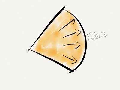
Pushing the future

But if we also work on pushing the boundaries of what we already have, we increase that area by a large amount:
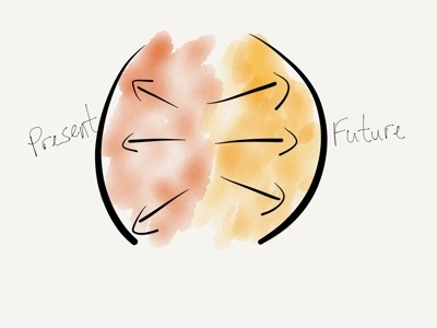
Pushing both ends

One example I keep coming back to is USSD. It’s a low-end mobile technology that got completely skipped over in the U.S., but is widely used all over Africa since it’s supported from the most basic feature phones all the way to the iPhone. Projects like MAMA (using mobile
technologies to improve the health and lives of mothers in developing nations) and messaging platforms like Vumi already use USSD in really innovative ways. We’re not talking about these low-end product solutions enough, and that’s a shame.

There are really two sets of questions we have to explore when designing and developing beyond the desktop. First, what can we do at the far edge of technology? How can we push the boundaries of the future? How can we go further?

But we also have to ask, what can we do at the low end of technology? How can push the boundaries of the present? How can we do more with what we already have?

As much as what I learned at Breaking Development will help evolve our company’s processes for future-friendly development, the most surprising outcome for me is how much it got me thinking about the potential to use existing technologies to solve the problems we run into while we push into the future. This is why I got more out of Breaking Development than I expected, and why I can highly recommend it to anyone who designs and builds digital interfaces.
Breaking Development: Prototyping Style

I’m attending the Breaking Development conference in San Diego this week, and will be posting my notes from a few of the talks here.

Ben Callahan did a great talk on design workflows called Prototyping Style. He discussed the problems with linear workflows before giving some great tips on a new way of collaborative working specifically suited for responsive design.

  • We used to have a very linear workflow, which went something like this:
    • Content
    • UX
    • Design
    • Front-end development
    • Back-end development
    • Launch
  • The problem with linear workflows is that decisions are being made in each step, before we have all the data
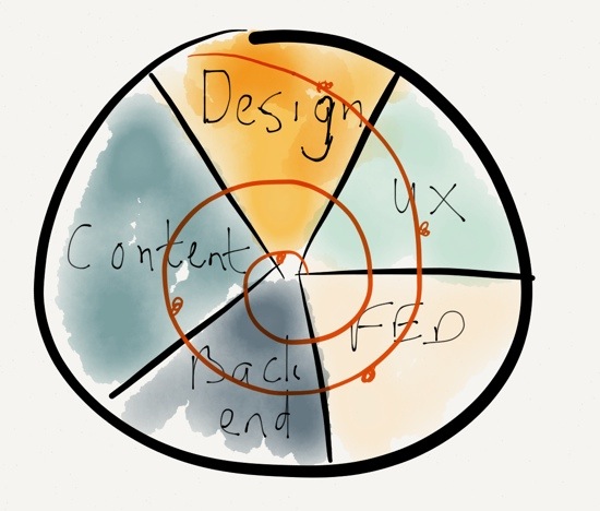
  • We need to invite others into the process, and work towards a “1 Deliverable” workflow

The “1 Deliverable” workflow looks like this (excuse my quick Paper drawing…):

1 Deliverable

The benefits of a “1 Deliverable” workflow:

  • It’s centered on iteration
  • It requires collaboration
  • It results in natural decisions (waiting for the last responsible moment to make decisions, once all the right data is available)
  • Watch out, it sometimes conflicts with organizational structure
  • It requires the right team — no room for superstar egos

So how do we advance the Design phase through a “1 Deliverable” workflow? 3 stages of design:

  • Establish the aesthetic
  • Solve the problem
  • Refine the solution

Establish the aesthetic

  • Do style comparisons with clients, to get a sense of what they’re looking for
    • Light vs. Dark
    • Flat vs. Textures
    • Illustration vs. Photography
  • Move from Style Tiles to Style Prototypes:
    • It shows more accurately what it will look like in the browser
    • It sparks conversations about browser support
    • It’s very easy to make quick changes with CSS
  • Use tools you are comfortable with to establish the aesthetic

Solve the problem

Refine the solution

  • Don’t use static design tools to refine the solution
  • Instead of static design handoffs, consider Design Pairing
  • Continuously get feedback and input on design direction
    • Set office up to create collaborative conversations
    • TVs with Apple TV connections so that anyone can throw up their designs onto any of the screens to discuss
  • Important: you need to be conscious of the switching point between solving and refining, so that design doesn’t continue ad in finitum

Ben ended his talk with a story about Miles Davis and the making of the album Kind of Blue, and what the album can teach us about collaboration. I really liked this because it’s something I’ve written about before as well, in A story about Miles Davis and the nature of true genius.

I really appreciated the practical nature of this talk. There were lots of ideas to take back and use in my everyday design work.

[Sponsor] HostGator web hosting

Web hosting is many things to many people. Grandma wants to start a knitting blog? WordPress. New tech start-up needs a server to present their minimum viable product? Ruby on Rails, PHP, and MySQL. HostGator has you covered, and with one-click installs via the proprietary QuickInstall application, free with every hosting plan.

HostGator is with you every step of the way. The Texas-based, award-winning support staff is available via telephone, LiveChat, and email 24/7/365.

From Shared plans, for just a few dollars per month, up to custom Dedicated servers and featuring both Linux and Windows hosting platforms, HostGator has a hosting solution for everyone. Have you ever considered a side business providing hosting services to your own clients? Perhaps you’re a web designer and want to add hosting value for your clients; a HostGator Reseller plan is the answer!

Try HostGator and get 20% off.

Sponsorship by The Syndicate.

Breaking Development: Pitfalls and Triumphs of the Cross-Screen Experience

I’m attending the Breaking Development conference in San Diego this week, and will be posting my notes from a few of the talks here.

I really enjoyed Cameron Moll‘s talk entitled “Pitfalls and Triumps of the Cross-Screen Experience”. One of the things that I appreciated is that it’s one of the first talks here I’ve seen that looked a bit more critically at Responsive Web Design. Not that Cameron isn’t a fan of responsive design, but he does bring up some interesting questions about its limitations. Here are my notes.

The need for multi-device experiences

  • “We don’t know what will be underneath Christmas trees two years from now, but that’s what we need to design for today” – Brad Frost
  • The best interface is the one that’s within reach.
  • Forget mobile. Think multiscreen.
  • At any time during the day, I may have 2-5 screens in use.
  • Would be more if you include screens in cars, other internet-enabled devices.

Five guidelines for multi-screen experiences

  • Discrete: an experience on one screen independent of, but ideally cohesive with, experiences on other screens
    • Twitter.com and NPR.com have great multi-screen experiences
  • Sequential: An experience capable of flowing from one screen to another
    • Amazon.com cart is available across multiple devices
    • 67% use multiple screens sequentially for online shopping
    • 90% use sequential for online activities in general
    • Up to 49% email themselves a link for continuing the activity on another device
  • Complementary: An experience complemented by a device’s unique capabilities
    • Day One and Google Maps apps utilize device capabilities of desktop browser and native apps
  • Extensional: An experience that controls, or is controlled by, another source
    • Instagram photos can be reposted to other networks, or pulled into apps like Flipboard
    • APIs essential for these types of experiences
  • Simultaneous: An experience involving multiples screens used simultaneously
    • Watching TV while going online with phones or tablets

Some do’s and don’ts for cross-screen experiences

Don’t:

  • Stereotype devices (or their owners, for that matter)
  • Fall prey to the convenience of device silos — we’re using multiple devices for multiple purposes
  • Unforgivingly force your app on users — let them use the web if they want to

Do:

  • Respect users’ mental models, aesthetically & functionally
    • Flipboard iPad and iPhone apps have different scrolling directions (left-right vs. up-down)
    • The iOS App Store “Update All” button is on opposite sides on iPhone and iPad
    • Simplenote has a “Done” button on iPhone, but not on iPad
  • Sequence tasks across screens (to the extent possible)
  • Make it vertically responsive, too
  • Leverage outside expertise

A closer look at Responsive Web Design

Don’t believe responsive design is a one-size-fits-all solution:

  • RWD is a must… for the browser, that is
  • How did native app development escape the same scrutiny?
  • Why don’t we have Media Query Snippets for native apps?
  • Amazon’s lack of RWD is not a concern — most of us rarely use their web site on mobile devices
  • You have to figure out the cross-screen experience for your product, because there’s not a single solution that applies to everyone
  • Remember, No One’s Forgotten How to Pinch and Zoom
  • What if pinch & zoom utilized media queries to render the layout differently (for those wanting denser content) vs. one size fits all? Demo: Gesture-Enabled RWD Proof-of-Concept

eBay CEO John Donahoe gets it:

We understand mobile to be just another screen…

It was a great talk with lots of food for thought.

Breaking Development: One Design to Rule Them All

I’m attending the Breaking Development conference in San Diego this week, and will be posting my notes from a few of the talks here.

Luke Wroblewski kicked off BD Conf 2013 with a talk entitled “One Design to Rule Them All”. It was a bit of a State of the Nation on what’s going on in the device landscape today. Here are my notes from the talk.

  • It’s impossible to determine what kind of experience we should design for by looking at standard device types (phone vs. tablet vs. laptop, etc.)
    • For example, smartphones now go up to 7″ screens and even a bit above.
    • Tablet sizes are equally all over the map, and to make things worse, you now have devices that are basically giant desktops that can transform into tablets or even phones.
  • What is the difference between a phone and a tablet anyway?
    • Pixel densities are not that different any more
    • Can’t reliably determine how big the device is
    • Can’t rely on feature detection (like if it makes phone calls or not)
  • We can no longer rely on knowing what type of device it is to figure out what to build.
  • It’s not clear any more what a mobile device is, what the difference between a tablet and a laptop is, and whether it’s touch-enabled or not (see Leap Motion).
  • We have to stop thinking about designing for phones, tablets, and laptops (device-specific).
  • Instead, what makes more sense is to look at the ergonomics of each device:
    • You get eye-sized or wrist-side devices, palm-sized devices, lap-sized devices, desk-sized devices, and wall devices like big-screen TVs
    • Each of these types require subtle differences in the interfaces, which is where responsive design come in.
  • This brings us to the principles of multi-device design:
    • Work mobile first
    • Support a continuum of screens
    • Account for high resolutions
    • Optimize for touch (can’t use mouse/cursor easily for touch)
    • Support cursor & keyboard
  • Good news: you only need one web design.
  • Bad news: it’s a new and different way of doing web design.
  • But wait, do we compromise the large screen experience if we go mobile first?
    • No, we’re creating a good experience everywhere, and we enable people to do more things in more places.
    • Look at Currys, Skinny Ties, and O’Neill as good examples.
  • And what about “the mobile context”?
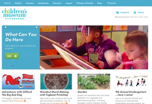
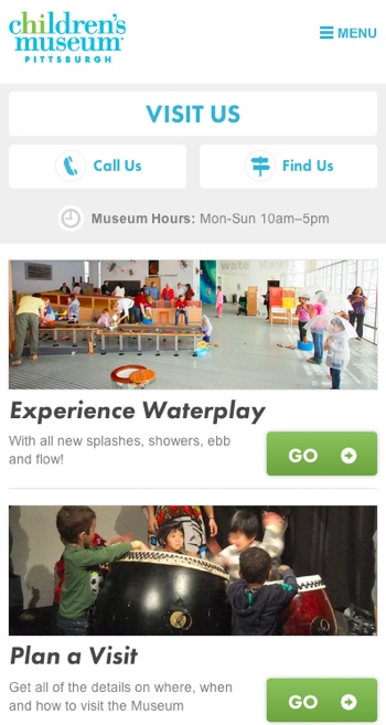
    • Children’s Museum of Pittsburgh: on mobile, they bubble up relevant content like how to get there, and they deprioritize that content on larger screens.
    • So you can still have one design, but use different priorities on mobile.

Smaller screens show important information about visiting like directions, hours, and contact details:

Museum mobile

On larger screens that information is deprioritized:

Museum desktop

It was a great high-level introduction to the conference, and I’m looking forward to the rest!

Pragmatism vs. idealism in design

From Mark Boulton’s great post I’m not a Craftsman:

I’m more often than not in a place where my own job, as a designer, is not to make something I love, but to make something appropriate. Something that does the job well. Something that responds to a hypothesis and serves a need. Not necessarily something loved and beautiful. And that’s ok.

In many cases, especially when it comes to client work, pragmatism beats idealism in design.

The benefits of product mistakes

John Ciancutti explains how Netflix uses data to make product decisions in How We Determine Product Success:

It can be frustrating to be in a product development environment where force of personality or hierarchy determines product outcomes. At Netflix the focus on customer value makes a teachable moment of those times one guesses wrong. My product intuition is vastly better today for the benefit of my mistakes.

It’s a great read on the importance of listening like you’re wrong when you develop products.

[Sponsor] Digg Reader: a Google Reader replacement

My thanks to Digg Reader for sponsoring Elezea’s RSS feed this week. If you haven’t settled on a Google Reader replacement (or even if you have), check it out!

Digg (yes, that Digg) has released a new RSS Reader for the web, iPhone, and iPad (Android coming soon). The design is sleek and clean, and the apps are speedy and efficient.

Whether you’re a hardcore RSS junky or simply want all your favorite online reading in one place, Digg Reader is for you. It’s free and available today!

Digg Reader

Sponsorship by The Syndicate.

More

  1. 1
  2. ...
  3. 114
  4. 115
  5. 116
  6. 117
  7. 118
  8. ...
  9. 194